Sorry for a very poorly worded title
My project is primarily for a stylistic display of words to layperson regarding their frequency of occurrences by way of font size. The output only needs to convey
1) Which word is the most frequent
2) Is a particular word more frequent than the other?
I am gunning for a presentable visual effect.
Here is my problem:
I am given an arbitrary list of words and their frequency. The distribution of the actual words and frequency are not known at advance. I want to to assign an appropriate font size to each word with respect to its frequency. A higher frequency word will have a larger font size. So it will be shown more prominently.
There are usually two kind of distributions:
1) A very evenly distributed list.
The frequencies are all within say 1 standard deviation of the mean
2) A very unbalanced list with extreme outliers on both end
I will use python to construct my example:
Here is the situation 1
import math


FONT_SIZE=96


def genImage1(wls, maxsize=100, color='red'):
    for wl in wls:
        print "<div style=\"font-size:%d;color:%s\">%s</div>" % (wl[1]/float(maxsize)*FONT_SIZE, color, wl[0])

wl = [['inhuman', 100], ['ironman', 90], ['hulk', 95], ['defenders', 85],
      ['punisher', 80], ['jessica jones', 83], ['daredevil', 80], ['x-men', 76],
      ['wolverine', 73], ['deadpool', 69], ['spiderman', 65], ['magneto', 60],
      ['Jean Grey', 55], ['Captain America', 53], ['Black widow', 49], ['Guardian of Galaxy', 41]];
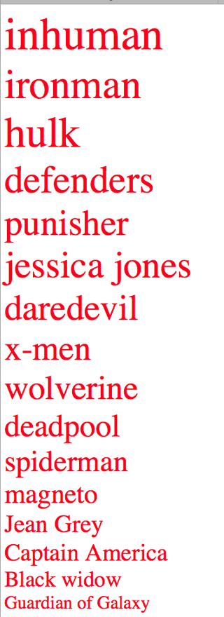
genImage1(wl, wl[0][1])
It is very straightforward and here is the outcome. It is what I expect to see.
Now here is a second list, a list of uneven distribution
wl = [['inhuman', 10000], ['ironman', 3090], ['hulk', 1395], ['defenders', 1285],
      ['punisher', 1180], ['jessica jones', 1083], ['daredevil', 980], ['x-men', 976],
      ['wolverine', 873], ['deadpool', 769], ['spiderman', 665], ['magneto', 60],
      ['Jean Grey', 55], ['Captain America', 53], ['Black widow', 49], ['Guardian of Galaxy', 41]];
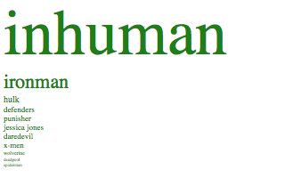
If I reuse the same routine above, of course it is not going to work
As you can see, a lot of words simply disappeared because the first word inhuman is too large by proportion.
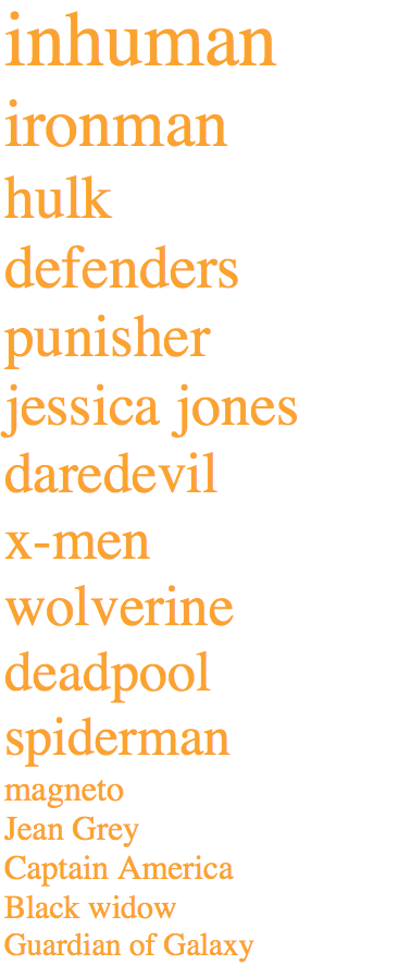
I can use log to compress both ends and produce a better result:
 def genImage2(wls, maxsize=100, color='red'):
    for wl in wls:
        new_size = math.log(wl[1])/math.log(maxsize )
        print "<div style=\"font-size:%d;color:%s\">%s</div>" % (new_size*FONT_SIZE, color, wl[0])
However here is the problem:
The frequency of defenders 1285 and that of spiderman is 665. I would like them to appear more different in size. With log, this proportionality is simply removed (i.e. defenders should be roughly twice the size of spiderman )
My question:
Is there any mathematical function that can allow me to compress both end of outliers and yet preserve some level of proportionality for the numbers in the middle?
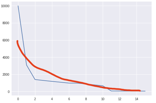
I would use the following chart to explain what I want to achieve:
Blue line represent the raw data set. Red line represents the ideal transformation of the original data series. I basically want to bring an outlier more into line while the difference between numbers in between both extreme is still visible to a viewer.


this proportionality is simply removedI mean I want to be able to show the audiencedefendersis actually different fromspiderman(defendersis twice the size). I will try come up with a plot $\endgroup$