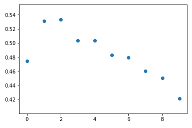
I'm building a logistic regression model where yes is the target, one of the attributes spnr_avg_spend_mod is shown below. It is a continuous variable but has been binned up into 10 bins using pd.qcut.
As shown in the image below, apart from the first data point there is a linear decrease in the proportion of yes with increasing spend (increasing spnr_avg_spend_mod).
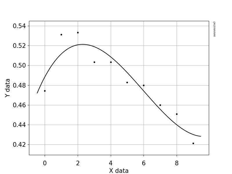
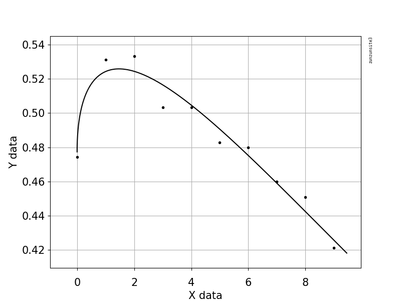
I am looking for ideas/methods on how to deal to this when modelling as it is a nice feature apart from that point.
In [14]: df
Out[25]:
   spnr_avg_spend_mod       yes
0                   0  0.474293
1                   1  0.531138
2                   2  0.533260
3                   3  0.503260
4                   4  0.503418
5                   5  0.482936
6                   6  0.479729
7                   7  0.460062
8                   8  0.450755
9                   9  0.421202

In [15]: plt.scatter(df.spnr_avg_spend_mod, df.yes)
Out[15]: <matplotlib.collections.PathCollection at 0x7f80962873c8>


yesatspnr_avg_spend_mod=0? One model would just draw a straight line between neighboring points. This would hit every point exactly, but the function would not be very smooth. Is this a valid way to "deal with" this problem? Why or why not? In other words, what problem are you trying to solve? $\endgroup$