For this kind of data, and any other univariate distribution, I have these recommendations.
1. Use what context you have to hand about the data. What is expected? What is or would be surprising or alarming?
There are at least four situations here:
1a. It's your (kind of) data and you should know about how it was produced and what to expect. So, I am a geographer and I know that big cities and big rivers are genuine but that no city is as yet 100 million people and no river 100,000 km long. That sort of detail may sound trivial, but knowing what is impossible, or implausible, can save an analysis from nonsense. At the easier end, an outlier may be evidently the result of some calculation or reporting error and either corrected or discarded as beyond repair.
1b. You're the data analyst and you have a client, boss, or someone else who should know about the data. Start a conversation if you have not done that already.
1c. You can use general knowledge or what you can find by Googling or other simple searches.
1d. None of the above. You shouldn't ever get to here, but minimally recognise that without any context you are not in a good position to judge.
I lay down all of the above because the idea that you can make good decisions about what is or what is not an outlier without subject-matter knowledge is somewhere between unduly optimistic and absurdly foolish.
Concretely, how do you proceed?
2. Always plot the data. Almost any graph will do so long as you can see the detail in the data, because you need to see all the data as backdrop.
2a. Yudi Pawitan has an interesting idea: a normal quantile plot will work well even if you are a long way from expecting anything like a normal distribution, because features and pathologies of any kind should be clear (not just outliers, but also skewness, fat tails, gaps, granularity, and so forth). Knowing how your data compare with a normal is like knowing your temperature when you know that you have a fever. How your data compare with a reference standard is worth knowing even if you don't expect your data to resemble that reference standard. (Many other names have been used for this plot, including normal probability plot, normal scores plot and probit plot.)
2b. Box plots, in my view, are now often over-sold unless the box plot is a variety that also shows details in the box and within the whiskers.
2c. Marked outliers will usually show up on histograms. But watch out as usual for the sensitivity of the histogram to bin width choice. With very large datasets note that outliers may form almost negligible bars by themselves. (It is sometimes helpful to use a variant on the histogram in which square root of frequency or density is plotted. Singletons show up better that way.)
In general, outliers are more evident on quantile plots.
3. If you use rules of thumb, distrust them.
3a. One over-used rule of thumb is to identify whatever is more than 1.5 IQR away from the nearer quartile. If you trace this back to its origin in J.W. Tukey. 1977. Exploratory Data Analysis. Reading, MA: Addison-Wesley, you'll find that it was never a rule of thumb for identifying outliers you should discard. It was a rule of thumb for identifying data points you should think about.
3b. Under rules of thumb, I include all significance tests with this flavour: Assume that the data should come from some named distribution. How likely is or are the putative outlier(s) in this scenario? Here the sting is that unless you have really good grounds for the assumption, the logic is somewhere between dubious and nonsensical. It is very easy to choose the chimpanzee distribution as reference when your data are more like a gorilla distribution. (This doesn't contradict 2a. above. A quantile normal plot is informative when the bulk of the data aren't normal. A significance test based on normality usually is not.)
4. Consider working on a transformed scale. Often the answer is not to throw out outliers, but to realise you'd be better off working with a transformed version of a variable under which the outliers will seem in line with the rest of the data. By far the most common example (but not the only one) is to take logarithms. This need not mean a logarithmic transformation if (e.g.) the outcome or response variable is of concern and using (say) a generalized linear model with logarithmic link would be a good idea. Essentially the same strategy goes under other names, such as Poisson regression.
5. (More advanced.) Use simulations. If you have one or more particular named distributions in mind, get simulated samples of the same size and ideally similar location, scale and shape as your data and see how common outliers are with such data.
6. Develop statistical caution about discarding or even identifying outliers. Recognising outliers is like knowing true love. If you're in doubt, you're not there. An outlier should stick out as being very different in several senses (graphical and numerical) and also appear really awkward for your intended analysis. The advice may then be to change the intended analysis, not to discard the data as not what was wanted. Think also about sample size: a bigger sample would (should) fill in many of the gaps, and what looks odd may only look odd because you have a small sample.
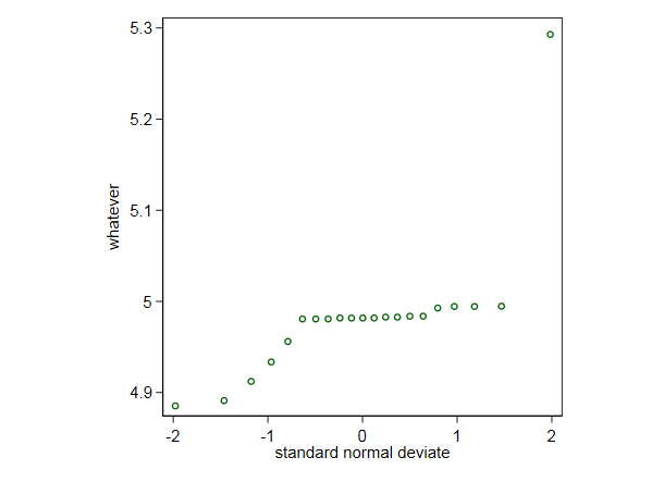
As a token, here is a quantile normal plot for your data.

The highest value does seem puzzling, but no amount of statistical expertise can fully compensate for not knowing what these data are. At the same time, I have to ask why are so many values all very close in the middle of the distribution? (You wouldn't spot that on a box plot.)
Recall the supposed exchange between Fitzgerald and Hemingway: The rich are different. Yes, they have more money. To change the analogy, do you have a two species problem, with good data points and bad data points mixed, and the job is tell them apart? This can happen with financial data when you're on the look out for illegal or unethical activity. But even if you know or think that you have a mix of gazelles and giraffes, the giraffes may not be as easy to spot among the gazelles as you imagine. And sometimes you just have gazelles, yet some surprise you as being much bigger than you expected. Otherwise put, in a real problem spotting g?????es among g?????es is easier aimed at than achieved.


