I have a large amount of data, divided into folders and files. Each file has 56 features/columns and around 10,000 rows. The data is normalised (values between -1 and 1) and some of the features have binary values (0,1).
My task is to predict the values for a specific column/label against the rest of the columns/features. I have been given no prior information or domain knowledge what-so-ever regarding the features. But, I have been told that, somehow, there is some relation between the label and the features. So I can't properly identify the most important and least important features just by looking at their names.
I have gone through the following steps. I was hoping someone could answer my questions regarding the steps I have taken. Plus, maybe someone can answer a few questions I have regarding each step.
STEP 1: I calculated the correlations for each file. So far so good. This step was just so that I could gain some knowledge about how much each features is related to the other etc.
STEP 2: I applied some statistical techniques and found out the mean, mode, variance, skewness, kurtosis etc. of the features. Then again, so far so good.
STEP 3: I used a simple linear regression algorithm and tried to predict the values for "y" (the label). I calculated the score, mean absolute percentage errors, mean absolute errors etc. Here is where most of the problems (I think) arise.
My first question is: The calculated "mean squared errors" for my regression technique are somewhere around (0.00001 to 0.00005). Why are they so small? Does the normalisation affect the value to be so small since the square of a number greater than 1 is greater than that number but its the opposite for numbers between 0 and 1? If the values were de-normalised to their original values, wouldn't the MSE be greater than the values that I am getting?
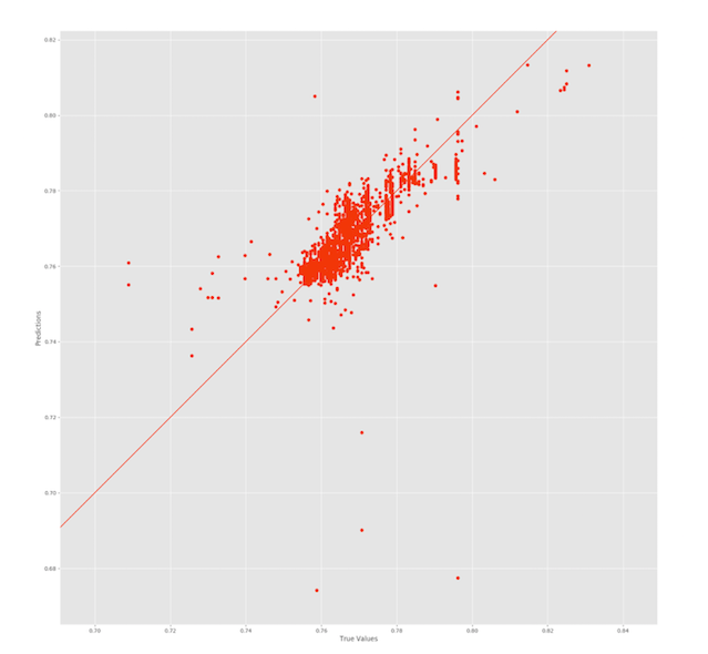
My second question is: The same goes for Mean Absolute Percentage Error that I calculate for the predicted values. They are around 0.5 (even after multiplying by 100). Why am I getting such "good" results when in reality my figure looks like this:
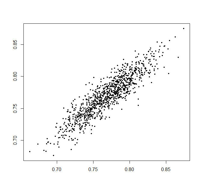
From the figure, its evident that I wasn't able to fit the data properly (hence the score of 0.76??) but my MAE and MAPE show very small values. In my opinion, the points should be more scattered "along" the line in an elongated fashion, not in a bulky way as shown in this figure.
STEP 4: After applying linear regression on the label column against all the columns (except for the label column), I was unsatisfied with the results. So what I did was, based on the correlation I got earlier in Step 1, I removed the internally correlated features that had a correlation equal to or greater than .95. Still I did not get satisfactory results. Which led me to the next question that is;
My third question is: Why are my predicted values not lying close to the predicted line. What am I doing wrong? Am I (1) over-using the features, as in am I using more features than needed which makes my model to take extra unnecessary features into consideration? or (2) Are the available features not enough to define my label properly? Are there some missing features that I was not provided with and because of that, my model is missing some key information (just like not taking into consideration the crime rate of an area while predicting the house prices).
References:
Linear Regression in Python; Predict The Bay Area’s Home Prices


