I have 5,000 samples drawn from each of approximately 50,000 distributions. I have good reason to expect most of them to be normally distributed, and I expect some of them to be multi-modal (mixture of Gaussians). I would like to understand:
- How many of my distributions visually appear to be normal?
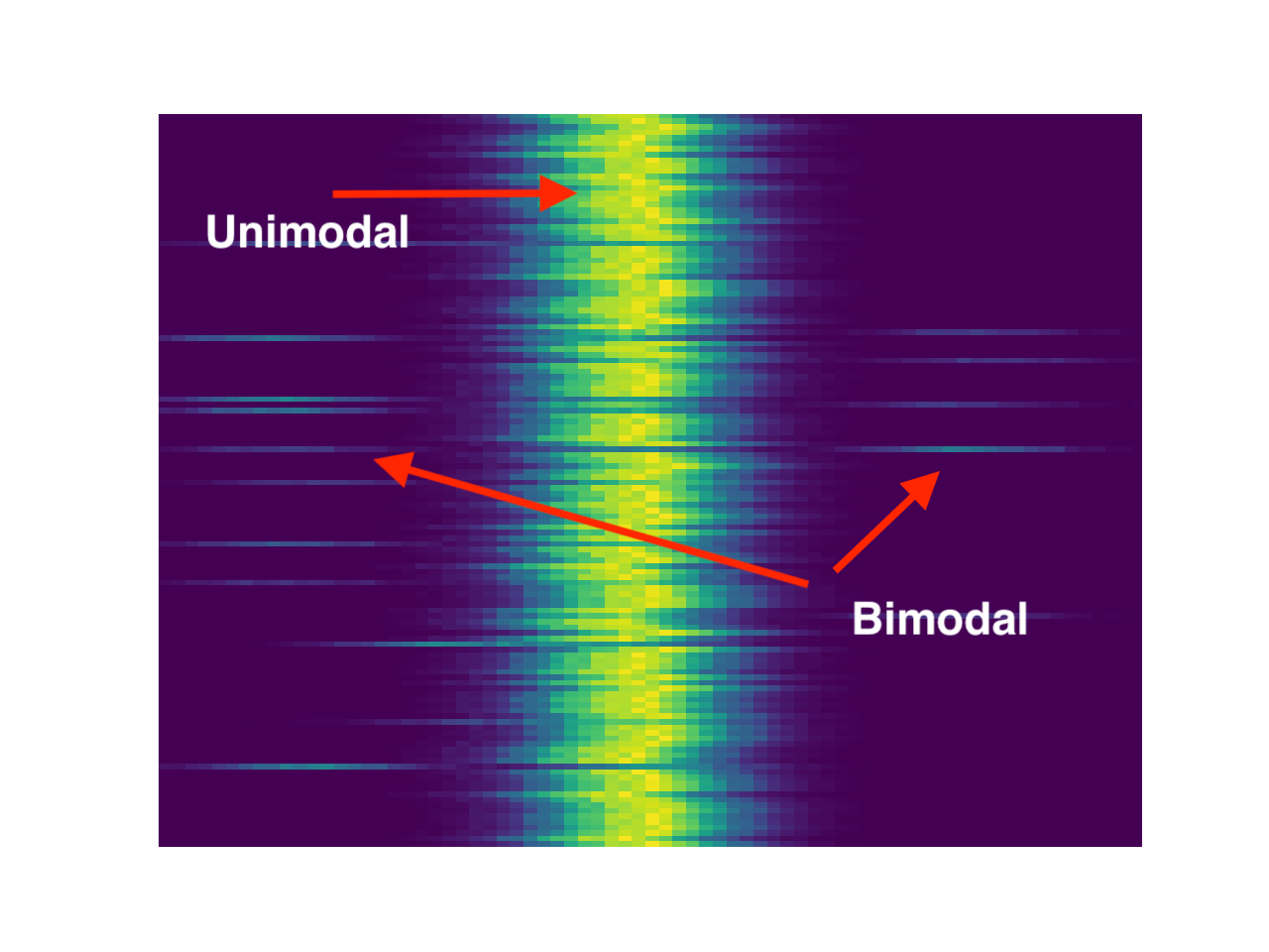
- Do the distributions that are multimodal look similar? Specifically, do they have the same number of modes, same distance between modes, or peaks in similar locations?
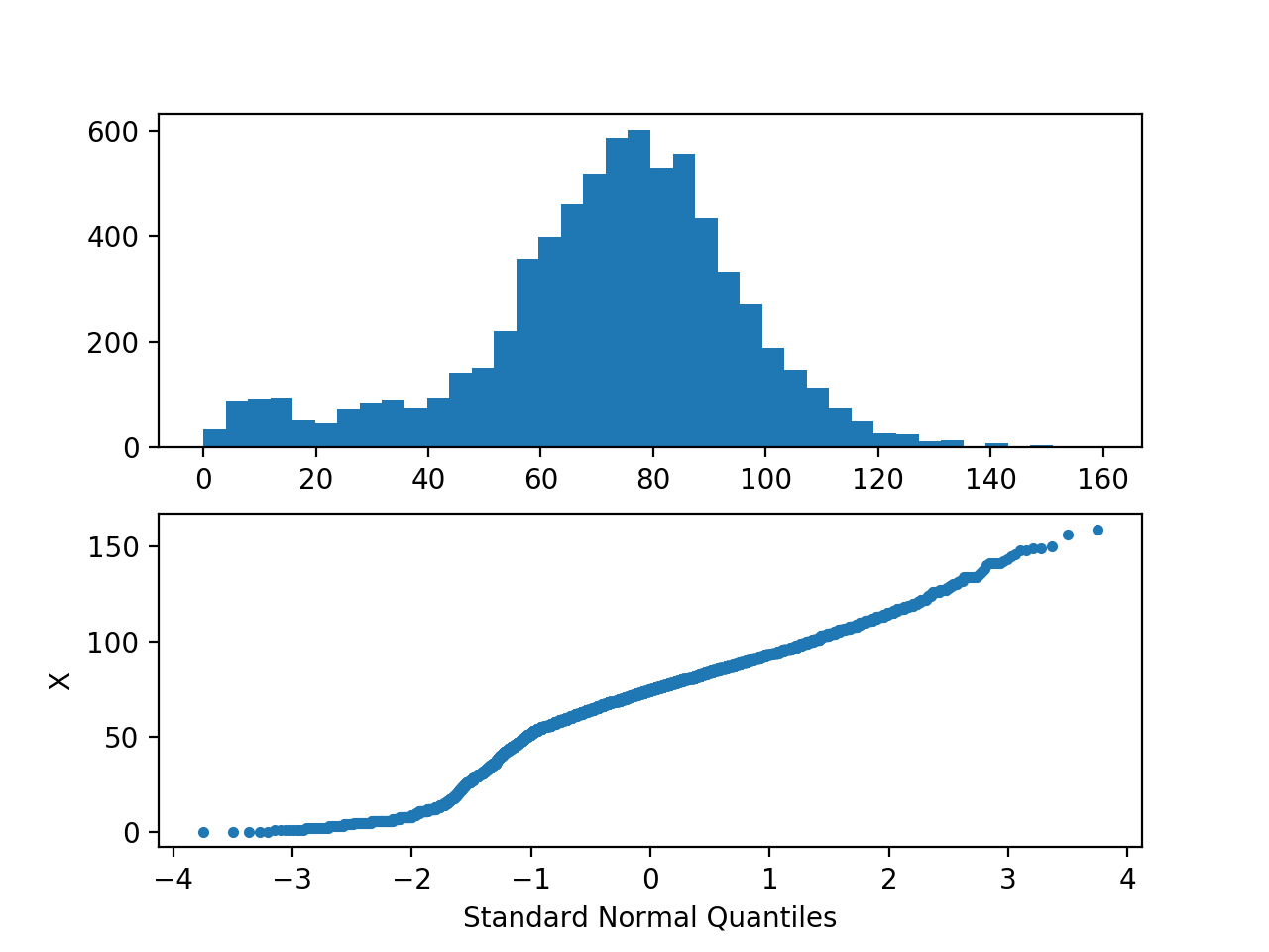
When I randomly spot-check with histograms and Q-Q plots, I find (as expected) that many of these distributions appear to be Gaussian (or at least, normal enough for my purposes). I've included an example below. I occasionally get a multi-modal distribution when spot-checking, and I will also very rarely get a plateau. Unfortunately, normality testing (Shapiro–Wilk, etc) is not a reliable way to distinguish between normal and multi-modal distributions, since my sample size is large enough to cause it to reject distributions I am willing to accept as "normal enough."
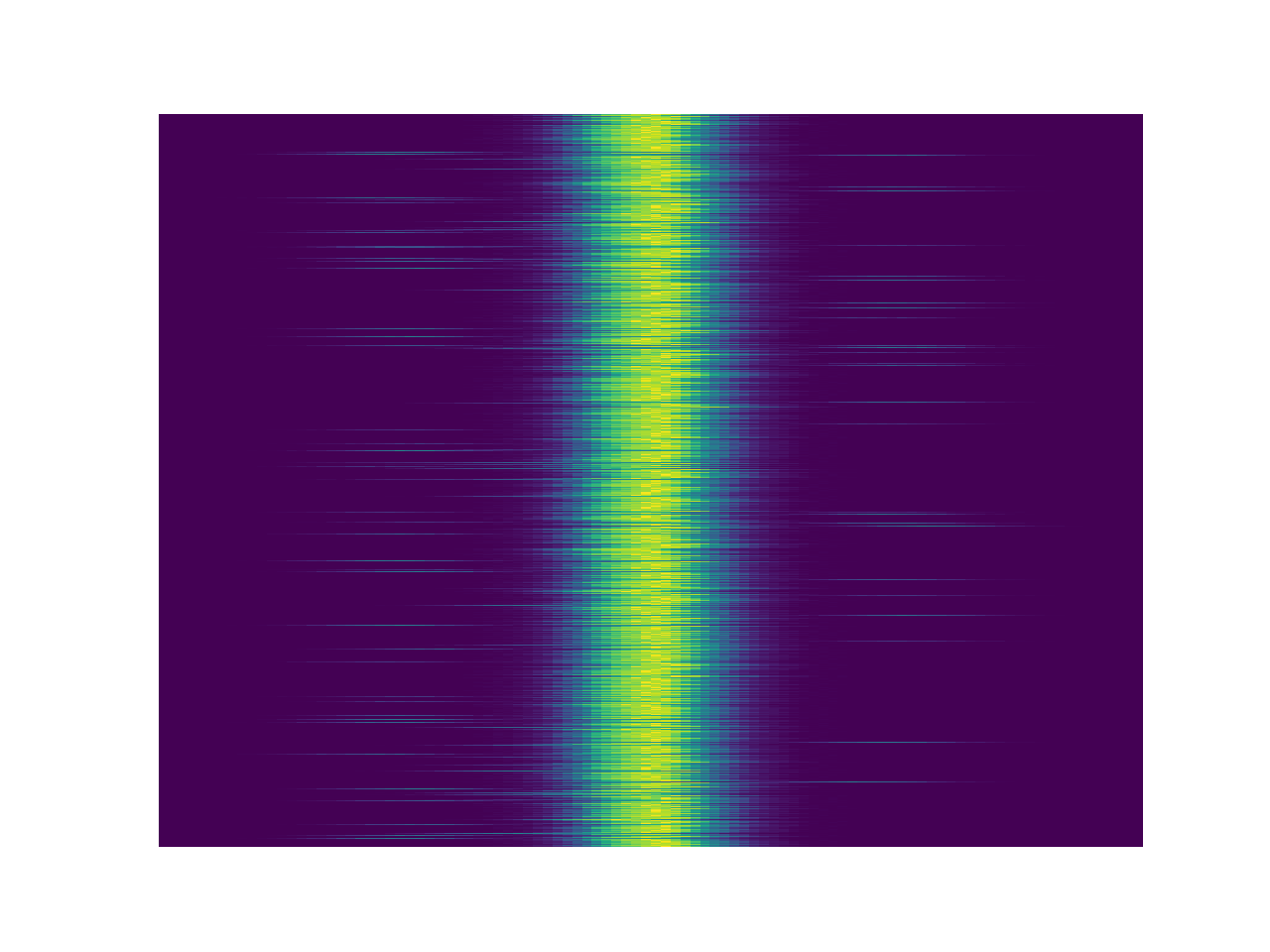
I would like to visualize and/or compare as many of these distributions as possible. I've looked at plots like this and this, but I have far too many distributions to compare.
Does anyone have any suggestions?


