2
$\begingroup$

I have a data set which gives a p value of $9.661\times10^{-7}$ under the Shapiro-Wilk test - in other words not very normal.

But the common advice is use visual inspection and the qq Plot for this data set is as below and it looks sufficiently normal - especially at the top end (which is what I am interested in).

My question is: how safe is it to look at this sort of visual display and say that, because the top end looks normal I am ok to base calculations about the behaviour of the right side of the distribution on that assumption?

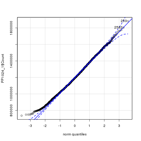
qqPlot

$\endgroup$
4
  • $\begingroup$ How many data do you have? (At least 260, I'm guessing.) What are these data? Why does there seem to be a floor? What is it that you really want such that you only care about the top end? $\endgroup$ Commented Jan 28, 2019 at 20:55
  • 1
    $\begingroup$ The data is about times a benchmark takes to complete a task in a complex computing system. In this case I have 3085 observations but I am seeking a general answer if possible - I am interested in the top end because I want to apply statistical methods to estimate worst case execution times. $\endgroup$ Commented Jan 28, 2019 at 20:58
  • $\begingroup$ @gung I would have guessed approximately $-1/2 / \Phi^{-1}(-3.6)\approx 3150$ observations because the most extreme "norm quantiles" are near $\pm 3.6.$ $\endgroup$
    – whuber
    Commented Jan 28, 2019 at 22:49
  • 2
    $\begingroup$ Do not interpret p-value as effect size. "- in other words not very normal". With large samples you may have very low p-values with small effect sizes. $\endgroup$
    – Glen_b
    Commented Jan 29, 2019 at 7:29

1 Answer 1

2
$\begingroup$

Since you have a large sample size, even small deviations from normality can give a small p-value. From what you said in comments (which should have been edited into the post) about the purpose, that the upper tail is of interest while the lower, where the largest discrepancies can be found, is not, you could well base your work here on the normal assumption. That conclusion is corroborated by @whuber's calculations in comments.

See also Is normality testing 'essentially useless'?

More generally, formal statistical tests are not that helpful in judging qq-plots. Visualization, like simulated (or calculated) confidence bands, and other methods like presenting a multi-panel plot with your qq-plot together with many simulated ones, are more helpful. Examples and discussion at Interpreting QQplot - Is there any rule of thumb to decide for non-normality?

$\endgroup$

Your Answer

By clicking “Post Your Answer”, you agree to our terms of service and acknowledge you have read our privacy policy.

Not the answer you're looking for? Browse other questions tagged or ask your own question.