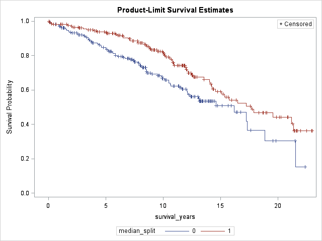
Your plan to base your analysis on a Cox model with the covariate treated as continuous makes a lot of sense, if both the proportional hazard (PH) assumption and linearity in the covariate hold true. This Cox multiple regression analysis is where you need the power that incorporating all the cases provides.
In that situation your Kaplan-Meier (KM) curves are mainly for display purposes, not for statistical analysis. All the log-rank test for the KM curve comparison tells you is the single-predictor relation of a binned continuous variable to outcome. That's of much less importance than the relation of that continuous variable to outcome in a Cox model that incorporates information about other covariates. It would be quite possible for this type of (single, binned-predictor) log-rank test to be insignificant statistically while the continuous predictor is still significantly related to outcome in a more complete Cox model.
So there would be nothing wrong with simply truncating the KM display at, say, 10 or 15 years. You could still base the log-rank test, if you need to show it, on all cases. Good practice is to present, under the KM curve, a table of cases still at risk in each subgroup at selected times. Among other things, that information will tell the reader how many cases with censoring or events at later times have been omitted from the plot. Those with experience looking at KM plots understand that the curves start to look ugly at late time points when few cases are still at risk, and they will not be misled by this type of presentation.

