0
$\begingroup$

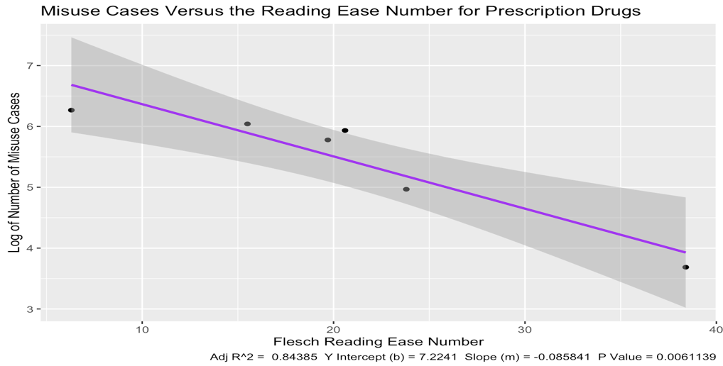
So this question is a little different from any of the other questions asked about this topic. I have a simple linear regression in R and it lists the residuals and has 'relatively large' confidence intervals relative to the set of data. I would really like to show the statistical significance of this model and would like a little more than just a nice $p$-value and high $R^2$ value to show, and the confidence intervals diminish this.

  • 6 data points, actual graph w/h confidence intervals shaded grey:

enter image description here

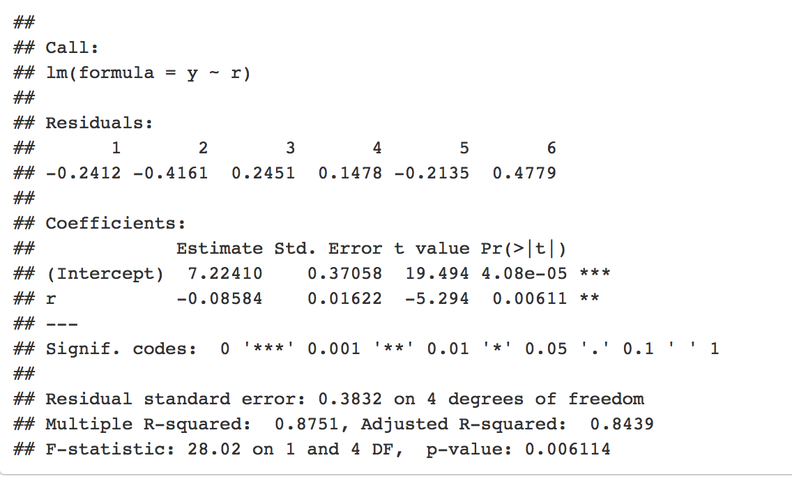
  • Output from the call to lm:

enter image description here

Would it help to graph the residuals along the normal?

In addition, how useful would it be to share the F statistic or the standard error with the residuals or the intercept to support the statistical validity of my regression despite the sub-optimal confidence intervals?

$\endgroup$
6
  • $\begingroup$ Welcome to CV. I edited your post to include the images. For future reference, please post output as is, using 4 spaces to indent it. This will make it look like code. As to your question, what exactly are you asking? Did you expect a narrower 95% CI for a sample size of only $n=6$? $\endgroup$ Commented Jul 10, 2019 at 3:46
  • 6
    $\begingroup$ I don't think I quite understand. You want to show that the model fits, but the confidence intervals "diminish" this? The F statistic shouldn't be very super useful in this case since you only have a single covariate (which seems to have an effect on the conditional mean). I think the coefficient table you provide in your second picture is more than enough. $\endgroup$ Commented Jul 10, 2019 at 3:46
  • 1
    $\begingroup$ Welcome to CV. The confidence intervals don't "diminish" anything and, considering that N = 6, they are quite narrow. They show that your model is working pretty well. Normality of the errors is an assumption of OLS regression, graphing it would show that the assumption is reasonable (or not) but with N = 6, it's not likely to be helpful. F values aren't that intuitive for most people. I'd say the only thing you could do to improve this is get more data. $\endgroup$
    – Peter Flom
    Commented Jul 10, 2019 at 10:36
  • 1
    $\begingroup$ To verify your results I extracted the data from the scatterplot and have almost identical coefficients, fit statistics, and confidence intervals. The independent match of my results confirm that your results are correct. In my opinion, @PeterFlom has given both an excellent summary and excellent advice in his comment. $\endgroup$ Commented Jul 10, 2019 at 13:02
  • $\begingroup$ Thank you all for your responses! I guess I'm simply not used to the visual aspects of graphing smaller data sets. Thank you guys so much for your responses. I thought that my confidence intervals were too high because I'd only ever seen tighter intervals for other (larger) data sets. Thank you for clearing up any confusion on my F values and such. $\endgroup$ Commented Jul 10, 2019 at 13:34

1 Answer 1

0
$\begingroup$

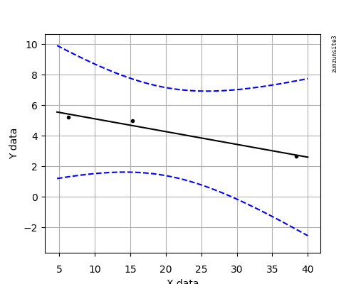
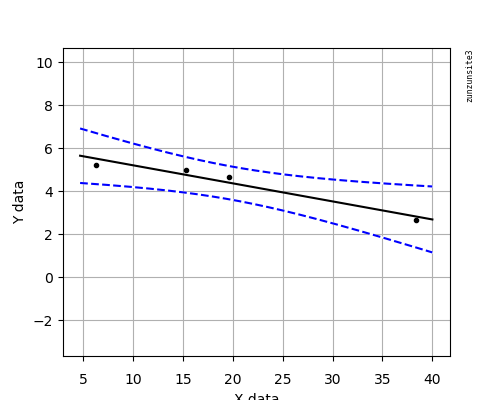
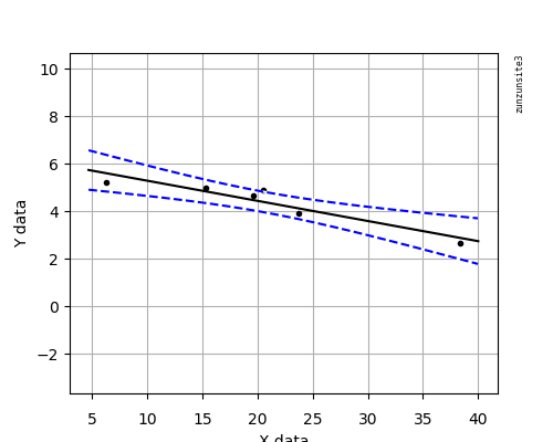
Regarding your comment " I'm simply not used to the visual aspects of graphing smaller data sets." here is your data with 3, 4, 5, and finally all 6 data points. Notice the progressively tighter confidence intervals. All graphs have the same scales. This is effectively a visual illustration of Peter Flom's advice in the comments.

Three Data Points:

3dp

Four Data Points:

4dp

Five Data Points:

5dp

Six Data Points:

6dp

$\endgroup$
1
  • $\begingroup$ If you are going to make a presentation, using this very obvious visual progression might be a good way to statistically justify additional data collection. These plots certainly make it very difficult to argue against collecting additional data. $\endgroup$ Commented Jul 10, 2019 at 16:36

Your Answer

By clicking “Post Your Answer”, you agree to our terms of service and acknowledge you have read our privacy policy.

Not the answer you're looking for? Browse other questions tagged or ask your own question.