I am trying to find pairs of predictor variables that give a good structure map for a dataset of chemical compounds. Structure maps in chemistry are 2D-plots, in which two independent predictor variables change along the X and Y axes, while the values of the target variable are shown either by a color if it is continuous or by different symbols if it is discrete.
A good structure map is such that clearly shows separation of data points into different clusters if the target variable is discrete or shows a trend if it is continuous.
My target variable is continuous, so I want to detect a trend.
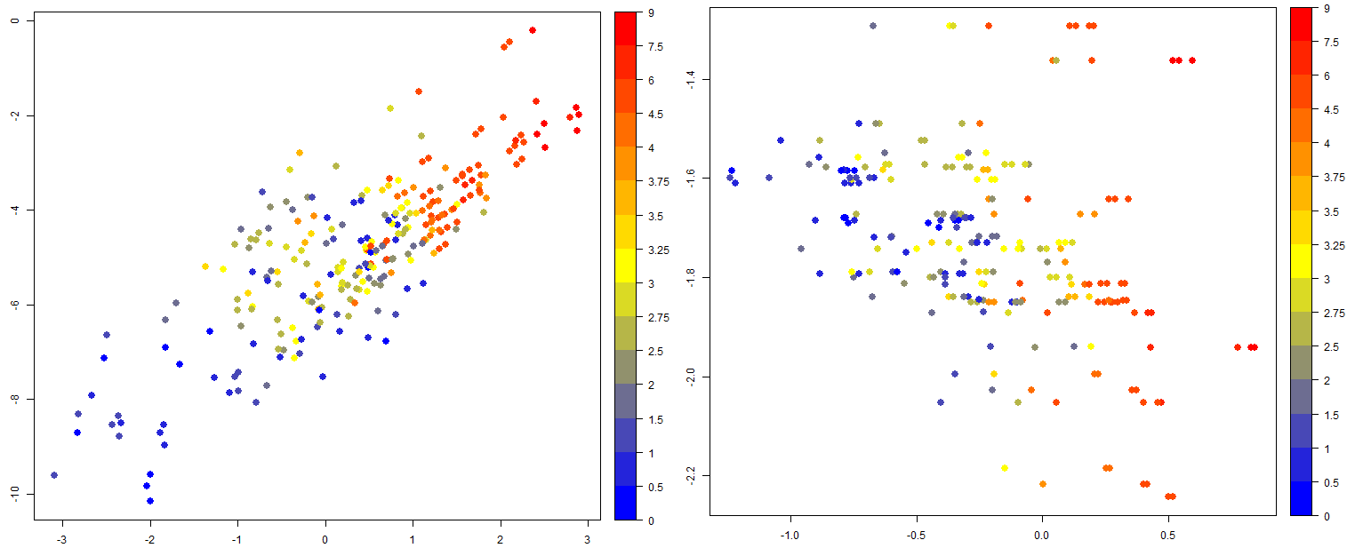
Two examples of relatively good structure maps for my dataset are as follows.
The value of the target variable is shown in a color bar. It is clear from the left figure that if I simultaneously increase X and Y values, I get compounds with larger value of the target variable. Also, in the figure on the right, it is easy to find regions where the target variable is large, small or average.
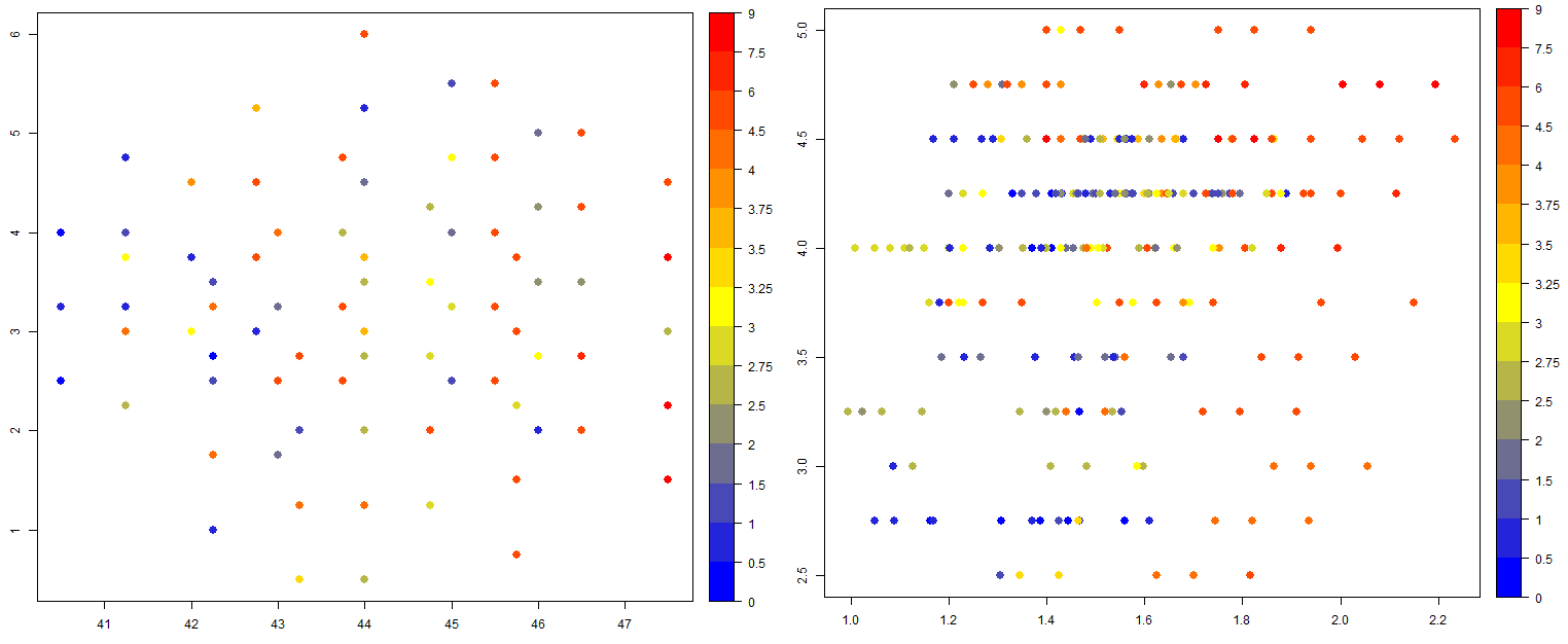
The data on bad structure maps are randomly scattered throughout the plot, so it is not possible to see how to tweak the values of predictor variables to get the desired target value. Two examples are below.
Predictor variables X and Y can be characteristics of a certain atom in the compound (e.g. its radius or ionization potential) or any linear or non-linear combination of such characteristics which makes the number of such variables very large.
My question is: Instead of examining these plots visually, which statistical tests can I run on them to select those where the data are not scattered randomly but show some trend in behavior of the target variable?
What I have tried so far is:
- Run a linear regression Y ~ X
- Projected the data to the regression line
- Made a one-dimensional plot where X-axis is the regression line, and Y-axis is the value of the target variable
- Calculated the Spearman correlation coefficient of the data projected onto the regression line.
My thinking was, whether I could detect a line along which the target variable changes monotonically.
I tested it on a few plots, and it looks like working: the Spearman coefficient is > 0.75 for good maps and lower than 0.5 for bad ones but I am not sure if this is a correct way to solve this problem.
I also calculated the distance correlation $dcor([X,Y],target)$ and the randomized dependence coefficient between the set of predictor variables $[X,Y]$ and the target variable. The distance correlation is high for good maps and low for bad maps and gives similar values to the coefficient that I am getting with the Spearman correlation along the regression line that I describe above. The randomized dependence coefficient is high for almost all maps, good and bad, though somewhat lower for bad maps, and low for only very bad maps.
Are there any established statistical tests for detecting trends in two-dimensional data?


