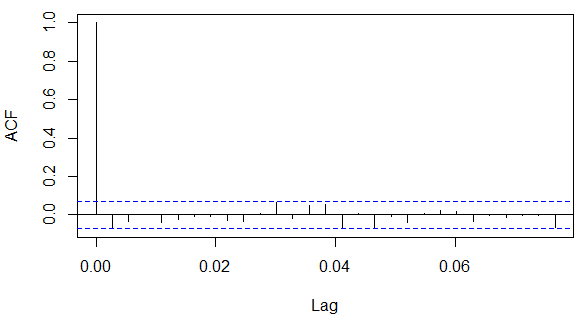
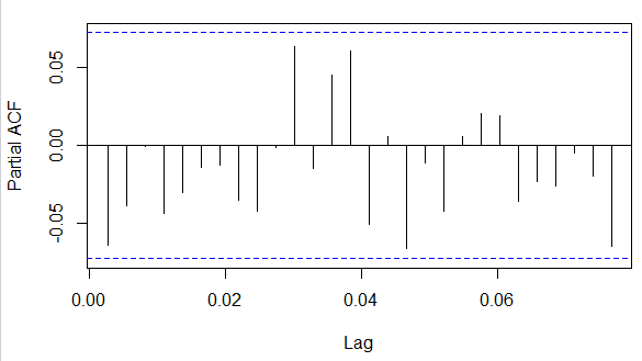
I am not very good at Time Series, so I have a few questions about my ACF & PACF plots. I have read through similar questions on stack exchange and other websites, but their graphs look different. I understand somewhat how to interpret the plots, but mine do not fit the stereotypical "molds". They are not slowly decreasing, they don't seem to be significant until a certain p.
- For the ACF plot, because they are between the blue dotted lines, that means they are not significantly correlated?
- For both plots, their lags are 0.0#, is that normal? Or is that incorrect? If it is not accepted, how would I change it? Most ACF plots I see are whole numbers.
- For both plots, is this an AR(1) model? An ARMA model? How do I know if there is a seasonal trend? Or is this white noise because nothing is significant?
Is there any other interpretation I am missing?


