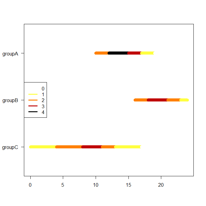
As you see, I would not use a violin plot, since the kernel density estimate would completely obscure the discreteness of the counts involved. Instead, I would use a black body radiation palette to indicate counts. See here for the function I am using, as well as some pointers to more information about black body radiation palettes.
First, let's recreate your data in R:
df <- structure(list(group = c("groupA", "groupA", "groupA", "groupA",
    "groupB", "groupB", "groupB", "groupC", "groupC", "groupC"),
  from = c(10, 10, 12, 12, 16, 16, 18, 0, 4, 8),
        to = c(16, 16, 18, 14, 20, 22, 24, 10, 12, 16)),
        class = "data.frame", row.names = c(NA, -10L))
Now we create a matrix that contains the counts at each point in time, per group:
tt <- seq(min(df$from),max(df$to))
nn <- matrix(nrow=length(tt),ncol=length(unique(df$group)),dimnames=list(tt,unique(df$group)))
for ( ii in seq_along(unique(df$group)) ) {
	df_sub <- subset(df,group==unique(df$group)[ii])
	    nn[,ii] <- sapply(tt,function(jj)sum(jj>=df_sub$from & jj<=df_sub$to))
}
nn_max <- max(nn)
Here is the function I mentioned. I use it to create a palette, where white corresponds to zero and black to the maximum nn_max:
blackBodyRadiationColors <- function(x, max_value=1) {
    # x should be between 0 (black) and 1 (white)
    # if large x come out too bright, constrain the bright end of the palette
    #     by setting max_value lower than 1
    foo <- colorRamp(c(rgb(0,0,0),rgb(1,0,0),rgb(1,1,0),rgb(1,1,1)))(x*max_value)/255
    apply(foo,1,function(bar)rgb(bar[1],bar[2],bar[3]))
}
colors <- rev(blackBodyRadiationColors((0:nn_max)/nn_max,max_value=1))
Finally, we plot, which is just a question of creating an empty plot and adding line segments with the right colors:
plot(range(as.matrix(df[,-1])),c(0.5,ncol(nn)+0.5),type="n",xlab="",ylab="",yaxt="n")
axis(2,1:ncol(nn),rev(colnames(nn)),las=2)
for ( ii in seq_along(unique(df$group)) ) {
    for ( jj in tail(tt,-1) ) lines(c(jj-1,jj),rep(ncol(nn)+1-ii,2),col=colors[nn[jj,ii]+1],lwd=10)
}
legend("left",lwd=3,col=colors,legend=0:nn_max)
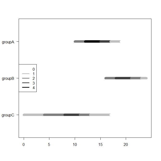
Alternatively (e.g., for paper publication), you could use grayscale:
    grayscale <- paste0("gray",round((nn_max:0)*100/nn_max))
plot(range(as.matrix(df[,-1])),c(0.5,ncol(nn)+0.5),type="n",xlab="",ylab="",yaxt="n")
axis(2,1:ncol(nn),rev(colnames(nn)),las=2)
for ( ii in seq_along(unique(df$group)) ) {
    for ( jj in tail(tt,-1) ) lines(c(jj-1,jj),rep(ncol(nn)+1-ii,2),col=grayscale[nn[jj,ii]+1],lwd=10)
}
legend("left",lwd=3,col=grayscale,legend=0:nn_max)


