A more colloquial answer to this would be that the polynomial regression, the higher the order, has more flexibility to learn but also the tendency to memorize every data point in the training set, but with unneccessary and unpredictable wriggly waves, that makes forecasting nearly impossible as algorithms can get stuck in one area and extrapolation is quite problematic. Thus polynomial regression memorizes data wich is equal to overfitting, and does not learn to deal with new data, it only catches a certain situation. And as Stephan highlighted, the visualization helps a lot here.
Update just to make it clear:
Overfit just means a model that learns its data very well, which can be very well shown with a polynomial. Actually we wouldn't need a train/test split to see it, because our mind should say that we cant explain something so perfectly. Look how the polynom tries to catch every data point in both pics. Just to make it more clear due to the comments below my post, I added another picture:
ML Overfitting:

Picture by Jannis Seemann Udemy
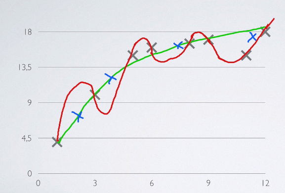
- The overfitting polynom is the red line.
- Grey crosses are train data
- Blue crosses are test data
- Green line is a simpler model, (e.g. a power function) that doesnt catch the data exactly, but learns the general trend or a picture of a model situation.
You can see that the red polynom learnt the data very well, but behaves bad on the test data. The simpler model, not catches the whole train data but behaves well overall. If you are aware of this behavior you wont need a visual train/test split to be sure if your model overfits, if you choose to a high polynom.
Polynom behavior in general
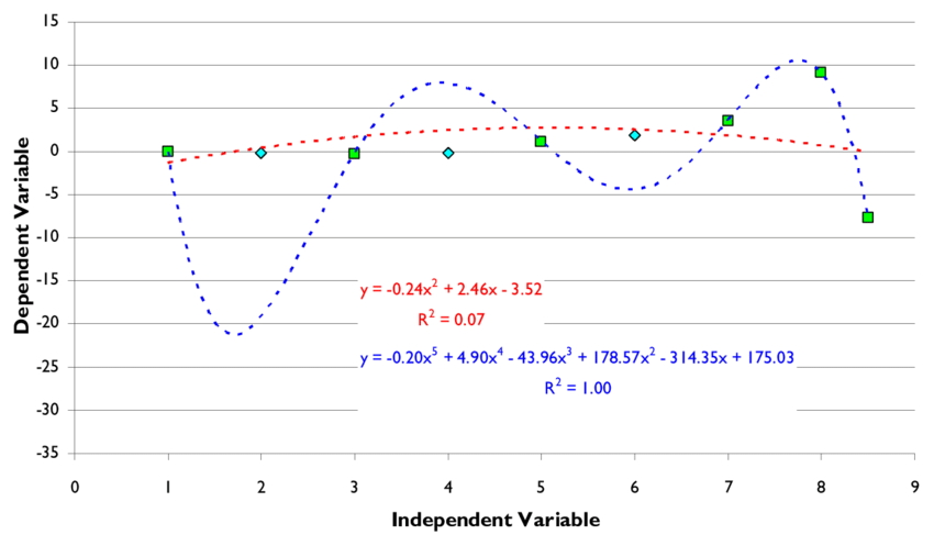
This picture shows a general comparison of a overfitted model with a high order polynom and a polynom of a much lower order. You can already see, that the model with the higher order overfits, although you havent seen the test data.
To feel the power of a simple overfit, you can do pictures like that yourself:
Use a simple scatterplot. Got to Microsoft excel, click on fitting the scatter plot with a linear trend. Than change to polynomial und increase polynomials to the highest order. The polynomial gives you the freedom to fit the data near perfectly, but that squiggly line does not normally fit on the test data, its totally useless (blue one). The red line although a much lower fit, may be extrapolated better and shows "maybe" the truth, that there is not much to expect, Your model will be bad, which is part of antoher discussion, but not overfitted.
 Image by researchgate https://www.researchgate.net/profile/Scott-James-5/publication/255205930/figure/fig1/AS:670698729123859@1536918446824/The-green-squares-represent-the-original-data-set-are-fit-using-two-conceptual-models-a.png


