3
$\begingroup$

I have a dataset with speed difference between men and women on several race distance. The data structure look like this.

> dput(head(dataset))
structure(list(id = c(3846L, 4333L, 4334L, 1178L, 4054L, 4540L
), km_effort = c(35.1, 28.5, 28.5, 43.5, 41.2, 41.2), diff = c(-0.00606338998621952, 
-0.00988382174440651, -0.00988382174440651, -0.0475944128297982, 
-0.00418224447119885, 0.00398614650722031)), row.names = c(NA, 
-6L), class = c("data.table", "data.frame"), .internal.selfref = <pointer: 0x000001a8119e1ef0>)

id = the unique identifier of each men/women pair
km_effort = the distance of the race
diff = is the speed difference ((SpeedM - SpeedF) / SpeedM) * 100

It's repeated measures as I have at least 2 races per pair and the purpose it to see if there is a link between distance and speed difference.

I then start to do a mixed effect model using the lme4 package

lme1 <- lmer(diff ~ km_effort + (1|id), data = dataset), REML = FALSE)
lme1.null <- lmer(diff ~ 1 + (1|id), data = dataset , REML = FALSE)

anova(lme1.null, lme1)

> anova(lme1.null, lme1)
Data: dataset
Models:
lme1.null: diff ~ 1 + (1 | id)
lme1: diff ~ km_effort + (1 | id)
          npar     AIC     BIC logLik deviance  Chisq Df Pr(>Chisq)    
lme1.null    3 -9274.7 -9255.3 4640.3  -9280.7                         
lme1         4 -9336.9 -9311.0 4672.4  -9344.9 64.161  1  1.147e-15 ***
---
Signif. codes:  0 ‘***’ 0.001 ‘**’ 0.01 ‘*’ 0.05 ‘.’ 0.1 ‘ ’ 

So for me it looks nice, as I can see that the distance seems to have an influence to the men/women speed difference.

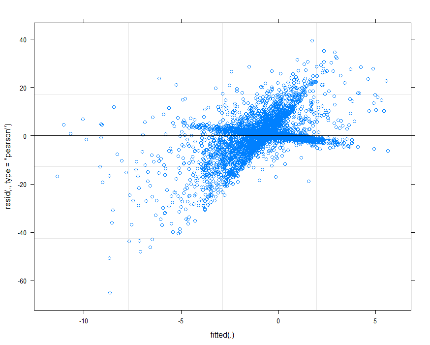
However when I started to check the assumptions here is my fitted vs residuals plot :

enter image description here

I don't know at all how I can interpret this. Some one could help me to it. What can I said about normality and heteroskedascity of the residuals ?

$\endgroup$
1
  • 1
    $\begingroup$ how are the men and women paired together? That is, how is id created? $\endgroup$
    – JTH
    Commented Sep 27, 2021 at 21:15

2 Answers 2

1
$\begingroup$

I see a few things that surprise me, and I wonder whether you can clarify:

What is the range of the response?

According to the plot, the fitted values range from -11 to +6, but the data sample shows actual values of diff are like 0.004. Something is odd about the scale.

How was the data coded for entry?

The second and third entries of diff are identical at -0.00988382174440651. This is such a specific number that I would be very surprised to see it duplicated by chance anywhere in the data, let alone in two consecutive entries. Those go with ids 4333 and 4334, both at distance 28.5. The fact that the ids are consecutive is also suspicious, and makes me wonder whether these are a man and a woman who are supposed to be paired? If so, that would be a problem because you'd have entered the data twice (and the ids don't match, which I think they should if this is a matched pair.)

What is the unexplained structure in your data?

That residuals vs. fitted plot is troubling. It looks like the letter "X", with two crossing lines of dots. The clusters that look like lines indicate some hidden feature in the data that splits points into two or more groups. Maybe you can determine what are the points in the two apparent clusters, and see if the clusters have some meaning in the data? Here is what jumps out at me:

  • That "descending" line that is close to the x-axis: This looks like a bunch ofdiffs that were almost exactly zero. That's because the apparent "line" of points appears to follow the relationship $y = -x$. Were some diff values not scaled to match the others? For example, did they not get multiplied by 100?

  • If those dots represent data that didn't get properly scaled, it would also answer my confusion about why the diffs you've shown us are so tiny, but the fitted values aren't ("What is the range of the response", above).

  • Furthermore, if those dots represent data that didn't get properly scaled, it might explain why the fitted vs. residual plot looks like an 'X': you have two groups of data: one that was scaled properly and one that wasn't. The fitted model is sort of splitting the difference between the two.

OK, that's some rambling in the direction of an answer. Hope it helps you diagnose your data and your model. As a last note, I would reiterate the note from @JTH: why were these specific men paired with these specific women? From the outside, it doesn't make sense. You should only treat data as paired when there is some link between the paired data which would confound your analysis (examples of paired data are: a student's test scores before and after a lesson, or the visual acuity of a person's right and left eyes).

$\endgroup$
0
0
$\begingroup$

Thank you both taking the time to look at my question.

First, I will try to explain more in details how I created the dataset. So, I have a database with race results structured like this :

> dput(head(race_result))
structure(list(id_race = c(10384L, 10384L, 10384L, 10384L, 
10384L, 10384L), id_participant = c(41819L, 154458L, 37670L, 194949L, 
6669L, 30031L), distance = c(52.8, 52.8, 52.8, 52.8, 52.8, 
52.8), sex = c("H", "H", "H", "H", "H", "H"), avg_speed = c(8.69453846857561, 
8.61650045330916, 8.60986547085202, 8.27262044653349, 8.24749425087864, 
7.84514424862768)), row.names = c(NA, -6L), class = c("data.table", 
"data.frame"), .internal.selfref = <pointer: 0x0000028cf3701ef0>)

My H0 is, as the race distance increases the speed difference between men and women decreased.

I have created all possible man/woman pair who race the same race for distance < 45 km. After this, I have a bush of pairs but each man and each woman can be in several pairs. So in order to create "same level" pair, I kept for each woman the man with the smallest speed differences.

I then check if those man/woman pair had raced at least a second race together for distance > 45 km.

This is how I got the dataset shared above.

Here is more details about the given dataset :

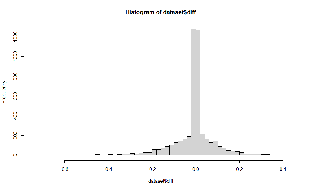
Histogram of speed difference results :

enter image description here

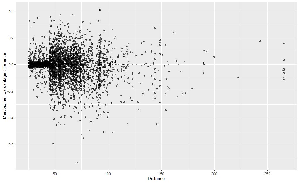
Scatterplot of my data :

enter image description here

If I understand well what @Wesley said, my fitted vs residuals plot shows 2 clusters. I believe that should probably come from the fact that I selected pairs at distance < 45. We can properly see it on the scatterplot.

Hope this help to clarify.

$\endgroup$

Your Answer

By clicking “Post Your Answer”, you agree to our terms of service and acknowledge you have read our privacy policy.

Not the answer you're looking for? Browse other questions tagged or ask your own question.