0
$\begingroup$

I'm looking if there is a name for what I'm trying to do.

TLDR: Market contains offers to exchange currency 1 for currency 2. I want to make a histogram showing total volumes of currency1 in specific price ranges, but making a histogram from the data shows number of offers in specific price ranges, not the amount of currency.

Shortcuts I'm using:

  • kk - millions (500kk = 500 million)
  • kkk - billions (5kkk = 5 billion =5000kkk = 5000 million)

Setup - there's a market in a videogame where players go to place offers to exchange currency 1 (YANG) for currency 2 (SD). I calculate an extra statistic, which is a rate calculated with 1000*SD/YANG, which is a rate that shows how much SD does 1kkk YANG cost.

Example with an image: Below you can see an image showing a snapshot of the market at some point in time. (I cropped out an unnecessary column). In row 0 we can see that a player is offering 10000kk YANG (10kkk YANG) for 2500SD. Rate in this case (kkkPrice) is 250 SD/kkk YANG.
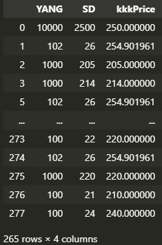
Image with data

Now I wanted to analyze this, so I made some graphs, mainly histograms.
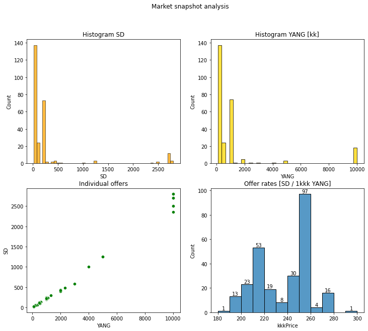
Market graphs

Problem: The problem for me lies in the bottom right graph. It's a histogram of the kkkPrice column, showing how many offers have which rate (bins are from 180 to 300 with step of 10)

We can see that in price range 250-260SD/kkk there are 97 offers out of 265 total (36.6%). Now when I manually filter out those offers and sum it up, I find out that those 97 offers are for 48 658kk YANG out of 317 153kk YANG total (15.3%).

In other words, 36.6% of offers contain only 15.3% of all the YANG offered.

This graphs shows how many offers are in each price range, but I would like to see how much YANG is in each price range. I don't know what it is called and if there's some predefined or simple way to calculate it instead of doing it myself (filtering each price range and summing it).

$\endgroup$
3
  • $\begingroup$ There are no graphs to see in your question. Also, can you perhaps post an excerpt of the data you're using? $\endgroup$
    – Igor F.
    Commented Nov 2, 2021 at 13:27
  • $\begingroup$ @IgorF. There are 2 images to see in my post. The links are i.imgur.com/cMdU73y.png and i.imgur.com/v9b3WpC.png . I guess you cant see them, otherwise I do not understand what you're saying. $\endgroup$
    – Welsy
    Commented Nov 2, 2021 at 14:21
  • $\begingroup$ Oh, I see. Obviously, our IT has (again!) changed the firewall settings :-/ $\endgroup$
    – Igor F.
    Commented Nov 2, 2021 at 15:28

2 Answers 2

0
$\begingroup$

This graphs shows how many offers are in each price range, but I would like to see how much YANG is in each price range. I don't know what it is called and if there's some predefined or simple way to calculate it instead of doing it myself (filtering each price range and summing it).

A weighted histogram does what you want. Most programming languages have a package/function for it that does it automatically.

In R: https://www.rdocumentation.org/packages/plotrix/versions/3.8-2/topics/weighted.hist

$\endgroup$
1
  • $\begingroup$ Thank you so much, you are a godsend! I can't believe it was so simple, I completely forgot there was a weights option for a histogram. Thank you so much!!! $\endgroup$
    – Welsy
    Commented Nov 2, 2021 at 17:32
0
$\begingroup$

Maybe you're looking for Market depth chart. https://en.wikipedia.org/wiki/Market_depth

$\endgroup$
1
  • $\begingroup$ Your answer could be improved with additional supporting information. Please edit to add further details, such as citations or documentation, so that others can confirm that your answer is correct. You can find more information on how to write good answers in the help center. $\endgroup$
    – Community Bot
    Commented Nov 2, 2021 at 14:54

Your Answer

By clicking “Post Your Answer”, you agree to our terms of service and acknowledge you have read our privacy policy.

Not the answer you're looking for? Browse other questions tagged or ask your own question.