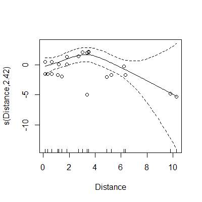
I have used mgcv to fit a simple gam with a negative binomial distribution. My model looks at how animal abundance changes with distance to a feature, and looks like this: gam(Count~s(Distance), data = data, family=nb, method = "ML"), where Count is a variable representing counts of animals, and Distance is a continuous variable describing distance to the feature of interest.
I am following Noam Ross' very helpful tutorial on visualizing gams (https://noamross.github.io/gams-in-r-course/chapter2), but I'm confused by the plot results from my model.
When I use the plot(gam) function to look at my model, after using the shift command to shift the y axis by the model intercept value, I am confused by the scale of the y-axis (output plot below). The code that I used to generate this plot is plot(model, residuals = TRUE, pch=1, cex=1, seWithMean = TRUE, shift = coef(model)[1])
Since my response variable is a count variable, and negative counts are impossible, why am I seeing negative values for my data points on the y-axis (after applying the shift command)? Am I misunderstanding what the y-axis is showing here - i.e. is it not on the scale of the response?

