1
$\begingroup$

I'm currenly trying to do a multivariate analysis to forecast yearly energy consumption for a given building (unit GJ).

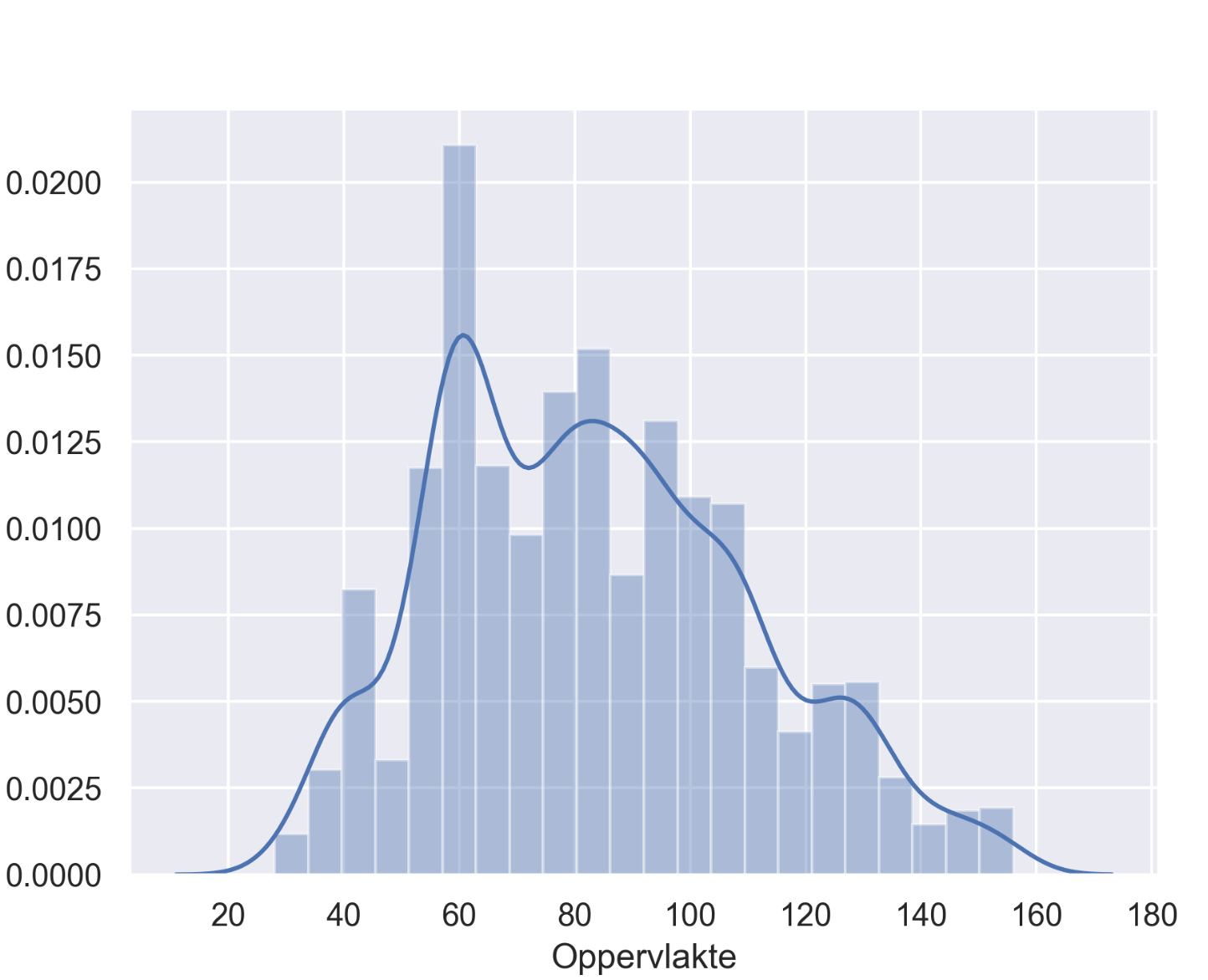
A lot of my sample data shows vertical columns when creating a scatter plot. As my data is not ideally spacially distributed, I suspect the source of these to be that the larger part of my data comes from streets where all buildings have the same specs.

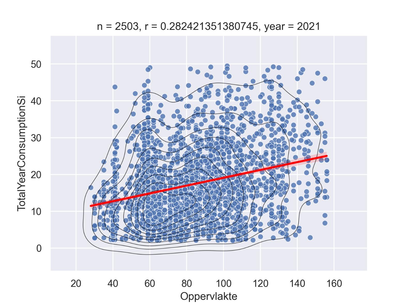
The example below show a correlation analysis for the surface (Oppervlakte in Dutch) of a building (variable originating from the land registry, unit m2).

enter image description here

I suspected that the correlation coefficient wouldn't be very high as a lot of factors determine energy consumption, but I expected at least a usable forecast variable from this one.

The bad distribution of the samples is reflected in de density plots in both histogram and the scatter density.

enter image description here

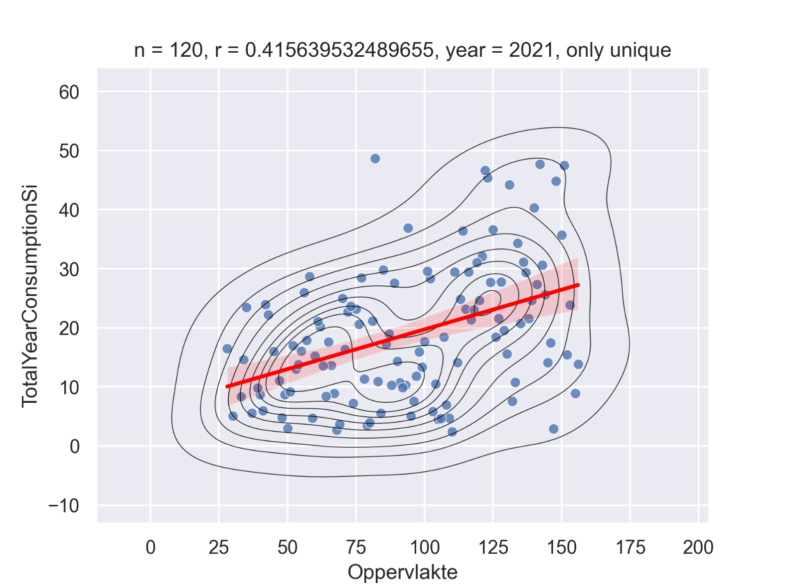
Suspecting to much of the same type of buildings to be an issue I tried to plot again but only using unique numeric values for surface.

This results in a much higher correlation coefficient and more evenly distributed data, this is the kind of result I would expect:

enter image description here

My questions are the following:

  • Is the "density blob" / "histogram spike" an indication of bad sampling?

  • Is my way of filtering the data a responsible way or is it better to use all the data (if this is even possible with such a low correlation)

Thanks in advance, Michaël

(Are plots are using Seaborn in Python)


Thanks for the answers so far! :)

@Ben

The consumption samples are an export from the database of a company that does provide a billing platform for energy suppliers. The data is bound to their customers and the bulk of the data is from their few biggest customers. As each customer usually operates within a single city, the data could be way better distributed spatially. The predictive variables are rather scarce as I depend on public datasets to build a model. Volume would indeed be a way better predictor than surface alone, but the registry doesn't provide it. Surface is the living space, so only the floor surfaces of a building.

Thanks for the log-log regression tip, will have a look at that!

@Tanner

It was my understanding that a predictive variable has to be quasi normally distributed to be usable for a regression model. Ben's suggestion to also try log scales looks interesting.

Creating synthetic results was indeed my fear in this and this was the primary reason to ask my questions here.

There doesn't seem to be a rule as to usable correlation coeffients lower bounds. Only the general rule of > 0.5 being significant. What is your experience in this? Anything >0.25?

$\endgroup$
6
  • $\begingroup$ Expecting to find a strong correlation and then changing your analysis until you find what you expect might be common, but it's very very bad practice. If the results don't match your expectations, consider that your expectations might be wrong. $\endgroup$
    – Eoin
    Commented Jul 15, 2022 at 15:16
  • $\begingroup$ I agree. I tried it under the assumption that some oddly specific values might dominate the data (surface around 40 and 60m2) which show both in the scatter plot and histogram. I felt that missing data in between might skew correlation results and the filtered data looked way more "natural". It felt wrong though, hence my question. $\endgroup$
    – Mive
    Commented Jul 15, 2022 at 19:30
  • $\begingroup$ Does "surface" account for different number of floors? Do you distinguish between commercial and residential buildings? $\endgroup$
    – dipetkov
    Commented Jul 15, 2022 at 23:43
  • $\begingroup$ The registry has the following definition of "surface": "The usable area of ​​a residential object". I can distinguish between "building purpose", e.g. residential, school, sports, shop, industrial... Current plots include all buildings regardless of the type os use. $\endgroup$
    – Mive
    Commented Jul 16, 2022 at 7:37
  • $\begingroup$ Correlation by itself does not imply correlation. If you're sample size is large enough, a correlation of 0.001 could be significant. As to your point about normality, depending which derivation of the Linear Model you use (MLE vs LSE), the assumption of normality is.... lose at best. Yeah if your data is wildly skewed you might have issues, but your data is plenty "normal enough" that it isn't skewing your results. $\endgroup$ Commented Jul 18, 2022 at 2:46

2 Answers 2

0
$\begingroup$

Since you don't describe your sampling mechanism, there is no way to diagnose "bad sampling" versus "this is just what the distribution looks like". This is an inherent statistical problem that occurs in many types of analysi when you get a distribution that looks a it unusual --- is this because the distribution is just a bit unusual (but we should follow the data where it leads us) or is it that the sampling method was informative? So in answer to your main question, no, a density blob is not necessarily an indication of bad sampling; it might just mean that there is a legitimate area of high density in the distribution.

What I would say here is that you have two variables that ought to be theoretically related by some nonlinear mathematical equation, so you should start with that equation in your regression and then search for unusual deviations from the expected nonlinear relationship. To be specific, if Oppervlakte refers to surface area of a building then this measure should have a well-defined mathematical relationship with building volume,$^\dagger$ which might be expected to be (roughly) proportionate to energy consumption (though this is likely to be affected by greater energy efficiency for larger buildings).

For this reasons I would recommend using a log-scale for the Oppervlakte and energy consumption variables and doing some kind of log-log regression bassed on these transformations. Think about whether you can obtain some "baseline" relationship based on a simplified deterministic relationship between surface area and energy consumption and then form your model to set this as a baseline effect but then add additional terms to measure deviations from this. Your plot shows a significant amount of variation in the relationship, so the inferred correlation is going to be quite weak. Ensure that your modelling choices are not made in order to get a desired conclusion, and accept that the answer might be that the variables in question are only weakly correlated.


$^\dagger$ You have not specified if "surface" includes only the surface area of the external walls, or also the roof, or also the point of contact between the floor and the ground, so it is hard to say what this relationship would be. Also, to get a deterministic relationship you would need to assume that each building is a rectangular prism and you would want other dimensions (e.g., height, width). Without these you might still be able to give a rough relationship based on some simplifying assumptions.

$\endgroup$
0
0
$\begingroup$

High Level: Your question doesn't have a "pure" mathematical answer per se, it really depends on context, but there are some principles we can use to think about this.

First to directly address your questions:

Is the "density blob" / "histogram spike" an indication of bad sampling? No, unless you know something specific. Your data could have any type of distribution, there is no garuntee that it is random / normally distributed. A common misconception is that large samples of data have a tendency towards normality. This is not true. You data distribution can look like anything, and that really doesn't tell us anything about your sampling.

Is my way of filtering the data a responsible way or is it better to use all the data (if this is even possible with such a low correlation)? To be honest I don't love it. The issue you seem to have with your data is it is censored to nearby values; the estimates are "rough" and not very precise. However, assuming this censoring is more-or-less random, it really shouldn't effect your statistical analysis. Sure, the graph looks a little funny, but it doesn't really change your analysis. I'd argue the reason you're getting a higher correlation with the reduced data is because you're oversampling from points on the high and low points of the distribution (where the variance tends to be lower based on your graphs) and undersampling from the middle (where your variance tends to be higher). So you're synthetically creating a data set that is overly confident.

Putting this all together: there is no reason to suspect your distribution is wrong based on the histogram. Your goal in sampling is to get as close to a random sample as possible. If your random sample includes a lot of building with the same specs... then that's you're true distribution, and you shouldn't change it.

An important point: An r of 0.28 may feel low for the type of data you're used to, but it really is quite usable, and sometimes that's just the kind of correlation you get in real life.

$\endgroup$

Your Answer

By clicking “Post Your Answer”, you agree to our terms of service and acknowledge you have read our privacy policy.

Not the answer you're looking for? Browse other questions tagged or ask your own question.