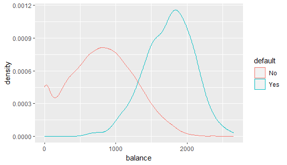
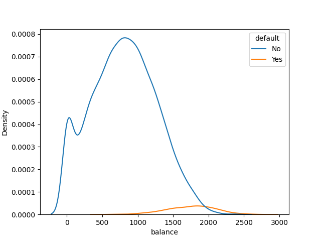
I plotted the same data in R using geom_density, but the blip for "Yes" is much, much smaller in Python using kdeplot from Seaborn than for R.
I am using the dataset default from the ISLR package. It's included for R and I downloaded it for Python from this link.
R code:
install.packages("ISLR")
install.packages("tibble")
install.packages("ggplot2")

library("ISLR")
library("tibble")
library("ggplot2")
df <- as_tibble(Default)

p <- ggplot(df, aes(x=balance, color=default)) +
  geom_density()
Output:
Python code:
import seaborn as sns
import matplotlib.pyplot as plt
import pandas as pd

default = pd.read_excel(r"")

sns.kdeplot(data=default, hue='default', x="balance")
plt.show()
Output:
I'm following this tutorial on logistic regression.
Can anyone explain to me in detail how the implementation in kdeplot versus geom_density results in these different graphs? I read the docs (kdeplot, geom_density) but I'm can't see a clear reason.
I really want to understand as I use Python for my work as a data analyst, want to learn forecasting techniques for my job, and would like to also learn R. I don't have much statistics background but I have calculus background, if that's relevant to understanding the differences.


