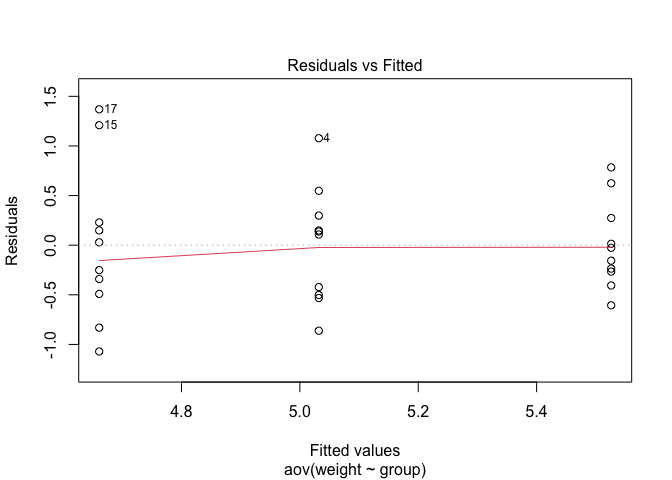
I am studying this source about One-Way ANOVA Test in R. We know that ANOVA test assumes that the data is normally distributed and the variance across groups are homogeneous. In the source the claim that we can check this with some diagnostic plots. At the part Check the homogeneity of variance assumption, the say that the residuals versus fits plots can be used to check the homogeneity of variances:
The residuals versus fits plot can be used to check the homogeneity of variances.
In the plot below, there is no evident relationships between residuals and fitted values (the mean of each groups), which is good. So, we can assume the homogeneity of variances.
But it is not explained how we can see it from the plot. Is it because of distribution of the points or of because the red line? So here is some reproducible code with the plot they are talking about:
library(ggpubr)
#> Loading required package: ggplot2
my_data <- PlantGrowth
my_data$group <- ordered(my_data$group,
                         levels = c("ctrl", "trt1", "trt2"))
# Compute the analysis of variance
res.aov <- aov(weight ~ group, data = my_data)
# Summary of the analysis
summary(res.aov)
#>             Df Sum Sq Mean Sq F value Pr(>F)
#> group        2  3.766  1.8832   4.846 0.0159 *
#> Residuals   27 10.492  0.3886
#> ---
#> Signif. codes:  0 '***' 0.001 '**' 0.01 '*' 0.05 '.' 0.1 ' ' 1
# 1. Homogeneity of variances
plot(res.aov, 1)

Created on 2023-04-07 with reprex v2.0.2
So I was wondering if anyone could please explain how to interpret this plot and why this could tell us something about the homogeneity of variance assumption?

