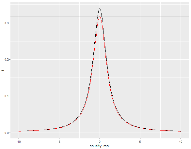
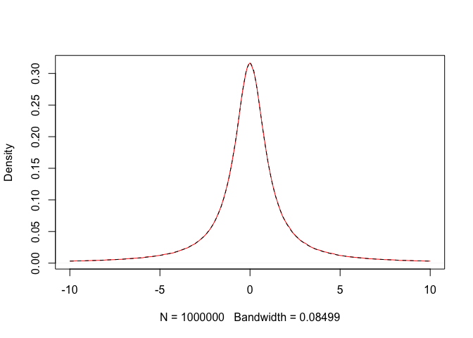
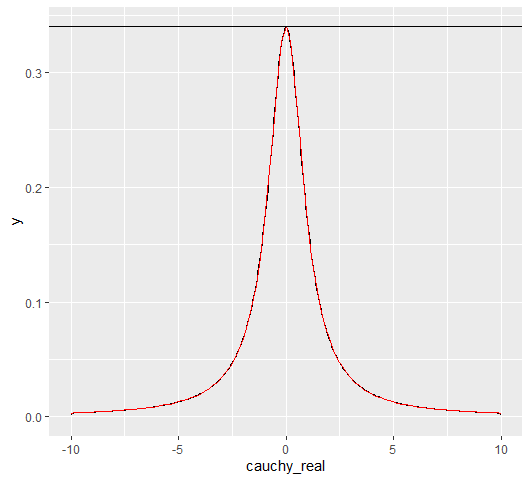
In R, suppose you generate $10^7$ random variates of the standard Cauchy distribution. Then you plot a histogram and density of this simulated data with the actual standard Cauchy density on top of it. For some reason, the charts don't match:
n = 10^7
tibble(cauchy_real = rcauchy(n)) %>%
  filter(cauchy_real >= -10, cauchy_real <= 10) %>%
  ggplot() +
  geom_density(aes(x = cauchy_real)) +
  geom_function(fun = dcauchy, colour = 'red') +
  geom_hline(yintercept = 1/pi)
R output:
Observations: 1. We filter the sample generated via rcauchy because it can generate some extreme outliers, and 2. We plot the horizontal bar on $y = 1/ \pi$ because, generally, in a Cauchy distribution, the peak of the distribution is at $y = 1/(\pi \gamma)$. 3. This discrepancy doesn't go away even if you increase n.
Why does this happen?


filterdoes here. Another hint: do the same thing with, say, a Normal distribution, but filter out all values more extreme than one SD from the mean. $\endgroup$rcauchy(10000)you get values such as -4000 which completely distort the graph. Another option is to usexlim(-5, 5)but the same thing happens. The cauchy doesn't have a closed form for SD so you cannot really compare the two. $\endgroup$xliminggplotdeletes observation outside of it's range. You could usecoord_cartesian(xlim = c(-10, 10))butgeom_densitydoesn't cope well with extreme range you get from 10^7 Cauchy values $\endgroup$geom_function(fun = dcauchy, colour = 'red')withgeom_function(fun = (\(x)(1/(2*atan(10) + 2*x^2*atan(10)))), colour = 'red'). The second function is the density of a truncated Cauchy distribution at $-10$ and $+10$. $\endgroup$1/pi$\approx 0.32$ while your black curve should have a peak at1/pi/(pcauchy(10)-pcauchy(-10))$\approx 0.34$ and that seems to be what you see $\endgroup$