2
$\begingroup$

I'm having some doubts how to properly compare my data (because of visual discrepancies), represented as histograms.

Here's an minimal and representative example, illustrating the data:

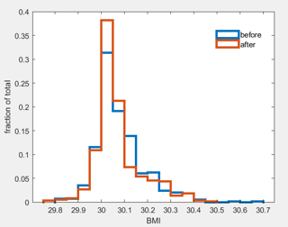
  • I measure BMI in a group of people before (BMI_1) and after (BMI_2) changing a diet (same people). I want to compare these groups in a meaningful way.

  • I plot the histogram of BMIs for each group to get an idea how much it changed and notice:
    • it doesn't seem normally distributed
    • visually, both distributions seem very similar
    • The difference in mean (before 30.08, after 30.07) seems small and not meaningful

enter image description here

  • Given not-normally distributed, I run ranksum(BMI_1,BMI_2) to test difference in median: p=0.04
  • I run a two-sample kolmogorov-smirnov kstest2(BMI_1,BMI_2) to test if the distributions are different: p=0.01.
  1. Do you share the notion that the two tests do not match the first visual impression? Is it best/sensible to ignore this apparent first-impression / visual discrepancy?
  2. Would it make sense to run the tests on the actual bins (less data!) rather than the data, which might reflect the visual impression more?
  3. Are the used tests correct in that they support the conclusion (below), if not, what test(s) would be more appropriate?

Setting the visual discrepancy aside and no further tests, I would conclude the data (distributions) are different, but the difference is small (difference in mean). The change in diet likely accounts for this small, yet measurable difference.

$\endgroup$
1
  • 1
    $\begingroup$ Much depends on what are the practically important questions. There appears to be much more structure in a quantile plot of differences and in scatter plot of after and before than is shown either by your histograms or by any of those tests. Binning can't help and may even hinder. Unless there are confidentiality constraints keep the original data points, always. $\endgroup$
    – Nick Cox
    Commented Apr 12, 2021 at 15:00

1 Answer 1

1
$\begingroup$

Part 1: Distinction between paired and 2-sample data. For a graphical display of measurements Before and After treatment for one group of people, it is often best to plot differences. If you show Before and After scores in separate histograms, stripcharts, boxplots, or other graphic displays the paired observations are not evident. If every one of 200 subjects shows even a little decrease, that is strong evidence of an effect, even if may not be large enough to be important in practice. Depending on the binning, two separate histograms of Before and After BMIs may show little difference--or no difference at all.

Consider the fictitious paired data sampled below (using R).

set.seed(412)
x.b = rgamma(200,10, 1/3)
d = rnorm(200,-2,.25)
x.a = x.b + d

summary(x.b)
   Min. 1st Qu.  Median    Mean 3rd Qu.    Max. 
  11.53   22.58   28.29   29.84   36.48   54.93 
summary(x.a)
   Min. 1st Qu.  Median    Mean 3rd Qu.    Max. 
  9.528  20.369  26.156  27.820  34.438  52.748 
summary(d)
   Min. 1st Qu.  Median    Mean 3rd Qu.    Max. 
 -2.693  -2.204  -2.034  -2.020  -1.836  -1.209 

Comparing the first two histograms is difficult (and pointless!). The third histogram shows the relevant information.
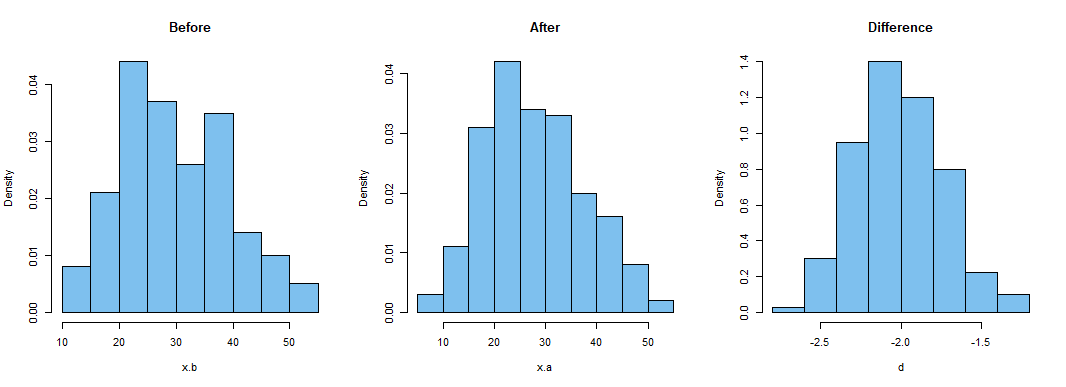
enter image description here

R code for figure above:

par(mfrow=c(1,3))
 hist(x.b, prob=T, col="skyblue2", main="Before")
 hist(x.a, prob=T, col="skyblue2", main="After")
 hist(d, prob=T, col="skyblue2", main="Difference")
par(mfrow=c(1,1))

However, you use the word 'groups' in your question, so it is not entirely clear whether you have paired measurements on one group of subjects Before and After, or whether you have data for a Before group and for an independently chosen After group. So I will discuss the case of data from independent groups also.

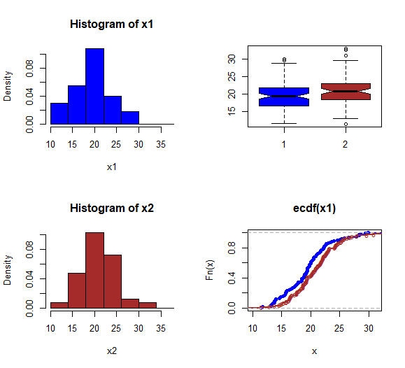
Part 2: Graphic displays of two-sample data. Various statisticians have different favorite graphical displays for showing differences between independent groups. Histograms are not among my personal favorites because information can be lost (or sometimes even distorted) by sorting observations into bins. Also, when histograms of two similar samples are plotted on the same axes, the interplay between them can be confusing. Even so, I imagine I can see more of the higher values in the Before (blue) group.

Consider the fictitious data below (200 subjects in each of two groups), sampled in R from two slightly different beta distributions. A nonparametric 2-sample Wilcoxon rank sum test shows a significant difference at the 5% level (nearly significant at the 1% level).

set.seed(2021)
x1 = 100*rbeta(100, 20, 80)
x2 = 100*rbeta(100, 20.5, 79.5)
wilcox.test(x1,x2)

        Wilcoxon rank sum test with continuity correction

data:  x1 and x2
W = 3954, p-value = 0.01063
alternative hypothesis: 
  true location shift is not equal to 0

However, I can imagine that by plotting the two histograms at left in the figure below on the same axis that I might have trouble seeing this significant difference. [R code for the figure is given below it.]

By contrast, the two boxplots seem to have different medians. The notches in the sides of the boxes overlap only very slightly, roughly indicating that a two-sample nonparametric test might find a significant difference at the 5% level. [Admittedly this is cheating, by superimposing what may be test results on a graphic display, but even ignoring the notches, the medians do seem different compared with the spread of the data in the two groups.]

Moreover, ECDF plots often give a better clue as to the CDF of a population, than the clue histograms of give about the densities of the population distributions. This is particularly true for samples of small or moderate size. Also, comparing the ECDFs of the two groups it seems that observations in x2 (brown sample) tend to be than do observations in x1. (Thus the brown ECDF plots mostly below the blue one.) Sometimes one says that sample x2 'stochastically' dominates x1.

Consider
enter image description here

par(mfcol = c(2,2))
cutp = seq(10,38, by=4)
 hist(x1, prob=T, br=cutp, col="blue")
 hist(x2, prob=T, br=cutp, col="brown")
 boxplot(x1,x2, notch=T, col=c("blue","brown"))
 plot(ecdf(x1), col="blue")
  lines(ecdf(x2), col="brown", lwd=2, pch="o")
par(mfcol = c(1,1))
$\endgroup$
5
  • $\begingroup$ wow. Thanks. Yes, the data is paired, one group before and after. I'll rephrase this, very sorry for that. I thought about plotting the difference, but I'm almost always hesitant to do so. The reason is, that you always have to show plot A and plot B to explain the difference - and if the difference is large/apparent, then it should already be obvious from A and B. Otherwise it's impossible to know if e.g. -3 is explained by 3-6 or 0-3... or any other possible combination $\endgroup$ Commented Apr 12, 2021 at 20:53
  • $\begingroup$ If you're doing a paired Wilcoxon test in R, you can use wilcox.test(x1, x2, pair=T), where x1 and x2 are victors of equal length containing before and after scores, resp. Alternatively, use wilcox.test(d) where d = x1-x2. If you use x1 and x2 the wilcox.test procedure begins by finding the differences, so the two methods are equivalent. // It is quite possible that wilcox.test(x1,x2, pair=T) [signed-rank test] will reject and that wilcox.test(x1,x2) [2-sample rank sum test] will not reject. // The info that data are paired (not independent) can be hugely important. $\endgroup$
    – BruceET
    Commented Apr 12, 2021 at 21:11
  • $\begingroup$ I guess I should have considered this, indeed. I don't use R, only MATLAB, but I'm sure they have the ranksum for paired data somewhere... $\endgroup$ Commented Apr 12, 2021 at 21:18
  • $\begingroup$ IMHO, you should start gradually getting familiar with R. No need to try to understand it all to find it useful. After brief orientation (help sites online) learn one procedure at a time as needed. // You can use R for free on your home computer. MATLAB is expensive and often available only in univ math depts or in corporate rsch groups. $\endgroup$
    – BruceET
    Commented Apr 12, 2021 at 21:22
  • $\begingroup$ "Various statisticians have different favorite graphical displays for showing differences between independent groups": indeed; Bruce could have added non-statisticians too. While agreeing with Bruce that ecdf plots show all the information without distortion, I generally prefer quantile plots which in essence flip the axes: outcome on vertical axis, cumulative probability on horizontal That may sound trivial but (1) it can be easier to see what is happening in the tails (2) differences on the outcome can be though about vertically. It's the same information, but sometimes easier to work with. $\endgroup$
    – Nick Cox
    Commented Apr 13, 2021 at 9:39

Your Answer

By clicking “Post Your Answer”, you agree to our terms of service and acknowledge you have read our privacy policy.

Not the answer you're looking for? Browse other questions tagged or ask your own question.