I am working with an imbalanced dataset containing 42 variables and around 136,000 observations, in order to perform a binary classification (96% of the observations belong to one class). I tried several approaches and models, but in the end, my classifier is bad (its confusion matrix is heavily pending to the more numerous class, and AUC-ROC measurements are a disaster). I suspect that the dataset does not contain information enough to split the target variable. How could I demonstrate this? I was thinking about plotting the distributions of each variable for each class, and, if they are very similar or identical, I would say that they do not have the power to predict the output. Reading Distinguishing between two groups in statistics and machine learning: hypothesis test vs. classification vs. clustering, I also believe I could use a k-means in the input dataset and see if it segregates over the two classes. But I don't know how rigorous are these approaches. Are these approaches valid? Is there a better approach?
-
1$\begingroup$ Why is accuracy not the best measure for assessing classification models? $\endgroup$– user2974951Commented Aug 29, 2023 at 7:40
-
3$\begingroup$ "Unbalanced" data as such are not necessarily a problem, unless you use accuracy as an evaluation measure, which is problematic especially in the "unbalanced" case. I recommend that you use probabilistic rather than "hard" classifications and adapt the decision threshold. $\endgroup$– Stephan KolassaCommented Aug 29, 2023 at 7:41
-
$\begingroup$ @StephanKolassa All good points, as always, but the fact that the ROC curve is so terrible tells me that the model will struggle to distinguish between the two categories for any threshold (unless ROC curves really are illegitimate for imbalanced situations, though I suspect they are fine). $\endgroup$– DaveCommented Sep 1, 2023 at 11:45
3 Answers
This is going to be hard.
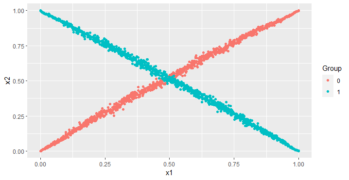
In this answer of mine, I give a situation where the two categories have dramatically different distributions, but only when the entire distribution in two dimensions is considered. Just considering the marginal distributions leads to viewing the two categories as having the same distribution, even though you can see the red and blue to be extremely different.
That’s in two dimensions. If there is a third feature, it would be possible to have the distributions differ in three dimensions yet have identical univariate and bivariate marginal distributions. However, it is kind of possible to plot in three dimensions, so you might be able visualize such a situation to assess differences.
You don’t have three dimensions. You have $42$, which means that the $41$-dimensional margins could be identical for both classes, yet, analogous the the situation above with the X-shape, the two distributions do differ dramatically in the full $42$ dimensions.
I see a few approaches.
If you fit an extremely flexible model like a neural network, it can pick up on the funky behavior in many dimensions. If such a model fails to distinguish between the categories, then perhaps the categories have similar distributions. The trouble with such an approach is that you have to combat overfitting concerns. (It is also somewhat circular reasoning to wonder if a predictive model can distinguish between the categories and test this out by fitting a predictive model.)
It is theoretically possible to calculate the mutual information between your feature vectors in $42$ dimensions and your class labels, such as with the
JMI(jackknife mutual information) package inR. From my experience using that package, however, such a calculation will be prohibitively slow with the sample size you have.Dimension reduction algorithms like t-SNE and UMAP aim to reduce your features to just a few dimensions (say two for visualization) while maintaining separability characteristics from the high-dimension space. For instance, I have run t-SNE on the MNIST digit pixel values. When I plotted the results in two dimensions with a separate color for each digit, the categories all seemed to bunch together, consistent with the digits being easy to distinguish. An issue with this approach is that the dimension reduction algorithms like t-SNE risk introducing separability in low dimensions when there is not any in the full space, and separability can be destroyed in the low-dimensional space even though it does exist in the high-dimensional space.
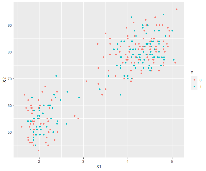
Finally, you mention clustering. This is an intriguing idea. The issue I see is that the clusters might be wildly different from the category labels. The image below demonstrates a situation where this may arise. The data come from a geyser in Yellowstone National Park and have a decent cluster in the lower left and another in the upper right. A clustering algorithm should be able to find those clusters. However, if you are using the two variables to predict the color, such a clustering algorithm is tricking you into thinking the color relates to those two variables. (Yes, you can see in this plot that the color has nothing to do with these two features, but this is just in two dimensions. As before, you have $42$ dimensions, meaning that this kind of easy visualization is off the table, unless you do a dimension reduction whose possible issues I discussed in point $\#3$.)
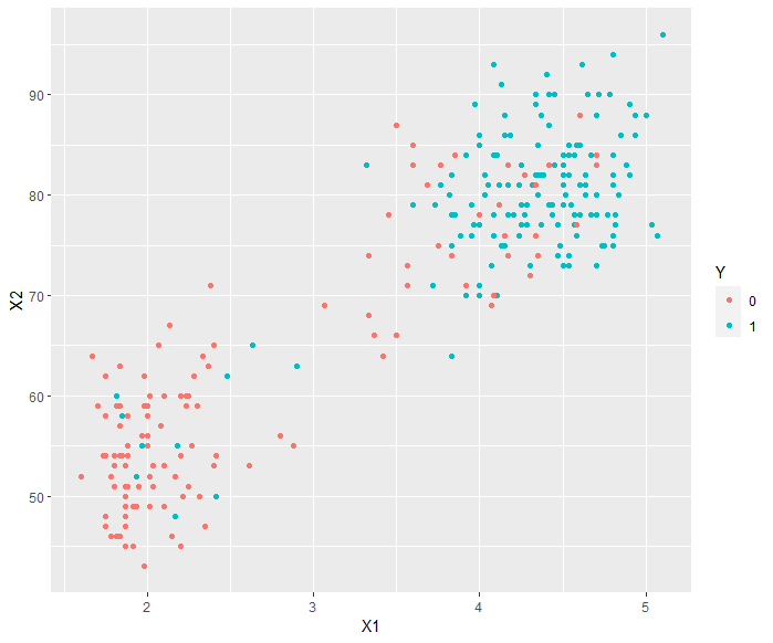
That is a far different situation than in the image below, where the color is predicted quite well by the two features.
# To generate the Yellowstone plots

# To generate the Yellowstone plot

library(ggplot2)
library(MASS)
data("faithful")
X1 <- faithful$eruptions
X2 <- faithful$waiting
Y <- as.factor(rbinom(dim(faithful)[1], 1, 0.5))
d <- data.frame(
  X1 = X1,
  X2 = X2,
  Y = Y
)
ggplot(d, aes(x = X1, y = X2, col = Y)) +
  geom_point()
z <- (d$X1 - mean(d$X1))/sd(d$X1) + (d$X2 - mean(d$X2))/sd(d$X2)
p <- 1/(1 + exp(-z))
y <- rbinom(length(p), 1, p)
d <- data.frame(
    X1 = X1,
    X2 = X2,
    Y = as.factor(y)
  )
ggplot(d, aes(x = X1, y = X2, col = Y)) +
  geom_point()
-
2$\begingroup$ Great answer, +1. Of course, clustering in high dimensions (and we don't even know how many of those 42 dimensions are categorical) comes with very unexpected behavior as well. The OP might want to read up on the curse of dimensionality. $\endgroup$ Commented Sep 6, 2023 at 14:22
I would start with a simpler model, for example logistic regression, in which you can look at the chi-square test to see how the addition of X variables improves the model, as well as at the individual p-values. If you do not see statistically significant results especially for the entire model, this would suggest the variables are not very informative of y. If you have reasons to believe there are interactions or higher-order terms (e.g. squares), you can add these to the model.
You could then progressively try more complex models (e.g. random forest or neural networks) and show that even with more flexibility (interactions etc.), the results do not improve. As per @Dave's helpful comment: to make the general statement that X is not informative of y, you could use a measure such as ROCAUC, which does not depend on a specific threshold.
If ROCAUC is close to 0.5, it means your classifier is not better than a coin flip. More precisely, if we let the classifier rank data points (highest ranking for most sure about positive class), the chance that a randomly chosen positive class will be ranked above a randomly chosen negative class is just 50%, which is no better than random order.
Finally, to make the case that X is not strongly related to y, it would help greatly to discuss what is in the data and why X might not be informative at all. For example, if you are predicting lung cancer for patients and X data contains job occupations, it could be the relationship is weak -- job occupation does not connect with lung cancer unless perhaps in very specific jobs like mining. However, if X contains demographic data or information about smoking, it seems strange if it could not predict lung cancer to some extent.
-
$\begingroup$ Precision, recall, $F_1$, and $F_{\beta}$ in general all have the same issue that they assess a predictive model like a logistic regression along with a decision rule, not just the predictive model. It could be that the predictive model separates the classes fine, just that all predictions fall below the threshold and are categorized the same way. Perhaps consider the points raised here. $\endgroup$– DaveCommented Sep 1, 2023 at 12:24
-
$\begingroup$ Thank you for your comment, I understand these metrics have limitations, but what other ones would you use for a flexible model (like you mention in your Point 1) to show if there is separation? Second, in the logistic regression, I suggest looking at chi-square and p-values, would you consider that a valid approach? Thanks! $\endgroup$ Commented Sep 1, 2023 at 12:58
-
1$\begingroup$ Log loss, Brier score, and ROCAUC all assess the direct mode outputs instead of considering performance at a single, likely arbitrary threshold. // An issue with using p-values like you describe is that they can be quite small for a large sample size despite minimal difference. Particularly with 136,000 observations, that is a real concern. I don’t think the claim is that the distributions are identical, just that they might be so similar as to preclude strong predictive discrimination. $\endgroup$– DaveCommented Sep 1, 2023 at 13:13
-
$\begingroup$ I see, I agree ROCAUC/Brier score would better support the general statement that the classifier cannot predict Y based on X - I will edit my answer. Final inquiry - what score would be "bad" enough to support such a statement, very close to 50% random guess by ROCAUC, can this be benchmarked to anything? Thank you. $\endgroup$ Commented Sep 1, 2023 at 14:09
-
1
In addition to Dave's excellent answer (+1), I'd like to point out that most (training) datasets can be perfectly classified by learning them by heart (exception to this rule is when points from different classes perfectly overlap, having exactly the same features, in which case they are inherently inseparable). You can take a nearest neighbour classifier or an SVM with the RBF kernel and a high $\gamma$ and achieve perfect accuracy, precision, ... whatever on the training set. Of course, this would be overfitting and the performance on unseen data is likely to be miserable.
On the other hand, we need to define "miserable". If accuracy >= 95% is what you're striving for, your job is already done: Classify everything as the larger class and you'll get 96%! So I suggest that you define a cost function to quantify how expensive each kind of classification error is.
From there, I'd proceed with $k$-nearest neighbours and validation:
- split your data into (at least) a training and a validation set;
- use increasing $k$ for the nearest neighbours, train them on the training set and measure the above defined cost on the validation set. If the cost remains mostly flat as you vary $k$, your features probably don't contain sufficient information for classification.
Alternatively, you could use an RBF SVM with a decreasing $\gamma$, but for your dataset (> 100,000 points) it would likely only be a waste of computational resources, without any real benefit over the nearest neighbours.
This is, of course, a very qualitative approach, open to interpretation. Unfortunately, I am not aware of a statistical test suitable for your purpose.
Regarding clustering, I'm skeptical: If your classes formed clearly distinguishable clusters, classification would most likely be easy (this is not a law of nature, but mostly holds in practice).
-
$\begingroup$
I'd like to point out that every (training) dataset can be perfectly classified by learning it by heart.This is not true. Consider categorical features. $\endgroup$– DaveCommented Sep 5, 2023 at 7:01 -
$\begingroup$ @Dave Sure, and when points from different classes happen to have exactly the same features. I'll edit. $\endgroup$– Igor F.Commented Sep 5, 2023 at 7:04


