Correlational Approach
(After writing all of this, I realized you actually had 5 variables, but the interpretation of the answer below is still basically the same).
It seems to me, based off the question, that you are interested in some relationship between four key variables, but are cognizant of the fact that this varies by city. I don't think you can meaningfully summarize that much by-group variation in your variables. Even with a correlation matrix or heatmap, there is simply too much information to sort through. Here I simulate some data to emulate your situation first.
#### Load Packages and Set Seed ####
library(lmerTest)
library(correlation)
library(tidyverse)
set.seed(123)

#### Number of Cities and Obs Per City ####
n_city <- 50
n_obs <- 100

#### Create Data Frame ####
df <- data.frame(
  city = rep(1:n_city, each = n_obs),
  x1 = rnorm(n_city * n_obs),
  x2 = rnorm(n_city * n_obs),
  x3 = rnorm(n_city * n_obs)
)

#### Random Intercepts/Slopes for Cities ####
random_intercepts <- rnorm(n_city)
random_slopes_x1 <- rnorm(n_city)
random_slopes_x2 <- rnorm(n_city)
random_slopes_x3 <- rnorm(n_city)

#### Create Outcome Variable ####
df$y <- with(df,
             random_intercepts[city]
             + random_slopes_x1[city]
             * x1
             + random_slopes_x2[city]
             * x2
             + random_slopes_x3[city]
             * x3
             + rnorm(n_city * n_obs))
If we group these correlations by city:
#### Check Correlations ####
data %>%
  group_by(city) %>%
  correlation()
we get a massive correlation matrix (I only show the first 5 cities here)...
# Correlation Matrix (pearson-method)

Group | Parameter1 | Parameter2 |         r |         95% CI |    t(98) |         p
-----------------------------------------------------------------------------------
1     |         x1 |         x2 |      0.01 | [-0.18,  0.21] |     0.12 | > .999
1     |         x1 |         x3 |      0.16 | [-0.03,  0.35] |     1.65 | 0.408
1     |         x1 |          y | -9.78e-03 | [-0.21,  0.19] |    -0.10 | > .999
1     |         x2 |         x3 |     -0.15 | [-0.33,  0.05] |    -1.46 | 0.443
1     |         x2 |          y |      0.38 | [ 0.20,  0.54] |     4.10 | < .001***
1     |         x3 |          y |     -0.60 | [-0.71, -0.45] |    -7.35 | < .001***
2     |         x1 |         x2 |      0.07 | [-0.13,  0.26] |     0.71 | > .999
2     |         x1 |         x3 |     -0.04 | [-0.23,  0.16] |    -0.39 | > .999
2     |         x1 |          y |      0.32 | [ 0.13,  0.49] |     3.34 | 0.005**
2     |         x2 |         x3 |      0.02 | [-0.17,  0.22] |     0.23 | > .999
2     |         x2 |          y |      0.64 | [ 0.51,  0.75] |     8.30 | < .001***
2     |         x3 |          y |     -0.47 | [-0.61, -0.31] |    -5.32 | < .001***
3     |         x1 |         x2 |     -0.02 | [-0.22,  0.18] |    -0.20 | > .999
3     |         x1 |         x3 |     -0.06 | [-0.25,  0.14] |    -0.55 | > .999
3     |         x1 |          y |     -0.75 | [-0.82, -0.65] |   -11.15 | < .001***
3     |         x2 |         x3 |      0.08 | [-0.11,  0.28] |     0.84 | > .999
3     |         x2 |          y |     -0.03 | [-0.23,  0.17] |    -0.31 | > .999
3     |         x3 |          y |     -0.38 | [-0.54, -0.20] |    -4.11 | < .001***
4     |         x1 |         x2 |      0.11 | [-0.09,  0.30] |     1.07 | > .999
4     |         x1 |         x3 |      0.04 | [-0.15,  0.24] |     0.42 | > .999
4     |         x1 |          y |      0.87 | [ 0.81,  0.91] |    17.13 | < .001***
4     |         x2 |         x3 |      0.08 | [-0.12,  0.28] |     0.83 | > .999
4     |         x2 |          y |     -0.09 | [-0.29,  0.10] |    -0.94 | > .999
4     |         x3 |          y |     -0.21 | [-0.39, -0.01] |    -2.13 | 0.178
5     |         x1 |         x2 |     -0.09 | [-0.29,  0.10] |    -0.94 | 0.900
5     |         x1 |         x3 |     -0.13 | [-0.32,  0.07] |    -1.27 | 0.835
5     |         x1 |          y |     -0.25 | [-0.43, -0.06] |    -2.56 | 0.059
5     |         x2 |         x3 |     -0.06 | [-0.25,  0.14] |    -0.57 | 0.900
5     |         x2 |          y |     -0.75 | [-0.82, -0.64] |   -11.07 | < .001***
We could employ a heatmap and perhaps facet this by city, but even this would be difficult to summarize meaningfully given you would have to compare 50 groups somehow.
Mixed Model Approach
What could be more meaningful but potentially more difficult is to simply fit a mixed model, where your three IVs and one DV are fit in a regression, but we model out each city by it's own unique intercept (random intercept), and potentially include more sophisticated random effects based on our needs. The syntax is similar to lm in R, but we use (1|city) to include the random intercept of cities.
#### Simple Model ####
model.int <- lmer(y
              ~ x1
              + x2
              + x3
              + (1 | city),
              data = df)
Here this fits a normal regression, but the response variable y varies by city. Running ranef(model.int) shows how much each city fluctuates around the conditional mean of y:
$city
   (Intercept)
1  -1.03268009
2  -0.35127375
3  -1.06261293
4   0.97840227
5   0.40144410
6   1.36994080
7  -1.56389063
8   0.54683387
9   0.50180444
10  0.22833614
11  0.50076443
12 -0.98574989
13  0.71349714
14 -0.16301217
15  0.45231931
16 -0.33856598
17  0.78105347
18  0.46048970
19 -0.07553787
20  0.53894904
21  1.54668930
22 -2.20445323
23  0.27170677
24  1.83835442
25 -0.06014703
26 -0.67720596
27  0.44845990
28 -0.60372979
29 -1.38065676
30 -0.39841245
31 -2.14597392
32 -0.73881666
33  0.34478326
34  0.92780038
35  0.05273206
36 -0.11864168
37  0.28281417
38  0.62924181
39 -1.33870775
40 -0.42792721
41  1.05921028
42 -0.30089312
43 -1.01100523
44  0.14459701
45  0.54592963
46  0.27505794
47  0.45523254
48 -0.95264744
49  1.04945728
50  0.58664008

with conditional variances for “city”
However, it seems you believe the relationships between your IVs and DVs vary by city, so a more plausible model may be one which also includes random slopes, shown now with the new syntax below, which replaces the 1 with all our predictor terms.
#### Fit Full Model ####
model.slp <- lmer(y
              ~ x1
              + x2
              + x3
              + (x1 + x2 + x3 | city),
              data = df)
The results show our fixed effects and random effects:
Linear mixed model fit by REML. t-tests use
  Satterthwaite's method [lmerModLmerTest]
Formula: y ~ x1 + x2 + x3 + (x1 + x2 + x3 | city)
   Data: df

REML criterion at convergence: 15085.8

Scaled residuals:
    Min      1Q  Median      3Q     Max
-3.3798 -0.6444 -0.0102  0.6398  3.5897

Random effects:
 Groups   Name        Variance Std.Dev. Corr
 city     (Intercept) 0.8647   0.9299
          x1          1.0907   1.0443   -0.26
          x2          1.5222   1.2338   -0.01 -0.12
          x3          1.0200   1.0100    0.18  0.00  0.04
 Residual             0.9918   0.9959
Number of obs: 5000, groups:  city, 50

Fixed effects:
             Estimate Std. Error        df t value Pr(>|t|)
(Intercept) -0.113360   0.132278 49.013180  -0.857  0.39562
x1          -0.034227   0.148405 48.978220  -0.231  0.81856
x2           0.001188   0.175072 49.023218   0.007  0.99461
x3           0.392522   0.143551 48.986373   2.734  0.00868

(Intercept)
x1
x2
x3          **
---
Signif. codes:
0 ‘***’ 0.001 ‘**’ 0.01 ‘*’ 0.05 ‘.’ 0.1 ‘ ’ 1

Correlation of Fixed Effects:
   (Intr) x1     x2
x1 -0.252
x2 -0.009 -0.119
x3  0.173 -0.002  0.037
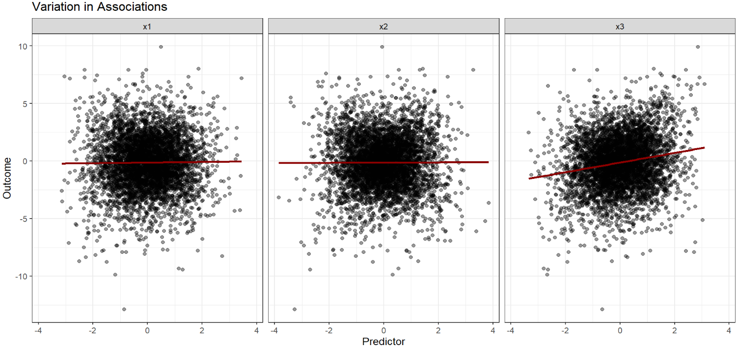
It seems that x3 is the most influential predictor, with the slopes and intercepts varying a fair amount. Plotting this may be helpful to visualize what is going on. First we can just plot the main effect each predictor has on the outcome. You can see that x3 has the most meaningful association while the other two are "flat."
#### Average Effect ####
df %>%
  pivot_longer(cols = contains("x"),
               names_to = "predictor",
               values_to = "value") %>%
  ggplot(aes(x=value,
             y=y))+
  geom_point(alpha = .4)+
  geom_smooth(method = "lm",
              se = F,
              color="darkred")+
  facet_wrap(~predictor)+
  theme_bw()+
  labs(x="Predictor",
       y="Outcome",
       title = "Variation in Associations")

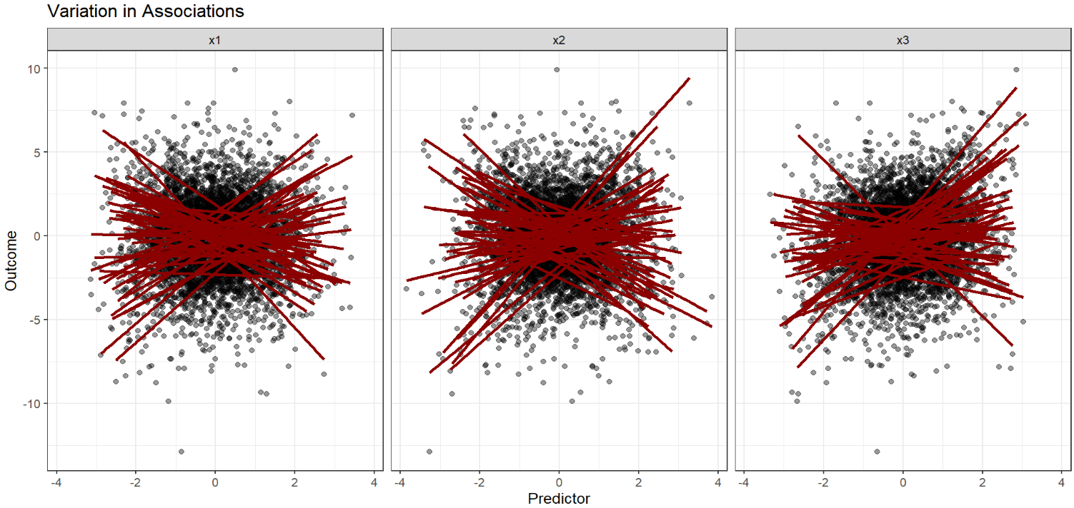
Changing the code to group these relationships by city:
#### Mixed Effects ####
df %>%
  pivot_longer(cols = contains("x"),
               names_to = "predictor",
               values_to = "value") %>%
  ggplot(aes(x=value,
             y=y,
             group=city))+
  geom_point(alpha = .4)+
  geom_smooth(method = "lm",
              se = F,
              color="darkred")+
  facet_wrap(~predictor)+
  theme_bw()+
  labs(x="Predictor",
       y="Outcome",
       title = "Variation in Associations")
We see a lot of variation by city with each drawn red line:

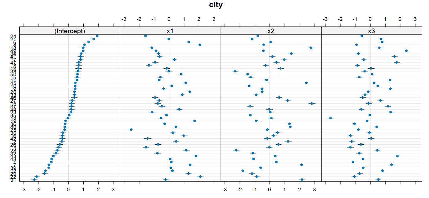
However, it may still be useful to determine which cities vary and by how much. We can inspect this by using ranef(model.slp).
$city
   (Intercept)          x1          x2          x3
1  -1.12361729  0.14943285  0.44747548 -1.15497954
2  -0.43709314  0.47399377  1.22579927 -1.22660879
3  -0.65738154 -1.53823824 -0.02145161 -1.31895491
4   1.06980044  2.05322178 -0.40419307 -0.91479656
5   0.59671297 -0.57717809 -1.27544608 -0.72552255
6   1.34369518  1.31518731  0.06934293  0.79403958
7  -1.29504010  1.39637595  2.11980123  1.41176362
8   0.69223549 -1.33581170 -0.26478080 -0.86068739
9   0.44541878 -0.36270692 -0.50919090  1.34586408
10  0.45828743  0.18996906 -1.35617567  0.50143210
11  0.58201366 -0.64549233 -0.19783999  1.33064489
12 -1.53029548  0.23184807 -1.79466973  0.82793902
13  0.66171310 -0.15688078  0.72645412  0.05202828
14 -0.04114744 -0.52765143  0.11056928 -2.65074821
15  0.21583041 -0.75066041  2.81112427 -0.11766525
16 -0.39410493  0.99711620  0.27424943 -1.31582034
17  0.81448286  0.36394147  0.96287237 -0.42553170
18  0.98695079 -1.14153773  2.74777699  0.59604367
19 -0.17933276  1.71202544 -0.89578123 -0.20632712
20  0.41355221  1.39158426 -0.48646080 -0.14346558
21  1.69276989 -0.01854201 -1.16190375  0.71941689
22 -2.10928083  2.09567804 -0.85410721 -1.05082693
23  0.16316791 -1.13063844  0.03519864  1.35422199
24  1.91866086 -1.56306471 -0.78274663 -0.56400815
25 -0.25367920 -2.52803739 -0.16185180 -0.78553432
26 -0.56933064 -0.72966704  0.58411171 -0.62920627
27  0.24995033 -0.64659081  1.19652123  0.66381377
28 -0.72941233  1.15206239 -2.22565484  0.47706728
29 -1.58047610  1.28933050 -1.18468098 -0.70305121
30 -0.36896070  0.26067152  0.52120332 -0.05824251
31 -2.26889745 -0.22295834  2.14988513  0.53696272
32 -0.83068029 -0.77176304 -1.11081479 -0.73564387
33  0.40156810  0.88879666 -0.91023373 -0.35571429
34  0.84288070 -0.70007611  1.43424610 -0.79530596
35  0.05426781 -0.16027823 -1.28165407 -0.02569450
36 -0.21029419 -0.28184057  1.31386627 -1.05483523
37  0.21553144 -0.46654427 -1.29550639  1.18219448
38  0.65273488 -0.01010801 -2.28514697 -0.38031978
39 -1.31586299  0.12389335 -0.59569529 -0.47694292
40 -0.22938452  0.45478125  1.38420746  0.42221215
41  0.81449534 -0.62740591  0.17606884  1.60942705
42 -0.39689880 -1.43312372 -0.15138616  0.05949651
43 -0.99970458  1.80014644  0.37314972  1.80678709
44  0.20111604  0.69005048 -0.02573371 -0.58859110
45  0.46823891  1.11354875  2.44106689  0.26116380
46  0.39602197 -0.92561265  0.63261421 -0.50121419
47  0.70324700 -0.92006151  0.45509325  1.77054083
48 -1.11917294  0.07739495 -1.07474629 -0.48226780
49  0.98691437 -0.86063974 -0.42122574  2.40351259
50  0.59778937  0.81205966 -1.46361994  0.12193459

with conditional variances for “city”
The intercepts in the first column show how much the conditional mean of y changes by city. For example, City 50 has a conditional mean that is about .598 above the conditional mean of the full model, meaning that $y$ is generally higher for City 50. The three columns after show the slope of each predictor on the outcome for that city. City 50 has the following slopes:
- $x_1: .812$
- $x_2: -1.463$
- $x_3: .122$
We can also summarize everything in this list with a dot plot, which makes it easier to look at how each city compares to the average.
library(lattice)
dotplot(ranef(model.slp))
