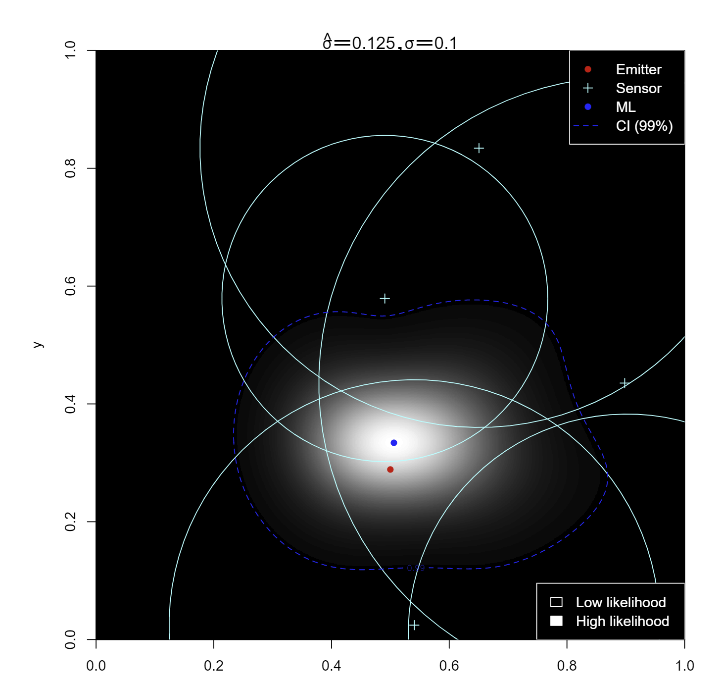
Adding to Sextus Empiricus answer, here is a visualization of the likelihood in R, using the maximum likelihood solution for $\sigma$ from Ben's answer:
# plot circles around the respective points with the distances as radii
draw_circle <- function(x, y, r, col = "black", lty = 1, lwd = 1) {
    theta <- seq(0, 2*pi, length.out = 100)
    lines(x + r*cos(theta), y + r*sin(theta), col = col, lty = lty, lwd = lwd)
}

# define the likelihood function for p = c(x, y)
likelihood <- function(x, y, d_vec, p_vec) {
    # true distances
    d_true = sqrt((p_vec[,1] - x)^2 + (p_vec[,2] - y)^2)
    # distance difference
    d_diff = d_vec - d_true
    # log-likelihood
    log_likelihood = -sum(d_diff^2)
    return(log_likelihood)
}

# plot the likelihood function for different values of xb and yb
plot_likelihood <- function(d_vec, p_vec, real_sigma, xlim, ylim,
                            n=101, pb) {
    # define the grid
    x_grid = seq(xlim[1], xlim[2], length.out = n)
    y_grid = seq(ylim[1], ylim[2], length.out = n)
    grid = expand.grid(x_grid, y_grid)
    # compute the likelihood for each grid point
    log_likelihood_grid = apply(grid, 1, function(x)
                       likelihood(x[1], x[2], d_vec, p_vec))
    log_likelihood_grid = matrix(log_likelihood_grid, nrow = n,
                                 ncol = n)
    # add a point at the maximum
    max_idx = which(log_likelihood_grid ==
               max(log_likelihood_grid), arr.ind = TRUE)
    xml = x_grid[max_idx[1]]
    yml = y_grid[max_idx[2]]
    # compute distances to the maximum
    dml = sqrt((p_vec[,1] - xml)^2 + (p_vec[,2] - yml)^2)
    # plug in the sigma^2 ml estimate
    # I choose a biased lower variance correction, for this
    # reason, this will only work with n>2 sensors
    sigma2_ml = sum((d_vec - dml)^2)/(length(d_vec)-2)
    log_likelihood_grid = -log(2*pi*sigma2_ml)/2 +
                log_likelihood_grid/(2*sigma2_ml)
    likelihood_grid =
      exp(log_likelihood_grid)/sum(exp(log_likelihood_grid))
    # set aspect ratio to 1
    par(pty = "s")
    # plot the likelihood
    image(x_grid, y_grid, likelihood_grid, col = grey(seq(0, 1,
          length.out = 100)), useRaster = TRUE, xlab = "x",
          ylab = "y", xlim = c(0,1), ylim = c(0,1))
    # plot p_vec
    points(p_vec[,1], p_vec[,2], pch = 3, col = "cyan",
           bg="black")
    # draw circles around the points with the distances as radii
    pd_vec = cbind(p_vec, d_vec)
    apply(pd_vec, 1, function(x) draw_circle(x[1], x[2], x[3], "cyan"))
    # add legend
    legend("topright", legend = c("Emitter", "Sensor", "ML",
           "CI (99%)"), pch = c(16, 3, 16, NA),
           col = c("red", "cyan", "blue", "blue"), bg = "black",
           text.col = "white", box.col = "white",
           lty=c(NA, NA, NA, 2), lwd=c(NA, NA, NA, 1))
    # legend for the image
    legend("bottomright", legend = c("Low likelihood",
           "High likelihood"), fill = grey(
             seq(0, 1, length.out = 100))[c(1, 100)],
           bg = "black", text.col = "white",
           box.col = "white", border="white")
    ord_likeli = order(c(likelihood_grid), decreasing = TRUE)
    reord_likeli= order(ord_likeli, decreasing = FALSE)
    cumsum_prob = cumsum(likelihood_grid[ord_likeli])
    cumsum_prob = cumsum_prob[reord_likeli]
    cumsum_prob = t(matrix(cumsum_prob, nrow = n, ncol = n,
                    byrow = TRUE))
    contour(x_grid, y_grid, cumsum_prob, add = TRUE, col = "blue",
            levels=0.99, lty=2)
    # plot the real position of the emitter
    points(pb[1], pb[2], pch = 16, col = "red")
    points(xml, yml, pch = 16, col = "blue")
    # add title with estimate of sigma and the real sigma
    title(bquote(paste(hat(sigma), " = ", .(round(sqrt(sigma2_ml),
             3)), ", ", sigma, " = ", .(round(real_sigma, 3)))),
              line = 0.5)
}
With randomly placed sensors and a large $\sigma$, to illustrate the problem better.
Notice this is an approximate inference: the finer the grid is, the better it becomes.
n=5
p_vec = matrix(runif(2*n, 0, 1), ncol = 2)
pb = c(0.5, 0.5)
# real emmiter position
pb = c(0.5, sqrt(3)/6)

# distances, assumed to be normally distributed with equal
# variance around the true distance
d_true = sqrt((p_vec[,1] - pb[1])^2 + (p_vec[,2] - pb[2])^2)
sigma = 0.1
d_vec = d_true + rnorm(n, 0, sigma)

plot_likelihood(d_vec, p_vec, sigma, xlim = c(0, 1),
                ylim = c(0, 1), pb=pb, n=1001)


