Can you suggest me which graphs I should do to visualize a mixed effects logistic regression model with three fixed predictors (all categorical) and two random intercepts?
1 Answer
There are a number of ways to visualize logistic GLMMS. For my examples, I use a logistic GLMM from here using their same code in R (with some minor changes):
#### Load Data ####
library(tidyverse)
hdp <- read.csv("https://stats.idre.ucla.edu/stat/data/hdp.csv")

#### Prepare Data ####
hdp <- within(hdp, {
  Married <- factor(Married, levels = 0:1, labels = c("no", "yes"))
  DID <- factor(DID)
  HID <- factor(HID)
  CancerStage <- factor(CancerStage)
}) %>%
  as_tibble()

hdp

#### Fit Model ####
m <- glmer(remission
           ~ IL6
           + CRP
           + CancerStage
           + LengthofStay
           + Experience
           + (1 | DID),
           data = hdp,
           family = binomial,
           control = glmerControl(optimizer = "bobyqa"),
           nAGQ = 10)
Quick Descriptive Plots
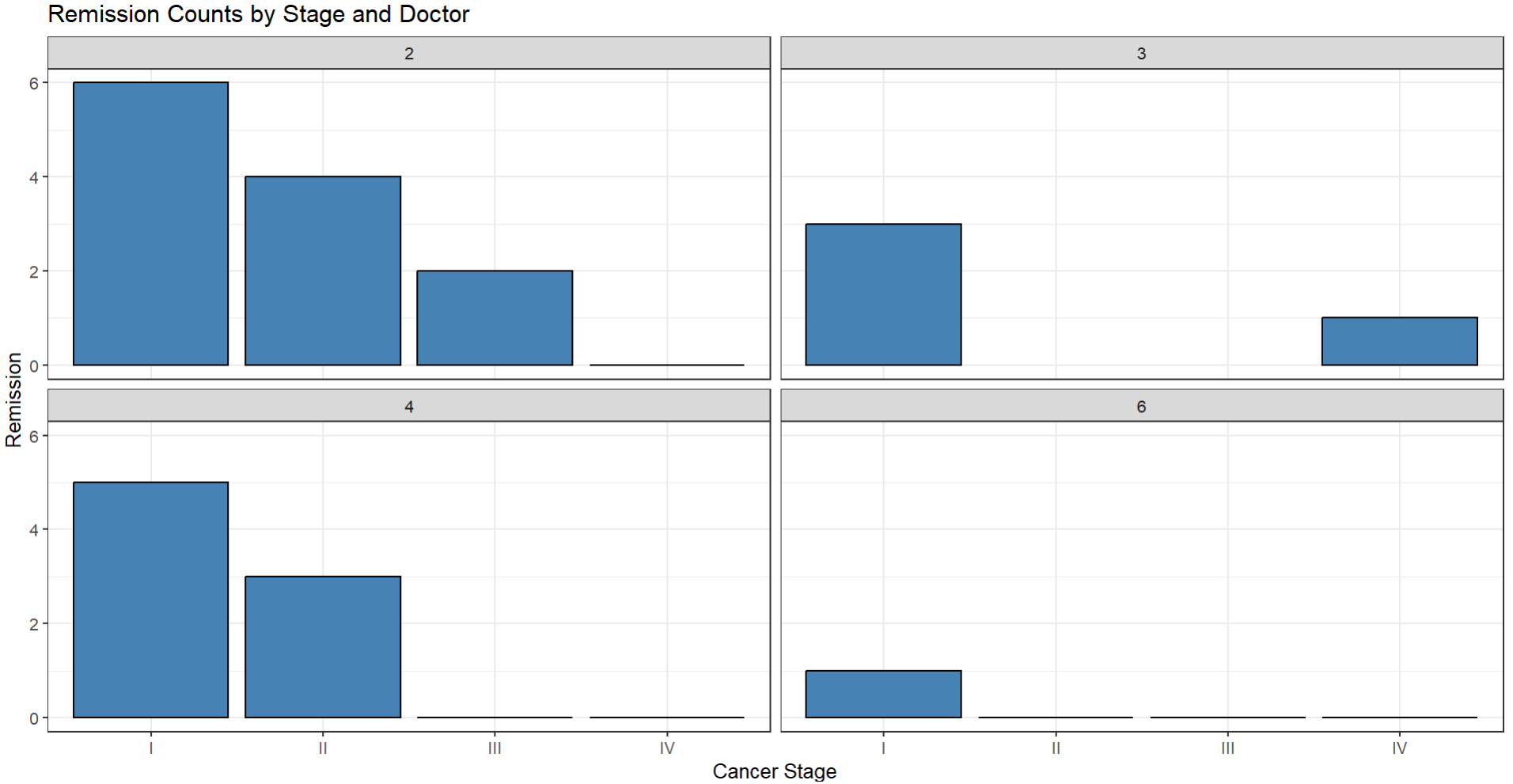
Since we are looking at binary outcomes, sometimes with categorical variables we can plot a subset of the random effects against the categorical variable and the response by simply grouping the data by each factor and then summing their successes. Here in this data this would represent how many times a patient went into remission (DV) based on cancer stage (fixed IV) and doctor (random effect).
#### Group Data ####
grouped <- hdp %>%
  filter(DID %in% c("2","3","4","6")) %>%
  group_by(CancerStage,DID) %>%
  summarise(rem = sum(remission))

#### Plot Counts of Remission ####
grouped %>%
  ggplot(aes(x=CancerStage,
             y=rem))+
  geom_col(fill="steelblue",
           color="black")+
  facet_wrap(~DID)+
  labs(x="Cancer Stage",
       y="Remission",
       title="Remission Counts by Stage and Doctor")+
  theme_bw()
Random Effect Variation
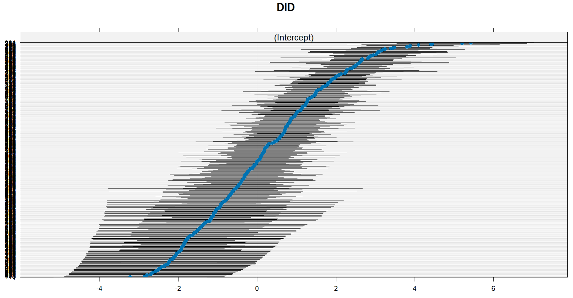
As you noted, a dotplot can be made of the variation in the intercepts (or the slopes):
#### Plot Random Effect Variation ####
lattice::dotplot(ranef(m))
Fixed Effect Predictions
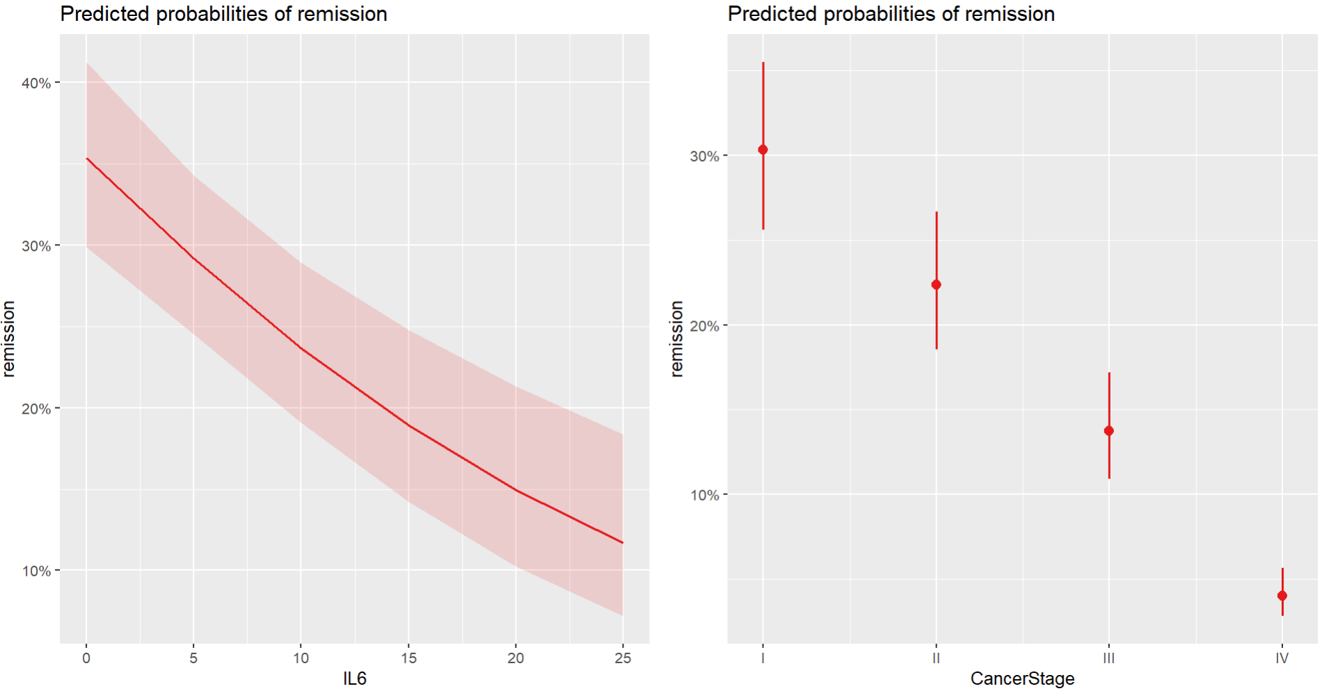
One can draw the regression line based off the predictions like so. Here I use an example of a continuous and a categorical variable to show how both could be visualized in a multiple predictor context (you can just run this for each term in your model, including for multiple categorical predictors):
#### Plot Continuous Variable ####
library(sjPlot)

p1 <- plot_model(
  m,
  type = "pred",
  terms = "IL6"
  )

#### Plot Categorical Variable ####
p2 <- plot_model(
  m,
  type = "pred",
  terms = "CancerStage"
)

#### Put Together ####
ggpubr::ggarrange(p1,p2)
I show how to do this by scratch for numeric variables here.
Combined Fixed and Random Effects
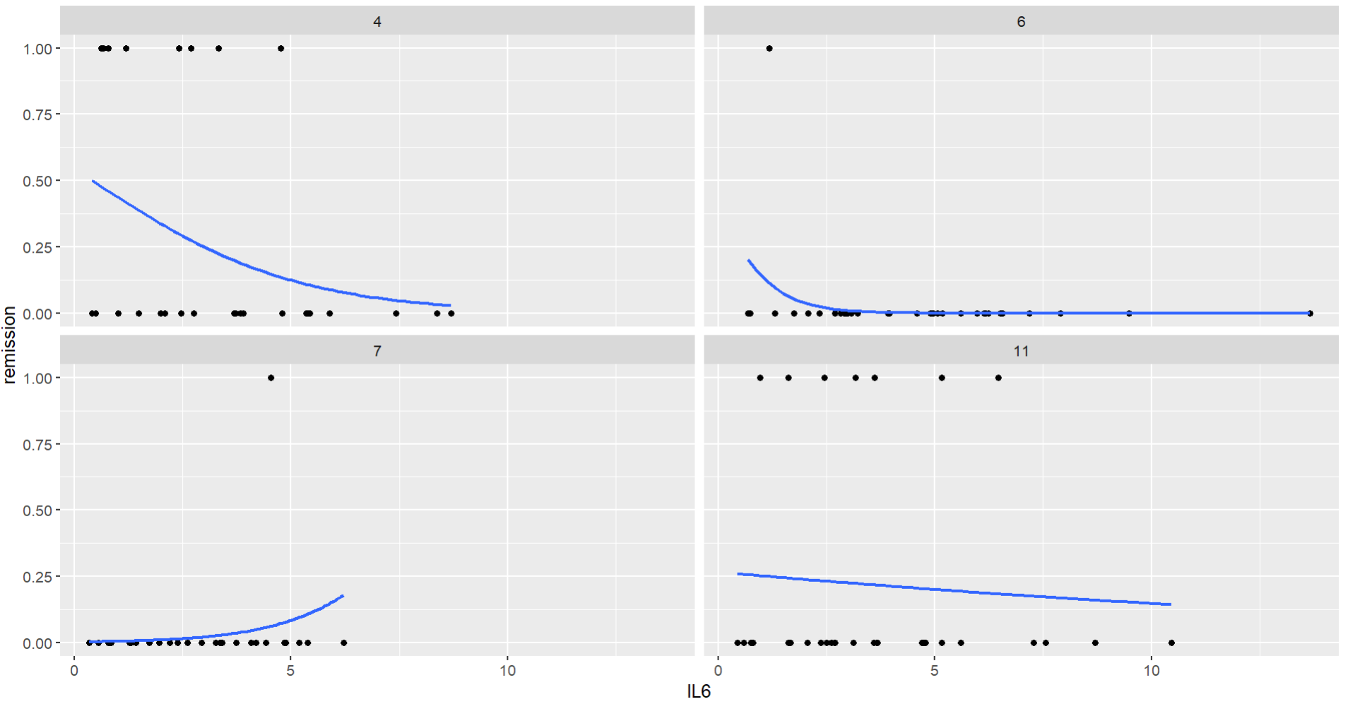
This isn't really an option for your case since you are using categorical variables, but for reference one can also plot regressions using the overall fixed effect and the random effect variation in regression intercepts/slopes, either by drawing the regression lines by random cluster or by faceting them like below.
hdp %>%
  filter(DID %in% c("4","6","7","11")) %>%
  ggplot(aes(x=IL6,
             y=remission))+
  geom_point()+
  stat_smooth(
    method = "glm",
    method.args = list(family=binomial()),
    se = F
  )+
  facet_wrap(~DID)
Residual Plots
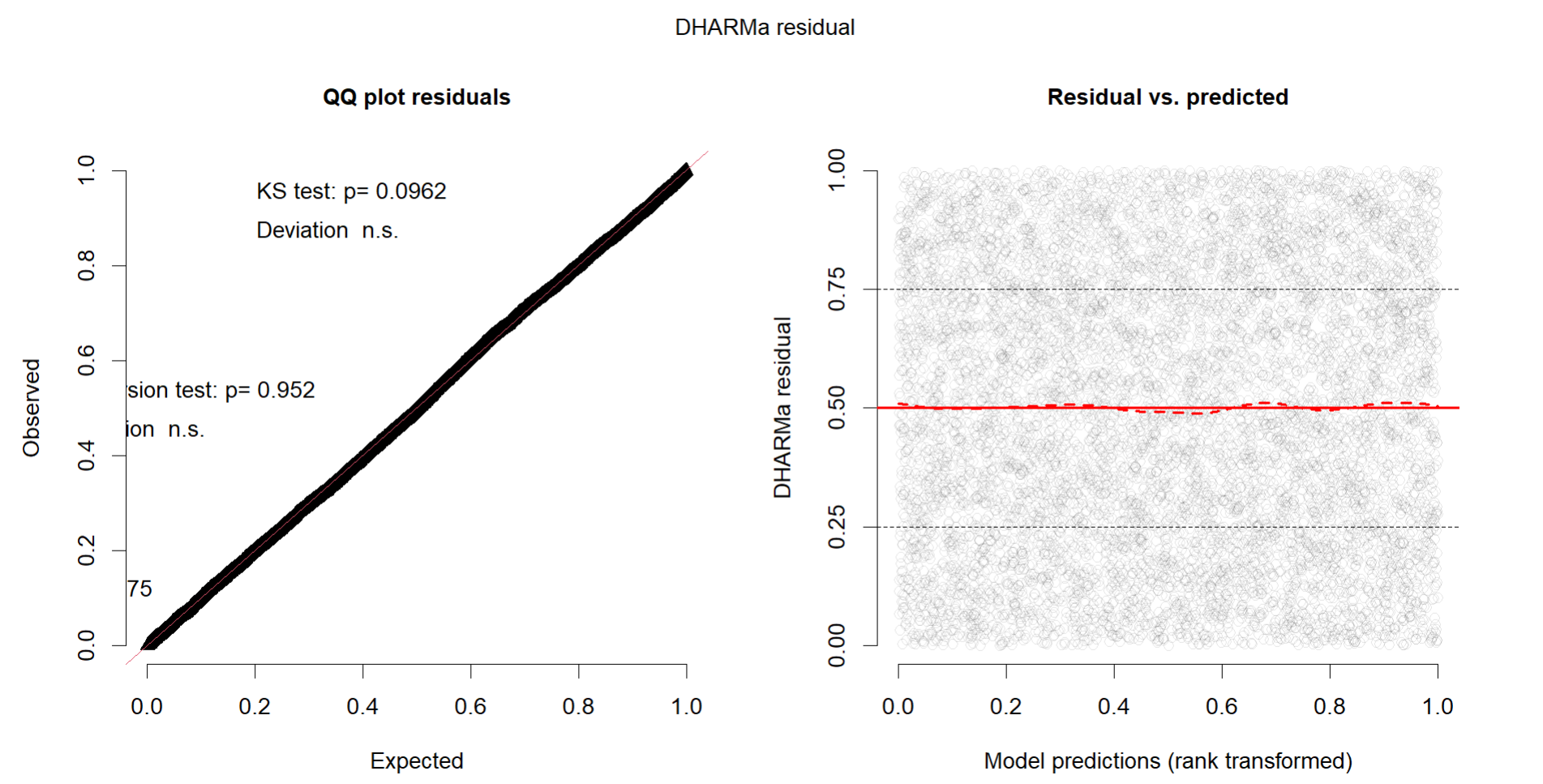
Since you are using a logistic GLMM, it would probably be good to check the standardized residuals, such as those found in DHARMa.
#### Generate Residuals ####
library(DHARMa)
res <- simulateResiduals(m)

#### Plot Checks ####
plot(res)

