2
$\begingroup$

I am using real data for a comparison of two groups: there are 3 replicates in one group and 3 replicates in the other group. All 6 replicates come from the control group, so that their responses should, ideally, be very similar, and a test should report very few significant results.

Now I got the results of raw p-values for the two-group comparison, and plot the histogram. Unfortunately, the histogram of raw p-values are not uniform-like – there are more small raw p-values there than expected. However, when I apply the Benjamini-Hochberg FDR control and check the q-values, there is 0 significant result! I am confused here as I am evaluating the method under the null – from the histogram of raw p-values, the method seems to report many false positives, but from the adjusted p-value (q-value) results, it seems good as I shouldn't report any significant result…

I admit that this is based on real data, not simulation data, so I cannot guarantee that what I am comparing are in reality "strictly under the null".

$\endgroup$
9
  • $\begingroup$ A little more details on the nature of the data could perhaps be useful. What is a replicate? A single measure from a participant? How are you splitting the “replicates” in two groups (e.g. randomly or comparing the three first ones to the next three)? How many of these participants/tests is your histogram based on? Did you try another visualization (e.g. density plot)? $\endgroup$
    – Gala
    Commented Jul 21, 2013 at 13:32
  • $\begingroup$ Importantly, under the null, you do expect significant results (how many depends on the error level). Superficially, it sounds better to have fewer than expected (i.e. be conservative) but it's not particularly good to have no significant result at all as it would mean that your test is poorly calibrated. Finally note that multiple test procedures are designed to control FDR or some error rate across a number of tests. Since you are considering all tests together, you have no longer have any replication and no way to empirically estimate how successful they are. $\endgroup$
    – Gala
    Commented Jul 21, 2013 at 13:49
  • $\begingroup$ What are you plotting the histogram of? Why do you have more than 1 p value? If 3 replicates come from one group and 3 from another, how do all 6 come from the control group? If all 6 come from the control group, why are you testing anything? $\endgroup$
    – Peter Flom
    Commented Jul 21, 2013 at 13:51
  • $\begingroup$ @GaëlLaurans: thanks a lot for your comments! The replicates are from different subjects' normal tissue (not cancer tissues as they're in the treatment group). I just take the first 3 and last 3 for grouping as all 6 should be homogeneous (ignoring individual subject effects). The number of tests is over 10,000. I didn't try other plots... $\endgroup$
    – alittleboy
    Commented Jul 21, 2013 at 14:10
  • 1
    $\begingroup$ How many significant results do you have? Sounds like the FDR is working correctly. $\endgroup$
    – Peter Flom
    Commented Jul 21, 2013 at 14:47

1 Answer 1

3
$\begingroup$

With 15000 tests, you should indeed have a proportion of rejection close to the nominal error rate and a relatively clean histogram/density plot. If the error level is 1%, 3500 false rejections of the null is definitely a surprising result. My first guess would be that successive replicates are not as independent as you thought. I would therefore first try to split each set of 6 observations randomly to assess that.

Also inspect some of these p-values and look at a stripchart or a density plot, just to make sure the histogram is not misleading you and your code is fine. You can also try simulated data, again to make sure everything else in your procedure is working as intended.

One thing you did not specify is the nature of the data and the specific test you are using. With only 3 observations in each group, the sampling distribution of some test statistics (e.g. rank-based tests) can be very unusual (but usually not in the way you describe, I would think).


Just a quick illustration of what I mean, with a simulation (the code is in R).

set.seed(4123412) # Makes the whole thing reproducible

# Some test with 3 observations, null hypothesis is true by construction
rndtest1 <- function() {
    t.test(rnorm(3), rnorm(3))$p.value
}

First, a simulation with 50 tests in total:

dist1 <- replicate(50, rndtest1())
hist(dist1)
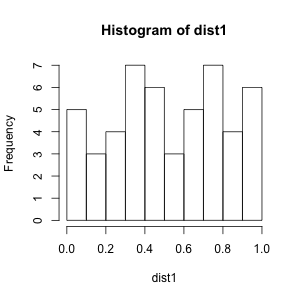
Bumpy histogram

As you see, the histogram is quite bumpy because with 50 observations you only have a rough idea of the distribution (or anything else, really).

Now, a simulation with 15000 tests:

dist2 <- replicate(15000, rndtest1())
hist(dist2)
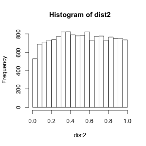
Nice uniform p-value distribution

Here the histogram looks almost the way you want it to look like under the null, i.e. like a uniform distribution.

(There is however a little quirk on the left hand of the plot. Indeed, the test is a little conservative:

> sum(dist2 < .05)/15000
[1] 0.03526667
> sum(dist2 < .01)/15000
[1] 0.006133333

It's an artifact of the small sample size and correction for unequal variances. Without the latter the histogram would be flat, an issue unrelated to the point I am making.)

Finally, my other point, a simulation with a test behaving differently with very small samples:

rndtest2 <- function() {
    wilcox.test(rnorm(3), rnorm(3))$p.value
}
dist3 <- replicate(15000, rndtest2())
hist(dist3)
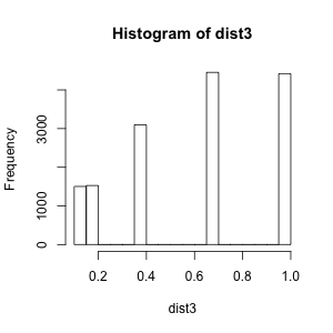
Discrete p-value distribution (rank-based test)

In fact, the p-value distribution is discrete:

> xtabs(~dist3)
dist3
 0.1  0.2  0.4  0.7    1 
 985  989 1976 3039 3011 

and therefore can never, ever, reject the null hypothesis at the 5% error level. This is why more information on what the data and test exactly are could be useful to spot other problems but in any case, 15000 tests should be enough to get a good idea of the p-value distribution and, hopefully, get uniform-looking data under the null.

$\endgroup$
3
  • $\begingroup$ thanks for your reply! would you be more specific about "a relatively clean histogram/density plot"? What should the histogram of p-value look like if the test is well-calibrated? Thank you ;-) $\endgroup$
    – alittleboy
    Commented Jul 22, 2013 at 13:10
  • $\begingroup$ It should indeed be a uniform distribution, my point being that with a small number of observations, even a uniformly distributed random variable could look quite bumpy. What about the random split? Could you try that? $\endgroup$
    – Gala
    Commented Jul 22, 2013 at 15:51
  • $\begingroup$ thank you so much for the reply! It is more clear to me now. BTW, I also get a p-value histogram under the alternative, and got a question posted here: stats.stackexchange.com/questions/65175/bell-shaped-p-values do you have any comments on the shape of the p-values (and how it relates to the test being used)? Thanks! $\endgroup$
    – alittleboy
    Commented Jul 22, 2013 at 20:18

Your Answer

By clicking “Post Your Answer”, you agree to our terms of service and acknowledge you have read our privacy policy.

Not the answer you're looking for? Browse other questions tagged or ask your own question.