Your initial data was rotated in the existing three dimensions such that the bulk of the variance was along the X axis, then rotated again such that the remaining variance was predominantly along the Y axis. Then the Z axis was flattened so only the new X and Y axes remained.
This article goes into a really good and accessible explanation of what is going on in PCA, I recommend you check it out: http://www.cs.otago.ac.nz/cosc453/student_tutorials/principal_components.pdf
UPDATE: Regarding your comment below, here's a simple example illustrating why your PCA transformed data doesn't look like the data projected into the X-Y plane:
set.seed(123)
X = rnorm(100)
Y = X + rnorm(100,0,.5)
Z = rnorm(100)
df = data.frame(X,Y,Z)
df.xz = as.matrix(cbind(Y,Z))
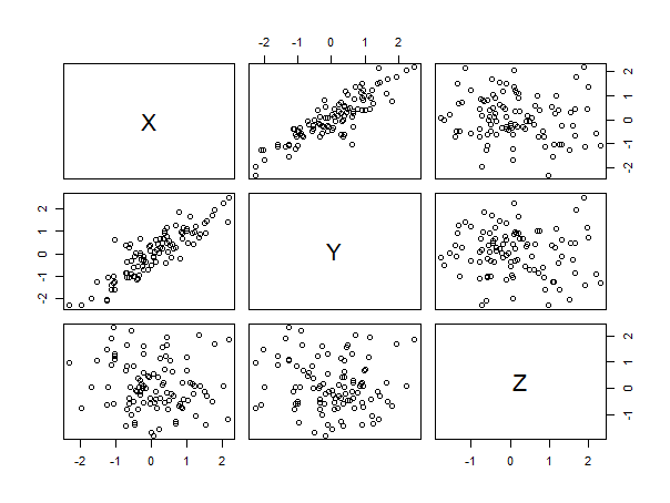
plot(df)

cor(X,Y) # .8786993
cor(X,Z) # -0.129176
cor(Y,Z) # -0.1019494

# X and Y are tightly correlated. Z is uncorrelated to both

pc.sd1 = princomp(df)

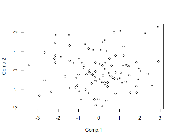
# plot of first two components looks random.
plot(pc.sd1$scores[,1:2])

It makes sense that the resulting plot looks random: it is random. The principal components capture the variance in the data. The idea is that if two variables are tightly correlated, we probably aren't adding much information by including both in our model: we really only need one, especially if one variable is actually a function of the other. Principal components is an easy way to ignore those relationships.
The plot in this example is capturing the relationship between X/Y and Z because there's a lot of variance in that (those) relationship(s). There's very little variance in the relationship between X and Y, so PCA allows us to combine those two dimensions into a single dimension so we can focus on the more complex relationship between this new dimension and Z.
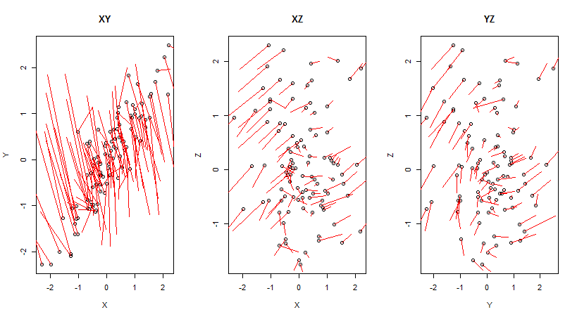
Let's look at how each point was transformed in each pair of dimensions to further illustrate this.
# The end point of each line signifies the end point of the PCA transformation.
PCA_transform_plot=function(dims){
  plot(df[,dims], main=paste(names(df)[dims], collapse=""))
  sapply(1:nrow(df), function(i){
    lines(rbind(df[i,dims]
               ,pc.sd1$scores[i,1:2]
                )
          ,col='red'
          )
  })
}

par(mfrow=c(1,3))
PCA_transform_plot(c(1,2))
PCA_transform_plot(c(1,3))
PCA_transform_plot(c(2,3))

As you can see, the points are displaced significantly relative to their initial positions in the XY plane, but much less so from their positions in the XZ and YZ planes. Moreover, the transformations in the XZ and YZ planes look very similar. In fact, the starting positions in the XZ and YZ planes look very similar. This isn't surprising: in this example, X and Y are so tightly correlated, they're practically interchangeable. PCA is a technique that let's us say (in this example), "Hey, these variables are so close, we don't really need both. Let's pretend our data is two dimensional instead of three dimensional, because it may as well be."

