37
$\begingroup$

I find R can take a long time to generate plots when millions of points are present - unsurprising given that points are plotted individually. Furthermore, such plots are often too cluttered and dense to be useful. Many of the points overlap and form a black mass and a lot of time is spent plotting more points into that mass.

Are there any statistical alternatives to representing large $n$ data in a standard scatterplot? I have considered a density plot, but what other alternatives are there?

$\endgroup$
1

7 Answers 7

14
$\begingroup$

This is a hard task with no ready solutions (this is of course because density plot is so a tempting fallback than no one really cares). So, what can you do?

If they really overlap (i.e. have exactly the same X & Y coordinates) and you are not using alpha, the best idea would be just to reduce the overlap using unique (with alpha, it may be summed over such groups).

If not, you may manually round the coordinates to the nearest pixels and use the previous method (yet this is a dirty solution).

Finally, you can make a density plot only to use it to subsample the points in the most dense areas. This on the other hand will not make the exactly same plot and may introduce artifacts if not precisely tuned.

$\endgroup$
2
  • 5
    $\begingroup$ Reducing the overlap with unique or by rounding can result in biased (deceptive) plots. It's important to somehow indicate the amount of overlap through some graphical means such as lightness or with sunflower plots. $\endgroup$
    – whuber
    Commented Feb 18, 2011 at 17:01
  • $\begingroup$ A counterpoint is a GWAS Manhattan plot, where we all know that there are tons of P values with -log10(P) between 0-3 and the overlap/density doesn't matter. $\endgroup$ Commented Apr 23, 2020 at 3:11
46
$\begingroup$

Look at the hexbin package which implements paper/method by Dan Carr. The pdf vignette has more details which I quote below:

1 Overview

Hexagon binning is a form of bivariate histogram useful for visualizing the struc- ture in datasets with large n. The underlying concept of hexagon binning is extremely simple;

  1. the xy plane over the set (range(x), range(y)) is tessellated by a regular grid of hexagons.
  2. the number of points falling in each hexagon are counted and stored in a data structure
  3. the hexagons with count > 0 are plotted using a color ramp or varying the radius of the hexagon in proportion to the counts. The underlying algorithm is extremely fast and eective for displaying the structure of datasets with $n \ge 10^6$

If the size of the grid and the cuts in the color ramp are chosen in a clever fashion than the structure inherent in the data should emerge in the binned plots. The same caveats apply to hexagon binning as apply to histograms and care should be exercised in choosing the binning parameters

$\endgroup$
4
  • 4
    $\begingroup$ That's a nice one. Just what the doctor ordered. $\endgroup$ Commented Feb 18, 2011 at 8:56
  • 13
    $\begingroup$ (+1) Also of interest, smoothScatter {RColorBrewer} and densCols {grDevices}. I can confirm it works pretty well with thousand to million of points from genetic data. $\endgroup$
    – chl
    Commented Feb 18, 2011 at 9:30
  • 2
    $\begingroup$ What if have 3D data? (too many for scatterplot3d) $\endgroup$
    – skan
    Commented Feb 16, 2016 at 14:59
  • $\begingroup$ To save others some time -- I found smoothScatter, as suggested 2 comments up, to have much better defaults / functioning. $\endgroup$
    – Charlie
    Commented Jul 20, 2018 at 18:59
17
$\begingroup$

I must admit that I do not fully understand your last paragraph:

"I am not looking for a density plot (although those are often useful), I would want the same output as a simple plot call but much faster than millions of overplots if possible."

It is also unclear what type of plot (function) you are looking for.

Given that you have metric variables, you might find hexagon binned plots or sunnflower plots usefull. For further references, see

$\endgroup$
7
$\begingroup$

Another direct answer to the question is the rgl package, which can plot millions of points using OpenGL. Also, specify a point size (e.g. 3) and zoom out to see these centers of masses as monolithic blocks, or zoom in and see the structure of what used to be monolithic - the point sizes are constant but the distances among them on the screen depend on the zooming. Alpha levels can also be used.

$\endgroup$
6
$\begingroup$

Here's a file I call bigplotfix.R. If you source it, it will define a wrapper for plot.xy which "compresses" the plot data when it is very large. The wrapper does nothing if the input is small, but if the input is large then it breaks it into chunks and just plots the maximum and minimum x and y value for each chunk. Sourcing bigplotfix.R also rebinds graphics::plot.xy to point to the wrapper (sourcing multiple times is OK).

Note that plot.xy is the "workhorse" function for the standard plotting methods like plot(), lines(), and points(). Thus you can continue to use these functions in your code with no modification, and your large plots will be automatically compressed.

This is some example output. It's essentially plot(runif(1e5)), with points and lines, and with and without the "compression" implemented here. The "compressed points" plot misses the middle region due to the nature of the compression, but the "compressed lines" plot looks much closer to the uncompressed original. The times are for the png() device; for some reason points are much faster in the png device than in the X11 device, but the speed-ups in X11 are comparable (X11(type="cairo") was slower than X11(type="Xlib") in my experiments).
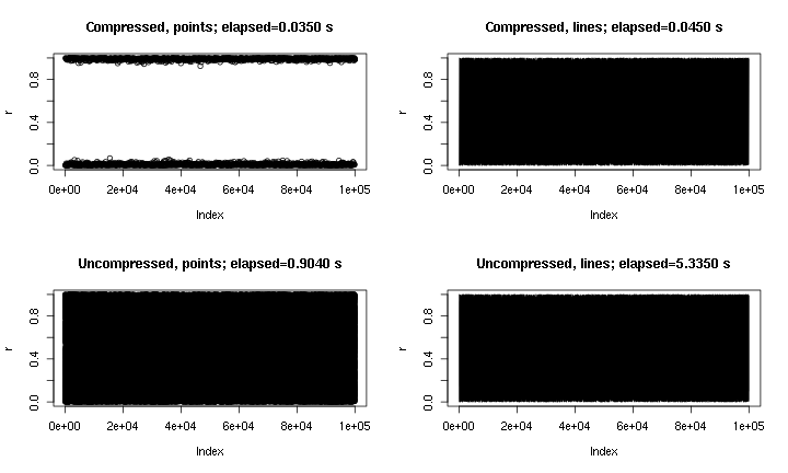
"bigplotfix.R" test output

The reason I wrote this is because I was tired of running plot() by accident on a large dataset (e.g. a WAV file). In such cases I would have to choose between waiting several minutes for the plot to finish, and terminating my R session with a signal (thereby losing my recent command history and variables). Now if I can remember to load this file before each session, I can actually get a useful plot in these cases. A little warning message indicates when the plot data has been "compressed".

# bigplotfix.R
# 28 Nov 2016

# This file defines a wrapper for plot.xy which checks if the input
# data is longer than a certain maximum limit. If it is, it is
# downsampled before plotting. For 3 million input points, I got
# speed-ups of 10-100x. Note that if you want the output to look the
# same as the "uncompressed" version, you should be drawing lines,
# because the compression involves taking maximum and minimum values
# of blocks of points (try running test_bigplotfix() for a visual
# explanation). Also, no sorting is done on the input points, so
# things could get weird if they are out of order.
test_bigplotfix = function() {
  oldpar=par();
  par(mfrow=c(2,2))
  n=1e5;
  r=runif(n)
  bigplotfix_verbose<<-T
  mytitle=function(t,m) { title(main=sprintf("%s; elapsed=%0.4f s",m,t["elapsed"])) }
  mytime=function(m,e) { t=system.time(e); mytitle(t,m); }

  oldbigplotfix_maxlen = bigplotfix_maxlen
  bigplotfix_maxlen <<- 1e3;

  mytime("Compressed, points",plot(r));
  mytime("Compressed, lines",plot(r,type="l"));
  bigplotfix_maxlen <<- n
  mytime("Uncompressed, points",plot(r));
  mytime("Uncompressed, lines",plot(r,type="l"));
  par(oldpar);
  bigplotfix_maxlen <<- oldbigplotfix_maxlen
  bigplotfix_verbose <<- F
}

bigplotfix_verbose=F

downsample_xy = function(xy, n, xlog=F) {
  msg=if(bigplotfix_verbose) { message } else { function(...) { NULL } }
  msg("Finding range");
  r=range(xy$x);
  msg("Finding breaks");
  if(xlog) {
    breaks=exp(seq(from=log(r[1]),to=log(r[2]),length.out=n))
  } else {
    breaks=seq(from=r[1],to=r[2],length.out=n)
  }
  msg("Calling findInterval");
  ## cuts=cut(xy$x,breaks);
  # findInterval is much faster than cuts!
  cuts = findInterval(xy$x,breaks);
  if(0) {
    msg("In aggregate 1");
    dmax = aggregate(list(x=xy$x, y=xy$y), by=list(cuts=cuts), max)
    dmax$cuts = NULL;
    msg("In aggregate 2");
    dmin = aggregate(list(x=xy$x, y=xy$y), by=list(cuts=cuts), min)
    dmin$cuts = NULL;
  } else { # use data.table for MUCH faster aggregates
    # (see http://stackoverflow.com/questions/7722493/how-does-one-aggregate-and-summarize-data-quickly)
    suppressMessages(library(data.table))
    msg("In data.table");
    dt = data.table(x=xy$x,y=xy$y,cuts=cuts)
    msg("In data.table aggregate 1");
    dmax = dt[,list(x=max(x),y=max(y)),keyby="cuts"]
    dmax$cuts=NULL;
    msg("In data.table aggregate 2");
    dmin = dt[,list(x=min(x),y=min(y)),keyby="cuts"]
    dmin$cuts=NULL;
    #  ans = data_t[,list(A = sum(count), B = mean(count)), by = 'PID,Time,Site']
  }
  msg("In rep, rbind");
  # interleave rows (copied from a SO answer)
  s <- rep(1:n, each = 2) + (0:1) * n
  xy = rbind(dmin,dmax)[s,];
  xy
}

library(graphics);
# make sure we don't create infinite recursion if someone sources
# this file twice
if(!exists("old_plot.xy")) {
  old_plot.xy = graphics::plot.xy
}

bigplotfix_maxlen = 1e4

# formals copied from graphics::plot.xy
my_plot.xy = function(xy, type, pch = par("pch"), lty = par("lty"),
  col = par("col"), bg = NA, cex = 1, lwd = par("lwd"),
  ...) {

  if(bigplotfix_verbose) {
    message("In bigplotfix's plot.xy\n");
  }

  mycall=match.call();
  len=length(xy$x)
  if(len>bigplotfix_maxlen) {
    warning("bigplotfix.R (plot.xy): too many points (",len,"), compressing to ",bigplotfix_maxlen,"\n");
    xy = downsample_xy(xy, bigplotfix_maxlen, xlog=par("xlog"));
    mycall$xy=xy
  }
  mycall[[1]]=as.symbol("old_plot.xy");

  eval(mycall,envir=parent.frame());
}

# new binding solution adapted from Henrik Bengtsson
# https://stat.ethz.ch/pipermail/r-help/2008-August/171217.html
rebindPackageVar = function(pkg, name, new) {
  # assignInNamespace() no longer works here, thanks nannies
  ns=asNamespace(pkg)
  unlockBinding(name,ns)
  assign(name,new,envir=asNamespace(pkg),inherits=F)
  assign(name,new,envir=globalenv())
  lockBinding(name,ns)
}
rebindPackageVar("graphics", "plot.xy", my_plot.xy);
$\endgroup$
4
$\begingroup$

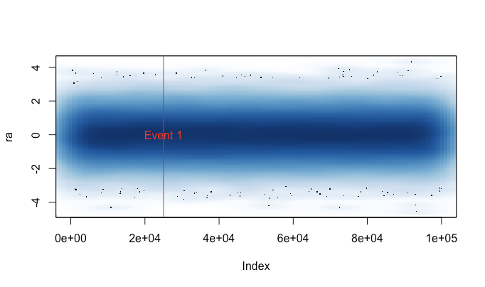
For large time series, I have grown to love smoothScatter (part of base R no less). I often have to include some additional data, and preserving the basic plot API is really helpful, for instance:

set.seed(1)
ra <- rnorm(n = 100000, sd = 1, mean = 0)
smoothScatter(ra)
abline(v=25000, col=2)
text(25000, 0, "Event 1", col=2)

Which gives you (if you pardon the design):

scatterSmooth example

It's always available and works well with enormous datasets, so it's nice to at least take a look at what you have.

$\endgroup$
0
$\begingroup$

Maybe I'll get shunned for my method, bad memories of one of my research profs screaming at people for throwing away good data by translating them into categories (of course, I do agree now a days lol), don't know. Anyway, if you're talking about a scatterplot, then I've had the same issues. Now, when I have numerical data, doesn't make much sense for me to categorize it for analysis. But visualizing is a different story. What I have found that works best for me is to first (1) break your independent variable into groups using the cut function. You can play around with the number of groups, and then (2) just simply plotting the DV against the cut version of the IV. R will generate box plots instead of that disgusting scatter plot. I do recommend removing the outliers form the plot (use the outline=FALSE option in the plot command). Again, I would NEVER waste perfectly good numerical data by categorizing and then analyzing. Too many issues doing that. Although I know that's a touchy subject of debate. But doing that specifically for the goal of at least making some visual sense out of the data, not much harm I've seen from it. I've plotted data as large as 10M and still managed to make sense out of it from this method. Hope that helps! Best Regards!

$\endgroup$

Your Answer

By clicking “Post Your Answer”, you agree to our terms of service and acknowledge you have read our privacy policy.

Not the answer you're looking for? Browse other questions tagged or ask your own question.