3
$\begingroup$

I have three variables. In the first table CPU value is fixed and similarly in the second. If I generate a graph for this data there will be four different graphs and then another four graphs if memory value is kept fixed and compared with CPU and approaches. Is there an efficient way to represent this data with less graphs generated?

Memory Approach1 Approach2 CPU
10 3.1 2.2 10
20 2.1 2.1 10
30 3.1 1.1 10
40 1.1 2.1 10
Memory Approach1 Approach2 CPU
10 3.1 2.2 20
20 2.1 2.1 20
30 3.1 1.1 20
40 1.1 2.1 20
Memory Approach1 Approach2 CPU
10 3.1 2.2 30
20 2.1 2.1 30
30 3.1 1.1 30
40 1.1 2.1 30
$\endgroup$
5
  • $\begingroup$ Can you please explain what you actually want to plot? Presumably you want to plot more than these data. $\endgroup$
    – cdalitz
    Commented Dec 8, 2020 at 10:19
  • $\begingroup$ Thanks, @cdalitz, I am plotting graphs for each table and there will more graphs for the three variables permutation of three variables data $\endgroup$
    – gohar shah
    Commented Dec 8, 2020 at 10:33
  • 1
    $\begingroup$ It is hard to know what you mean by "efficient". @chl's approach is the kind of multiple panel graph I would draw, but if fewer graphs is the goal then you could plot everything on just one graph, at the cost of a mess and a complicated key or legend. $\endgroup$
    – Nick Cox
    Commented Dec 8, 2020 at 11:02
  • $\begingroup$ Ok thanks @NickCox, by efficient i mean using less graphs here. $\endgroup$
    – gohar shah
    Commented Dec 8, 2020 at 11:34
  • $\begingroup$ One graph is as said possible. $\endgroup$
    – Nick Cox
    Commented Dec 8, 2020 at 11:42

1 Answer 1

6
$\begingroup$

Since there are two factors (memory and CPU) with fixed levels, you can probably use a simple faceted graphic like the one shown below, which relies on the R statistical package. Conditional or trellis displays are also available in Stata, SAS JMP, or Python, and the idea can be ported to Mathematica or Gnuplot, or whatever software you like.

This way, you have all the information in three separate panels, which share the same coordinate axes (especially on the y-axis, if values happen to be more variable than the ones you presented in your table). This is the clearest display that I can think of: As noted by Nick Cox, using a single panel display would mean messing up the information and having a hard time with the key or caption.

library(ggplot2)
d <- data.frame(memory = rep(seq(10, 40, by = 10), 3), 
                CPU = rep(c(10, 20, 30), each = 4), 
                approach1 = rep(c(3.1,2.1, 3.1, 1.1), 3), 
                approach2 = rep(c(2.2, 2.1, 1.1, 2.1), 3))
dm <- reshape2::melt(d, measure.vars = 3:4)
p <- ggplot(data = dm, aes(x = memory, y = value, color = variable))
p + geom_line(aes(group = variable)) + facet_grid(~ CPU) + theme_bw()
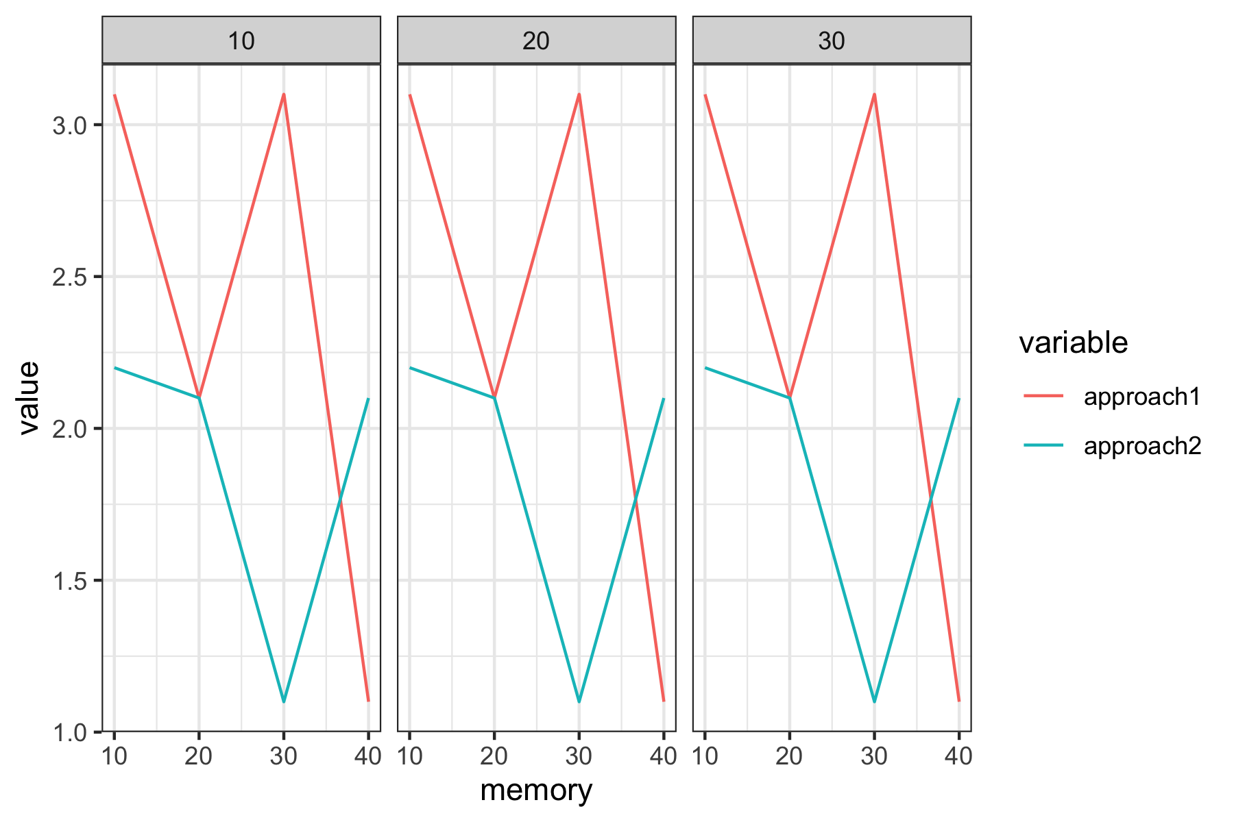
enter image description here

$\endgroup$
3
  • $\begingroup$ "using R (or Python)" -- or any other congenial software. $\endgroup$
    – Nick Cox
    Commented Dec 8, 2020 at 11:03
  • $\begingroup$ Thanks, @NickCox, the code is in R but I can go for python or R as long as I am presenting the data in correct form $\endgroup$
    – gohar shah
    Commented Dec 8, 2020 at 11:05
  • 1
    $\begingroup$ What anyone uses is up to them, but as a CV question the focus here is on general graphical principles, so that the software or code used is at most a side-issue. $\endgroup$
    – Nick Cox
    Commented Dec 8, 2020 at 11:17

Your Answer

By clicking “Post Your Answer”, you agree to our terms of service and acknowledge you have read our privacy policy.

Not the answer you're looking for? Browse other questions tagged or ask your own question.