Say I have the following four dimensional data, where first three can be considered as coordinates, and the last one can be considered as values.
c1, c2, c3, value
1, 2, 6, 0.456
34, 34, 12 0.27
12, 1, 66 0.95
How to better visualize the effect of the first three coordinates on the last value?
I're aware of three methods.
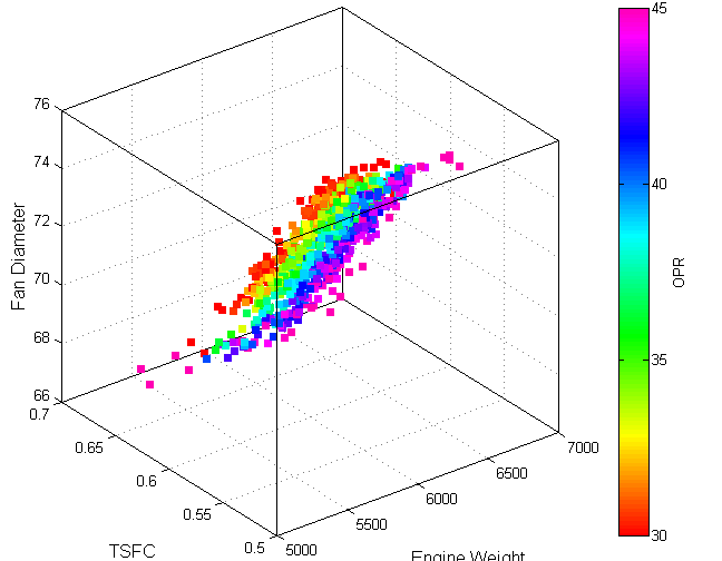
One is 3D plot for the first three coordinates with the size of points as the four value. But it is not that easy to see the trend in the data.
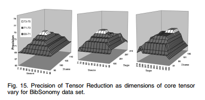
Another is using a series of 3D plot, each of which is with a coordinate fixed.

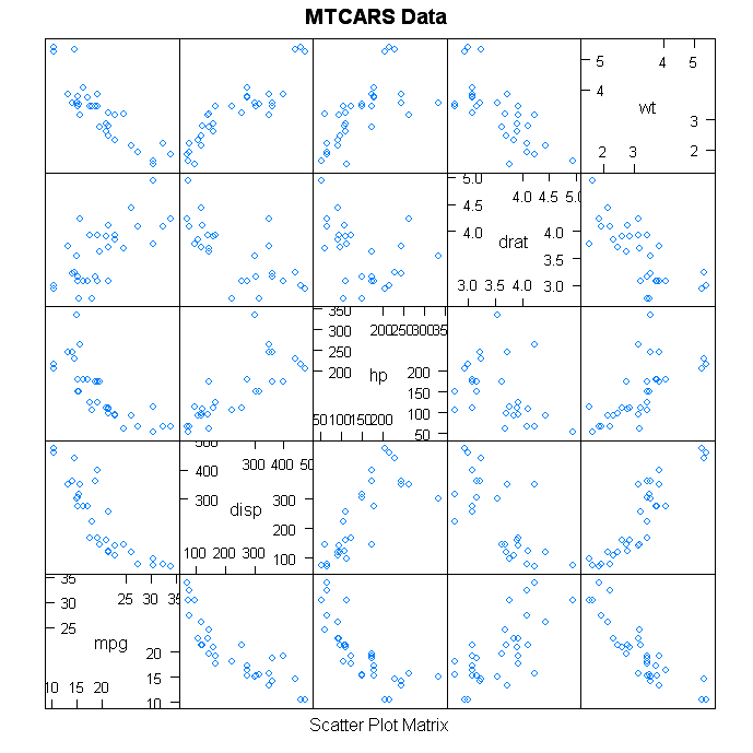
Another one may be a socalled "trellis graphs" in lattice of R. Not sur eif it is for this purpose but it seems so.


