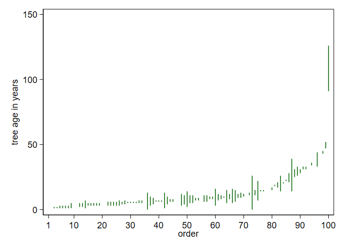
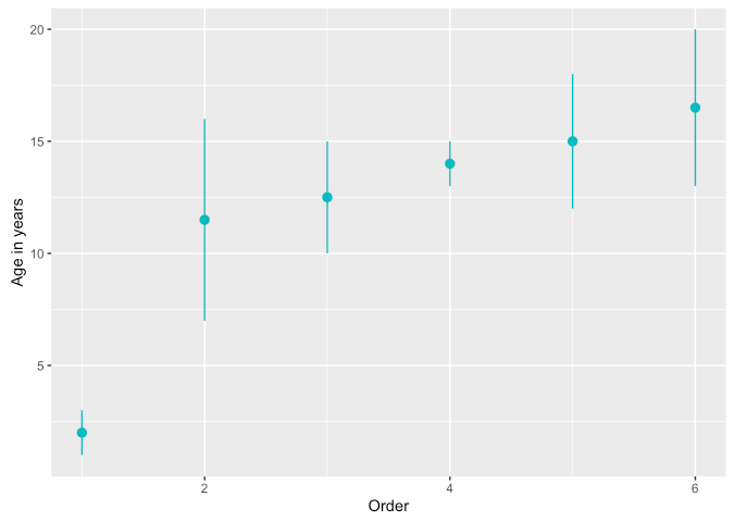
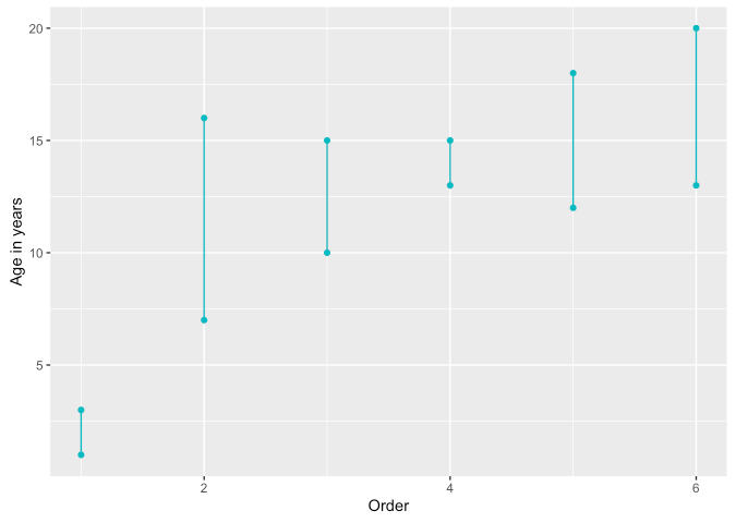
I have a dataset, containing some trees and the estimated upper and lower bounds of their ages. For example, tree #1 is 10~15 years old, and tree #2 is 13~20 years old, etc. I want to visualize the data.
I know that I can calculate the mean values of the bounds and plot a histogram. However, the plot would be more useful if the upper and lower bounds are also presented, since it shows the uncertainty of our estimations. How should I do that? Or is this even possible or reasonable?
My original thought is that the x-axis should be the ages and the y-axis should be the number of trees, which is the same as the histogram, but I'm not whether using these axes are possible or practical.
The followings are some samples from the dataset (unrelated columns are omitted):
| Tree ID | Estimated ages (year) (lower bound) | Estimated ages (year) (upper bound) |
|---|---|---|
| 1 | 10 | 15 |
| 2 | 13 | 20 |
| 3 | 1 | 3 |
| 4 | 7 | 16 |
| 5 | 13 | 15 |
| 6 | 12 | 18 |


