I would like to suggest that the important thing is to develop a physically realistic, practically useful model of energy cost. That will work better to detect changes in costs than any visualization of the raw data can accomplish. By comparing this to the solution offered on SO, we have a very nice case study in the difference between fitting a curve to data and performing a meaningful statistical analysis.
(This suggestion is based on having fit such a model to my own household usage a decade ago and applying it to track changes during that period. Note that once the model is fit, it can easily be calculated in a spreadsheet for the purpose of tracking changes, so we should not feel limited by the (in)capabilities of spreadsheet software.)
For these data, such a physically plausible model produces a substantially different picture of energy costs and usage patterns than a simple alternative model (a quadratic least-squares fit of daily usage against monthly mean temperature). Consequently, the simpler model cannot be considered a reliable tool for understanding, predicting, or comparing energy use patterns.
Analysis
Newton's Law of Cooling says that, to a good approximation, the cost of heating (during a unit of time) should be directly proportional to the difference between the outside temperature $t$ and the inside temperature $t_0$. Let that constant of proportionality be $-\alpha$. The cost of cooling also should be proportional to that temperature difference, with a similar--but not necessarily identical--constant of proportionality $\beta$. (Each of these is determined by the insulating capability of the house as well as the efficiencies of the heating and cooling systems.)
Estimating $\alpha$ and $\beta$ (which are expressed as kilowatts (or dollars) per degree per unit time) are among the most important things that can be accomplished, because they enable us to predict future costs, as well as measure the efficiencies of the house and its energy systems.
Because these data are total electricity usage, they include non-heating costs such as lighting, cooking, computing, and entertainment. Also of interest is an estimate of this average base energy usage (per unit time), which I will call $\gamma$: it provides a floor on how much energy can be saved and enables predictions of future costs when efficiency improvements of known magnitude are made. (For instance, after four years I replaced a furnace by one claimed to be 30% more efficient--and indeed it was exactly that.)
Finally, as a (gross) approximation I will assume the house is maintained at a nearly constant temperature $t_0$ throughout the year. (In my personal model I assume two temperatures, $t_0 \le t_1$, for winter and summer respectively--but there aren't yet enough data in this example to estimate both of them reliably and they would be pretty close anyway.) Knowing this value helps one evaluate the consequences of maintaining the house at a slightly different temperature, which is one important energy-saving option.
The data present a singularly important and interesting complication: they reflect total costs during periods when outside temperatures fluctuate--and they fluctuate a lot, usually about one-quarter of their annual range each month. As we will see, this creates a substantial difference between the correct underlying instantaneous model just described and the values of the monthly totals. The effect is especially pronounced in the in-between months, where both (or neither) heating and cooling take place. Any model that does not account for this variation would mistakenly "think" energy costs should be at the base rate $\gamma$ during any month with an average temperature of $t_0$, but the reality is far different.
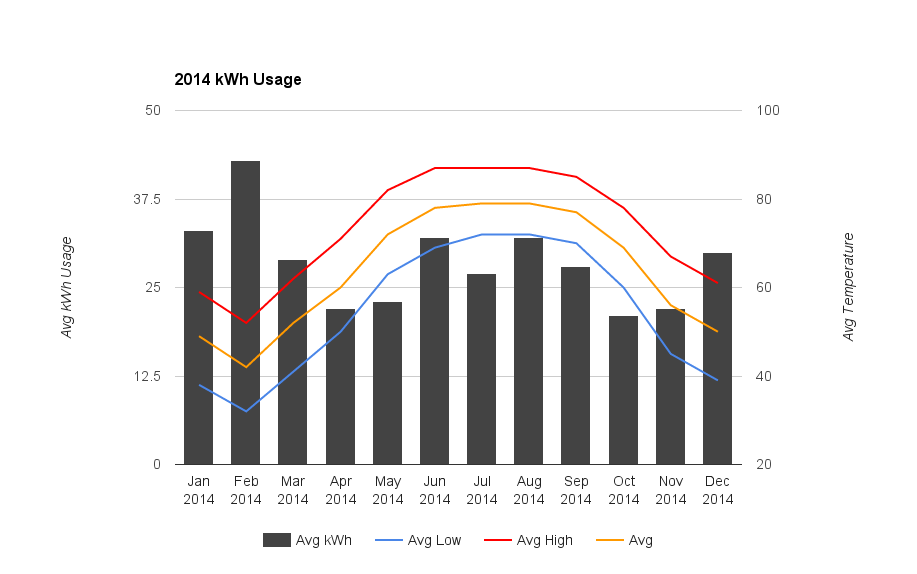
We don't (readily) have detailed information about the monthly temperature fluctuations apart from their ranges. I propose handling that with an approach that is practical, but a tiny bit inconsistent. Except at the extreme temperatures, each month will usually experience gradual increases or decreases in temperature. This means we can take the distribution to be approximately uniform. When the range of a uniform variable has length $L$, that variable has a standard deviation of $s = L/\sqrt{6}$. I use this relationship to convert the ranges (from Avg. Low to Avg. High) to standard deviations. But then, essentially to obtain a nicely behaved model, I will downweight the variation at the ends of these ranges by using Normal distributions (with these estimated SDs and means given by Avg. Temp).
Finally, we must standardize the data to a common unit time. Although that's already present in the Daily kWh Avg. variable, it lacks precision, so let's instead divide the total by the number of days in order to gain back the lost precision.
Thus, the model of unit-time cooling costs $Y$ at an outdoor temperature of $t$ is
$$y(t) = \gamma + \alpha(t-t_0)I(t\lt t_0) + \beta(t-t_0)I(t\gt t_0) + \varepsilon(t)$$
where $I$ is the indicator function and $\varepsilon$ represents everything not otherwise explicitly captured in this model. It has four parameters to estimate: $\alpha,\beta,\gamma$, and $t_0$. (If you're really sure of $t_0$ you could fix its value rather than estimating it.)
The reported total costs during a time period $x_0$ to $x_1$ when the temperature $t(x)$ varies with time $x$ will therefore be
$$\eqalign{
&\text{Cost}(x_0,x_1) = \int_{x_0}^{x_1} y(t)dt \\
&=\int_{x_0}^{x_1} \left(\gamma + \alpha(t(x)-t_0)I(t(x)\lt t_0) + \beta(t(x)-t_0)I(t(x)\gt t_0) + \varepsilon(t(x))\right) t^\prime(x) dx.
}$$
If the model is any good at all, the fluctuations in $\varepsilon(t)$ ought to average to a value $\bar\varepsilon$ close to zero and will appear to randomly change month to month. Approximating the fluctuations in $t(x)$ with a Normal distribution of mean $\bar{t}$ (the monthly average) and standard deviation $s(\bar t)$ (as previously given from the monthly range) and doing the integrals yields
$$\bar{y}(\bar{t}) = \gamma + (\beta-\alpha)s(\bar t)^2 \phi_s(\bar t-t_0) + (\bar{t}-t_0)\left(\beta + (\alpha-\beta)\Phi_s(t_0 - \bar{t})\right) + \bar\varepsilon(\bar{t}).$$
In this formula, $\Phi_s$ is the cumulative distribution of a Normal variate of zero mean and standard deviation $s(\bar t)$; $\phi$ is its density.
Model fitting
This model, although expressing a nonlinear relationship between costs and temperature, is nevertheless linear in the variables $\alpha,\beta,$ and $\gamma$. However, since it is nonlinear in $t_0$, and $t_0$ is not known, we need a nonlinear fitting procedure. To illustrate, I simply dumped it into a likelihood maximizer (using R for the computation), assuming the $\bar\varepsilon$ are independent and identically distributed, with normal distributions of mean zero and common standard deviation $\sigma$.
For these data, the estimates are
$$(\hat\alpha,\hat\beta,\hat\gamma,\hat {t_0}, \hat\sigma) = (-1.489, 1.371, 10.2, 63.4, 1.80).$$
This means:
The cost to heat is approximately $1.49$ kWh/day/degree F.
The cost to cool is approximately $1.37$ kWh/day/degree F. Cooling is a little more efficient.
The base (non-heating/cooling) energy usage is $10.2$ kWh/day. (This number is fairly uncertain; additional data will help pin it down better.)
The house is maintained at a temperature near $63.4$ degrees F.
The other variations not explicitly accounted for in the model have a standard deviation of $1.80$ kWh/day.
Confidence intervals and other quantitative expressions of uncertainty in these estimates can be obtained in standard ways with the maximum likelihood machinery.
Visualization
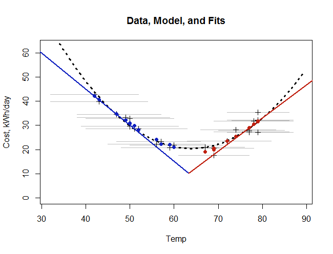
To illustrate this model, the following figure plots the data, the underlying model, the fit to the monthly averages, and a simple least-squares quadratic fit.

The monthly data are shown as dark crosses. The horizontal gray lines on which they lie show the monthly temperature ranges. Our underlying model, reflecting Newton's law, is shown by the red and blue line segments meeting at a temperature of $t_0$. Our fit to the data is not a curve, because it depends on the temperature ranges. It is shown therefore as individual solid blue and red points. (Nevertheless, because the monthly ranges do not vary a lot, these points do seem to trace out a curve--almost the same as the dashed quadratic curve.) Finally, the dashed curve is the quadratic least squares fit (to the dark crosses).
Notice how much the fits depart from the underlying (instantaneous) model, especially in the middle temperatures! This is the effect of monthly averaging. (Think of the heights of the red and blue lines being "smeared" across each horizontal gray segment. At extreme temperatures everything is centered at the lines, but at middle temperatures the two sides of the "V" get averaged together, reflecting the need for heating at some times and cooling at other times during the month.)
Model comparison
The two fits--the one painstakingly developed here and the simple, easy, quadratic fit--agree closely both with each other and with the data points. The quadratic fit is not quite as good, but it's still decent: its adjusted mean residual (for three parameters) is $2.07$ kWh/day, whereas the adjusted mean residual of the Newton's law model (for four parameters) is $1.97$ kWh/day, about 5% lower. If all you want to do is plot a curve through the data points, then the simplicity and relative fidelity of the quadratic fit would recommend it.
However, the quadratic fit is utterly useless for learning what's going on! Its formula,
$$\bar y(\bar t) = 219.95 - 6.241 \bar t + 0.04879 (\bar t)^2,$$
reveals nothing of use directly. In all fairness, we could analyze it a little:
This is a parabola with vertex at $\hat t_0 = 6.241/(2\times 0.04879) = 64.0$ degrees F. We could take this as an estimate of the constant house temperature. It does not differ significantly from our first estimate of $63.4$ degrees. However, the predicted cost at this temperature is $219.95 - 6.241(63.4) + 0.04879(63.4)^2 = 20.4$ kWh/day. This is twice the base energy usage fit with Newton's Law.
The marginal cost of heating or cooling is obtained from the absolute value of the derivative, $\bar{y}^\prime(\bar t) = -6.241 + 2(0.04879)\bar{t}$. For example, using this formula we would estimate the cost of heating a house when the outside temperature is $90$ degrees as $-6.241 + 2(0.04879)(90) = 2.54$ kWh/day/degree F. This is twice the value estimated with Newton's Law.
Similarly, the cost to heat the house at an outdoor temperature of $32$ degrees would be estimated as $|-6.241 + 2(0.04879)(32)| = 3.12$ kWh/day/degree F. This is more than twice the value estimated with Newton's Law.
At the middle temperatures, the quadratic fit errs in the other direction. Indeed, at its vertex in the $60$ to $68$ degree range it predicts nearly zero marginal heating or cooling costs, even though this mean temperature comprises days as cool as $50$ degrees and as warm as $78$ degrees. (Few people reading this post will still have their heat off at $50$ degrees (=$10$ degrees C)!)
In brief, although it looks almost as good in the visualization, the quadratic fit grossly errs in estimating fundamental quantities of interest related to energy usage. Its use for evaluating changes in usage is therefore problematic and should be discouraged.
Computation
This R code performed all the computing and plotting. It can readily be adapted to similar datasets.
#
# Read and process the raw data.
#
x <- read.csv("F:/temp/energy.csv")
x$Daily <- x$Usage / x$Length
x <- x[order(x$Temp), ]
#pairs(x)
#
# Fit a quadratic curve.
#
fit.quadratic <- lm(Daily ~ Temp+I(Temp^2), data=x)
# par(mfrow=c(2,2))
# plot(fit.quadratic)
# par(mfrow=c(1,1))
#
# Fit a simple but realistic heating-cooling model with maximum likelihood.
#
response <- function(theta, x, s) {
  alpha <- theta[1]; beta <- theta[2]; gamma <- theta[3]; t.0 <- theta[4]
  x <- x - t.0
  gamma + (beta-alpha)*s^2*dnorm(x, 0, s) +  x*(beta + (alpha-beta)*pnorm(-x, 0, s))
}
log.L <- function(theta, y, x, s) {
  #   theta = (alpha, beta, gamma, t.0, sigma)
  #   x = time
  #   s = estimated SD
  #   y = response
  y.hat <- response(theta, x, s)
  sigma <- theta[5]
  sum((((y - y.hat) / sigma) ^2 + log(2 * pi * sigma^2))/2)
}
theta <- c(alpha=-1, beta=5/4, gamma=20, t.0=65, sigma=2) # Initial guess
x$Spread <- (x$Temp.high - x$Temp.low)/sqrt(6)            # Uniform estimate
fit <- nlm(log.L, theta, y=x$Daily, x=x$Temp, x$Spread)
names(fit$estimate) <- names(theta)
#$
# Set up for plotting.
#
i.pad <- 10
plot(range(x$Temp)+c(-i.pad,i.pad), c(0, max(x$Daily)+20), type="n",
     xlab="Temp", ylab="Cost, kWh/day",
     main="Data, Model, and Fits")
#
# Plot the data.
#
l <- matrix(mapply(function(l,r,h) {c(l,h,r,h,NA,NA)},
                   x$Temp.low, x$Temp.high, x$Daily), 2)
lines(l[1,], l[2,], col="Gray")
points(x$Temp, x$Daily, type="p", pch=3)
#
# Draw the models.
#
x0 <- seq(min(x$Temp)-i.pad, max(x$Temp)+i.pad, length.out=401)
lines(x0, cbind(1, x0, x0^2) %*% coef(fit.quadratic), lwd=3, lty=3)
#curve(response(fit$estimate, x, 0), add=TRUE, lwd=2, lty=1)
t.0 <- fit$estimate["t.0"]
alpha <- fit$estimate["alpha"]
beta <- fit$estimate["beta"]
gamma <- fit$estimate["gamma"]
cool <- "#1020c0"; heat <- "#c02010"
lines(c(t.0, 0), gamma + c(0, -alpha*t.0), lwd=2, lty=1, col=cool)
lines(c(t.0, 100), gamma + c(0, beta*(100-t.0)), lwd=2, lty=1, col=heat)
#
# Display the fit.
#
pred <- response(fit$estimate, x$Temp, x$Spread)
points(x$Temp, pred, pch=16, cex=1, col=ifelse(x$Temp < t.0, cool, heat))
#lines(lowess(x$Temp, pred, f=1/4))
#
# Estimate the residual standard deviations.
#
residuals <- x$Daily - pred
sqrt(sum(residuals^2) / (length(residuals) - 4))
sqrt(sum(resid(fit.quadratic)^2) / (length(residuals) - 3))


