I have a very strange problem. I don't think it's a bug because I've tried it a few ways with similar results.
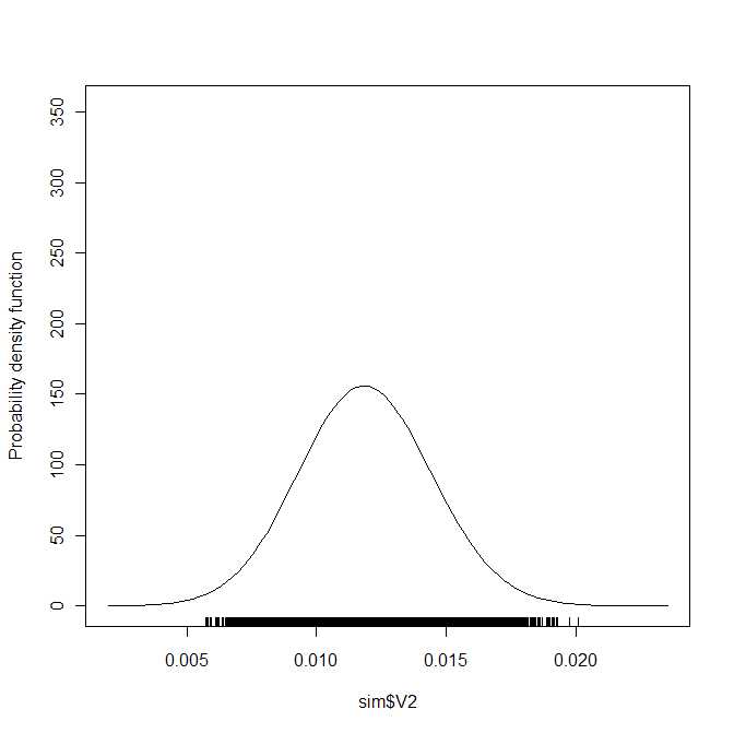
I have three sets of data that are all related to each other. When I make density plots of them individually (with the sm package), like so:
sm.density(sim$V2)
I get this curve:

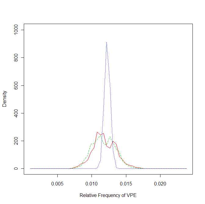
And the other two curves look very similar. But! When I plot them all onto one graph for comparison, I get very different results:

The first curve I showed you has turned into one of those shorter, jagged curves in this plot. So, I can't figure out how the first smooth curve turns into something so jagged, with apparently an extra peak appearing as well.
Does anyone have any idea what might account for this? Could there be some difference in how the density is being calculated?
