I have a large data set: over 100,000 data points, each with 60 dimensions. I want to display the data in 2D to visibly maximize the separation between classes, which I know for each point. I asked a similar question before, and Linear Discriminant Analysis (LDA) was suggested -- a solid answer.
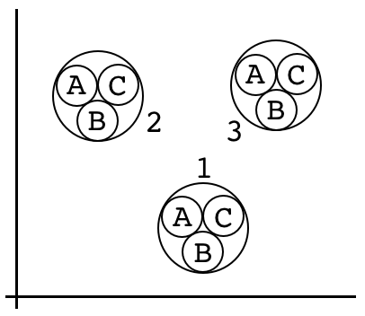
Now, besides knowing that each data point falls into a certain class (say 1/2/3), each of these data points also has a second type of classification (say A/B/C). I would like to visualize how well these points cluster by one class, and then see how similar the substructures of the clusters are when each cluster is broken up based on the other class. For example, if we choose the numerical class for the "outer" clustering and the alphabetical class for the "inner" clustering, I would want to find the 2D representation of the data which makes it look maximally like this:

Bonus points if we can find a way to guarantee that the A/B/C subclasses are all oriented the same way with respect to each other, for each main class. Note, however, that I would also expect to be able to perform the clustering in the opposite order (with the alphabetical class forming the "outer" clusters and the numerical class forming the "inner" clusters) because the classifications are independent.
The problem with LDA in this context is that, when considering only one class at a time, it maximizes the between-class separation at the expense of potentially blurring the boundaries of the other class in the resulting visualization, because it doesn't know about that the other class exists. So, when I visualize LDA on one classification, the distinctions for the second classification are not as clear as they could be. However, if I do a 9-way LDA (with each class being a combination of the two classifications, like 1A), I see 9 clusters, but they are not grouped together in any easily visualizable way; this is expected, however, because the classifications are independent (not to mention the fact that there are now 8 LD dimensions).
I think about it this way. Say I start at center of the figure above. If I know which instance of the numerical class I want, I know which direction to move in: down for 1, up-left for 2, up-right for 3. The goal is to show that, no matter which numerical cluster I went to, I have the same directional options if I want to then move from that cluster's center to an alphabetical cluster. In each case, it's up-left for A, down for B, and up-right for C. And of course I would expect the same to be true if the classifications were performed in reverse (although this would require a different figure).
Are there any standard techniques for doing this kind of hierarchical cluster visualization? If not, any advice on how to get started?
UPDATE:
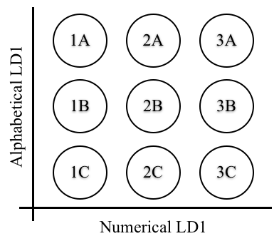
The best solution I've found so far is to perform two separate LDAs: one for the alphabetical class and one for the numerical class. Then I can visualize the first dimension of each in the same graph, like this:

While this gives me something like the picture I was looking for, I'm not sure that it proves what I set out to prove, which is that the data represent these two types of classifications independently. While this graph makes it look like the data bear this out, to make the argument robust I'll have to show that the alphabetical LD and the numerical LD are uncorrelated.
