I am looking for information about best practices for presenting the results of longitudinal analyses.
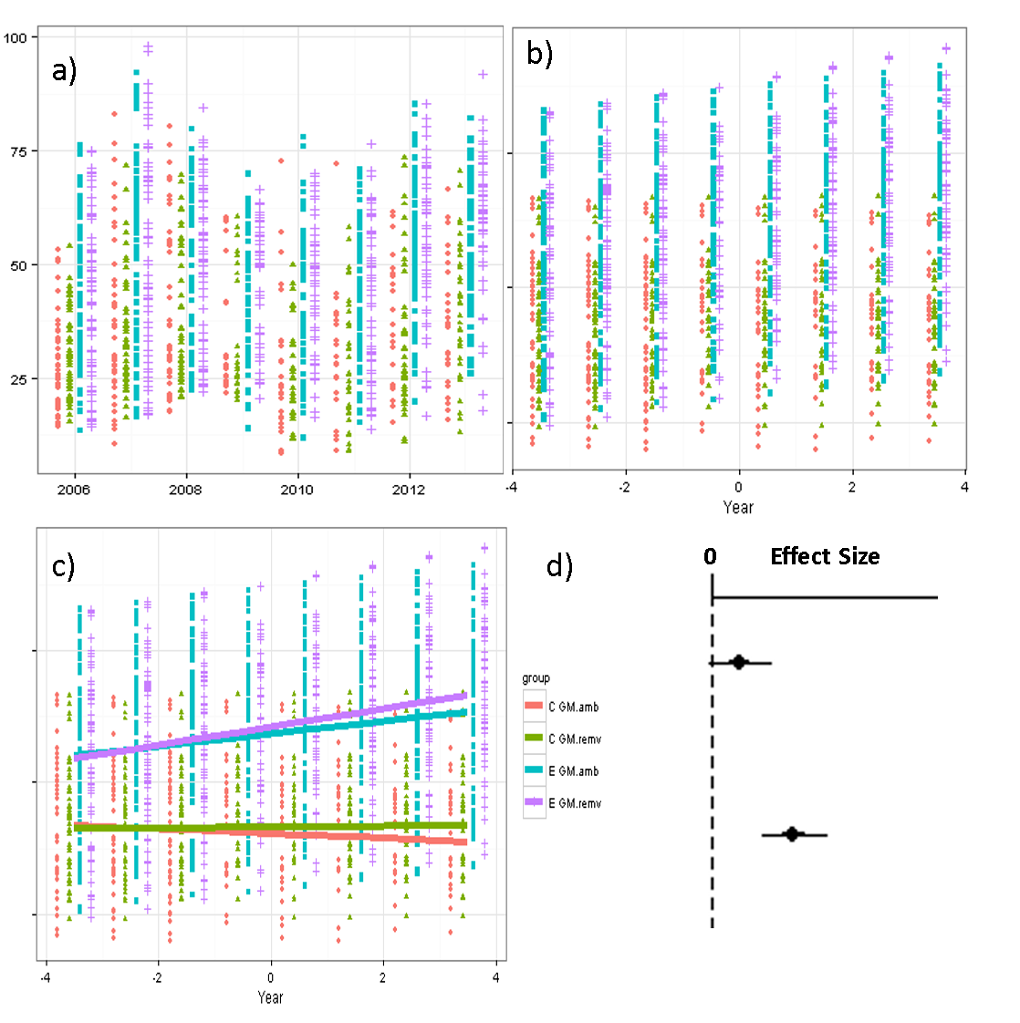
I am presenting results from an 8 year longitudinal experiment with two crossed treatments (4 treatment combos total). There was considerable variation in our response variable between years (panel a in figure) - a cycle like pattern, in fact - that I can smooth out by using "year" as a random effect (panel b).
One treatment resulted in immediate differences (blue and purple points >> green and red points the 1st year of study), and continued divergence between treatment groups (blue and purple lines generally increase, green and red lines generally decrease). The 2nd treatment appears to have also resulted in changes over time (purple > red line, green > red line). This second treatment is what we are particularly interested highlighting.
The overall model in R is something like this
response ~ time + trtAB + trt12 + time*trtAB + time*trt12 + (1|year) + (1|ID)
I am wondering how best to visualize the results from this analysis in a way that focuses attention on the overall divergence between the different treatments. Ideally I'd like to present the full regression results graphically as in panel c but with prediction intervals. However, the initial difference between treatments that occurred in 2006 due to one set of treatments makes the emerging difference between the other set of treatments appear diminutive, when in fact the slopes of the lines are highly significant.
I typically present a coefficient plot (panel d) which shows the magnitude of the time*treatment coefficient. While this is intuitive to me, I have trouble succinctly explaining it to others (and writing about it in my dissertation).
I'm considering whether I should use the delta method to combine the time parameters to give me the overall magnitude of change for each treatment combination, eg
red slope    = time
green slope  = time + time*trt12
blue slope   = time + time*trtAB
purple slope = time + time*trtAB + time*trt12
I'm worried this might come across too much like I'm massaging the results.


