5
$\begingroup$

enter image description here

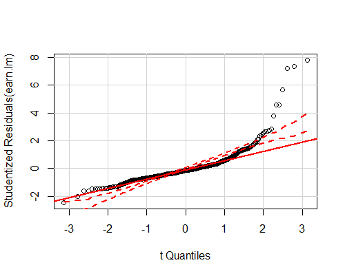
Based on only the above plot, what comments would you make about whether the OLS assumptions are satisfied? In particular homoskedasticity, normality. I just want to know if I'm right. It seems to me that:

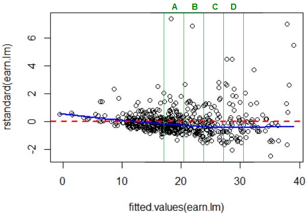
  • There seems to be some heteroskedasticity present, since the variance seems to increase with higher fitted values.
  • There are quite a few large outliers, e.g. those around fitted value 20. So the kurtosis might be higher than that of a normal distribution
  • Overall the violation of these assumptions does not seem to be extreme.

Is that correct? And are there any other specific observations that can be made which I missed?

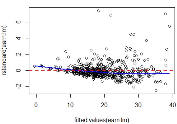
Finally, is it correct that the below plot confirms that there is indeed heteroskedasticity, or what do you make of it?

enter image description here

$\endgroup$
3
  • $\begingroup$ Clear heteroskedasticity and skewness in first plot; possible nonlinear relationship. What are the data? The QQ plot doesn't necessarily indicate hetero (it's for judging normality, but when you have hetero and possible lack of fit, there's no point trying to assess normality that way) $\endgroup$
    – Glen_b
    Commented Nov 2, 2015 at 0:00
  • $\begingroup$ @Glen_b Thank you. How exactly can you observe skewness from the first plot? Is it because there are more datapoints on the right? So the data is right skewed? Also, I was wondering if the blue smooth line (first above 0, then below) has any direct interpretation? The data is earnings against several factors such as height, weight, number of siblings etc. $\endgroup$
    – rbm
    Commented Nov 2, 2015 at 10:51
  • $\begingroup$ It's not the data that are right skew, but the residuals (well, the data may be right skew as well, but that's not relevant to what we're trying to do). It's not so much "more data points on the right" (there may be fewer), but the relative distance from the mean. See the pictures in my answer. $\endgroup$
    – Glen_b
    Commented Nov 2, 2015 at 11:40

1 Answer 1

2
$\begingroup$

In the first plot we can see

i) some nonlinearity in the local mean of the residuals (you don't really need the blue curve to tell you that - compare the trend in the left half with the trend in the right half and you can see it changes from downsloping to nearly flat even without the smooth). Aside from saying it's some kind of smooth approximation of the local movement in the mean, I can't interpret the blue curve precisely because you didn't say how it was calculated. It might have been created in any of several ways -- it's up to you to tell us what you did, not the other way around.

ii) clear heteroskedasticity, because the spread increases as we move from low fitted values to high ones.

iii) clear skewness in the conditional distribution of the residuals. Consider each of the green "slices" below (A, B, C and D):

enter image description here

Take slice "A" for example. The blue line marks (approximately) the mean:

enter image description here

We can see there's much more of a tail out to the right in slice A. We see the same in slices B, C and D ...

$\endgroup$
2
  • $\begingroup$ The blue line is a lowess line (locally weighted smooth). Thanks a lot for the detailed answer! $\endgroup$
    – rbm
    Commented Nov 2, 2015 at 12:23
  • $\begingroup$ @rbm That information should be edited in to your question. $\endgroup$
    – Glen_b
    Commented Nov 2, 2015 at 23:17

Your Answer

By clicking “Post Your Answer”, you agree to our terms of service and acknowledge you have read our privacy policy.

Not the answer you're looking for? Browse other questions tagged or ask your own question.