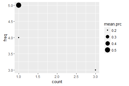
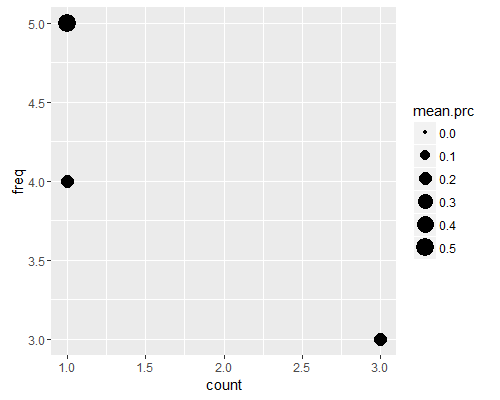
I have a dataset of a million documents. I took the frequency distribution of the documents based on the number of words in it. I also have the precision results for each document. Now I want to show the average precision per frequency. How do I plot this? What kind of diagram can incorporate boht the frequncy and the precision for each count
My dataset sample
name, number of words,precision
doc1, 3, 0.3
dco2,4,0.2
doc3,3,0.1
doc4,3,0.2
doc5,5,0.5
Now what I need to plot is
freq., count, mean prec.
3, 3,0.2
4,1,0.2
5,1,0.5


