1
$\begingroup$

I am implementing a recommendation engine tool used by several users who are supplying feedback in the form of thumbs up (+1) or thumbs down (-1) for each recommendation. The recommendation engine uses 3 different models independently to suggest recommendations (i.e each model suggests its own unique recommendations). The feedback data is in a pandas dataframe df shown below.

df.head()
recommendation_id    feedback    model      x1      x2
0978hb34             1           model_1    23    0.89
0khb3459             1           model_2    10    0.67
098uf3n4            -1           model_2    89    0.23
03kjh8ef             1           model_3    16    0.67
...                  ...         ...        ...   ...

I want to visualize the relationships between feedback and the three features model, x1 and x2. I can't think of a way to do this in a statistically correct / intuitive way; what type of visualization would capture most information in this data set in a correct and intuitive way? I don't mind generating several plots (it doesn't all have to be in one plot), so long as they are easy to understand.

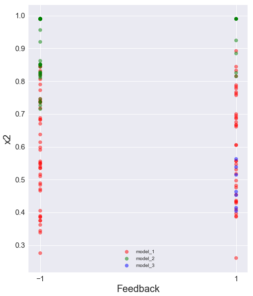
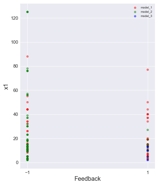
So far what I have done is to create the scatter plots below, but they aren't very aesthetic and don't give much insight.

enter image description here

enter image description here

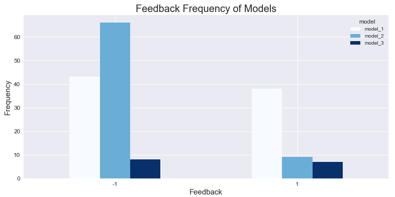
EDIT: One nice bar-plot visualization I have generated did give useful insight into the 3 models, shown below. It just counts the absolute number of times feedback was given for each model.

enter image description here

$\endgroup$
2
  • $\begingroup$ It would be helpful if you can describe the data itself and the desired goal of the visualization in a bit more detail. From what you posted here I guess x1 and x2 are continuous and my first suggestion would be boxplots separated by model and/or feedback $\endgroup$ Commented Jan 10, 2018 at 21:09
  • $\begingroup$ @MaartenPunt given the sensitivity of the data I am afraid I can't say exactly what x1 and x2 represent, but yes they are both continuous and with ranges [10,160] and [0,1] respectively. The goal of the visualization would be to understand how each model is performing with respect to features x1 and x2. $\endgroup$
    – PyRsquared
    Commented Jan 11, 2018 at 8:45

1 Answer 1

2
$\begingroup$

So if I understand your question correctly you want to see what kind of feedback you get depending on 1) which model you use, and 2) the feature level of either x1 or x2.

I think in that case I would use some kind of bar graph that plots the number of times of positive (negative) feedback for subranges of the feature level and model type, that is plot: how often does model 1 get positive feedback in range 10-40 for x1, how often in range 40-70 and so forth. Kind of a combination of a standard bar graph with a histogram.

You may also want to adjust the amount of positive and negative feedback to percentages, or even stack them depending on your precise question.

$\endgroup$

Your Answer

By clicking “Post Your Answer”, you agree to our terms of service and acknowledge you have read our privacy policy.

Not the answer you're looking for? Browse other questions tagged or ask your own question.