I have analyzed some data on vegetation change as a function of change in soil parameters. I compared a dataset from 2001 with a dataset from 2018 (fully balanced).
To investigate the change in vegetation (expressed as Bray-Curtis dissimilarity indice) as a function of change in soil parameters (just 2018 minus 2001 value) i ran several models. When comparing using AIC I ended up with a model of 9 soil parameters explaning vegetation change.
For visualizing the effect of different soil parameters i wanted to keep it simple and use a forest plot, but it turned out to be paradoxal. I saw in several ecological papers how researchers presented the results of their models using forest plots and found it an elegant and seemingly simple way to present results. I needed to scale my covariates however, because as R stated: "the predictor variables are on very different scales". The model looks fine, but how do interpret the results of my model with scaled variables?
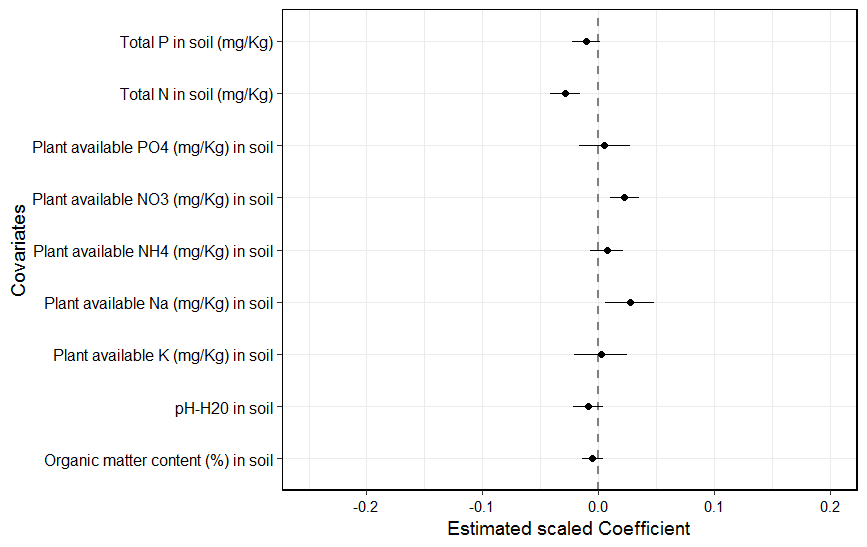
Below is the result of the linear mixed model using a forest plot to visualize results.
Model: Vegetation change expressed as dissimilarity commposition between 2001 and 2018~change in total N + change in total P + change in PO4 (etc.) + (1|block/plot) +(1|Year)

