I am interested in drawing graphs to show the distribution of letters throughout a word. This would be in the form of a graph with the x-axis being a continuous scale from 0 to 1 and the y-axis being frequencies. For example I would expect the letter 'Q' to have a distribution that is higher for small x and decreases as x increases since words are more likely to begin with 'Q' than end with it.
I have a dataset of 1 million words that I've mined from famous novels in R and I have a list for each letter of every position it appeared in as a proportion of the words it was in e.g. 3/8 if it was the third letter of an eight letter word.
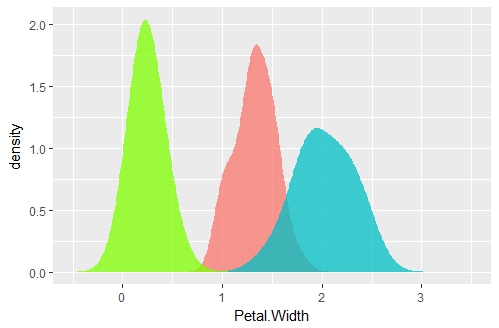
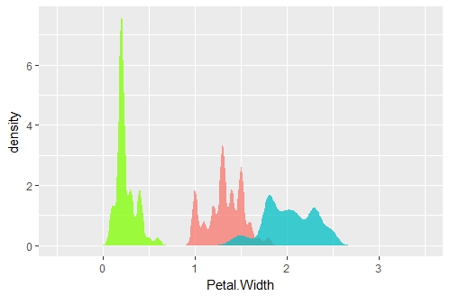
I am unsure of how to convert this data into a smooth curve showing their distributions. I have ideas that are accurate (just counting the number of occurrences of each value) but don't look smooth (since they'll be a massive jump at x = 0.5 and due to the influence of common 2-letter words). I also have ideas that are smooth (placing down normal distribution curves at each point and then summing) but don't feel accurate or valid in any sense. What method would be the happy medium of this?


