1
$\begingroup$

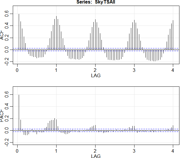
I have the below stl() (with s.window="periodic") decomposition plot of a time series which I would like to analyse and model. The time series is hourly with data from Dec 2017 up until 17 Sep 2018. I am not very sure on how to interpret the trend. Does it mean that my data has no overall trend? What does the "wiggly" trend line ,like so, indicate?

stl_decomp

Apart from this, I plotted the ACF and the PACF plots for the series (without differencing or transforming) and I have the below plot and I cannot seem to understand what the the ACF plot is telling me.

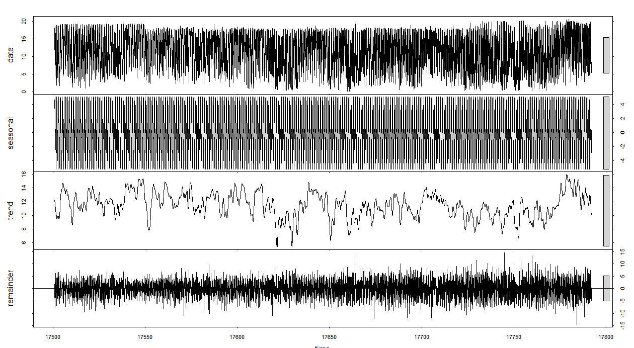
acf_plot

$\endgroup$
1
  • $\begingroup$ stl decomposes your time series into it's components so that you can see which component causes the most variability (the smaller the bar on the right the higher the variability). The ACF and PACF plots are telling you that you have a seasonal trend present in your data $\endgroup$ Commented Sep 26, 2018 at 11:26

1 Answer 1

0
$\begingroup$

The ACF/PACF plots are typically plotted when seasonality (if present) is removed. As you can see in the ACF plot, at time t, you have stronger dependence with the previous times (t-s), (t-2*s), etc., where s is the length of the seasonality. Notice how that effect is missing in the PACF plot - because it is accounted for in the first peak, and the few values instantly preceding the current value (the zeroeth peak, so to speak). I'm pretty sure that if you split the PACF plot into tiles of length s and summed them, you would get something very similar to the first tile of the ACF plot.

$\endgroup$

Your Answer

By clicking “Post Your Answer”, you agree to our terms of service and acknowledge you have read our privacy policy.

Not the answer you're looking for? Browse other questions tagged or ask your own question.