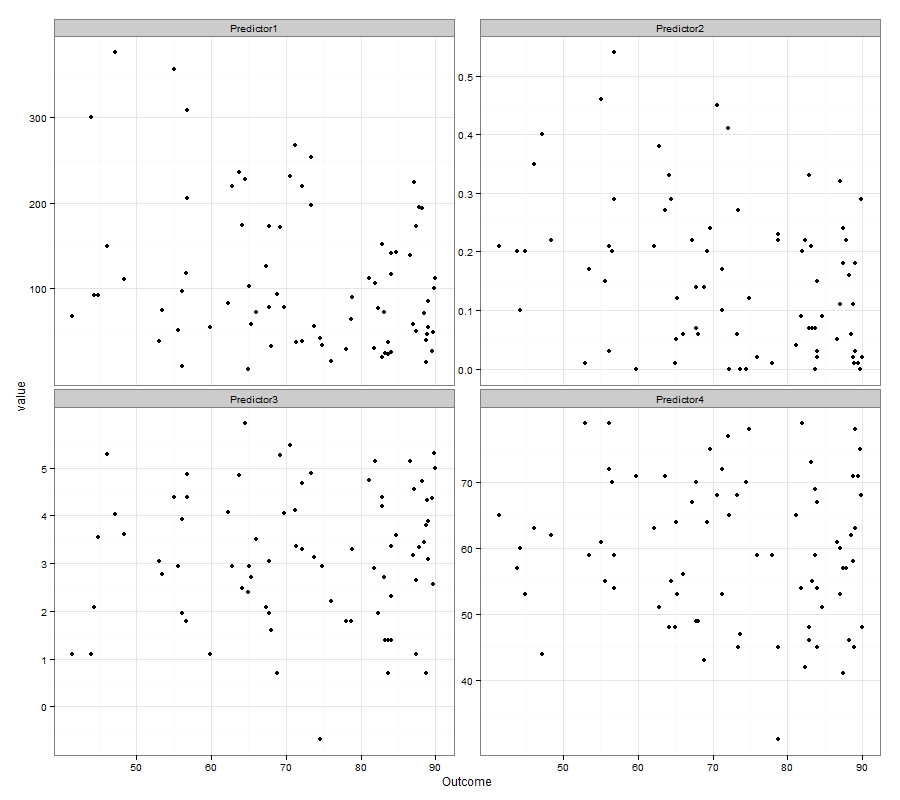
What you are seeing is called "Regression towards the Mean" and is completely expected. Any time that there is variability in the data (and yours looks like it has a bunch) then the prediction values will on average be between the overall mean and the observed values. The plot you created, of the outcome vs the predicted values is not commonly done, for the reasons that you are seeing, it tends to confuse more than enlighten. It is more common to plot the predicted values against the residuals as this plot will show more randomness if the model is reasonable.
Edit to address comment below
csgillespie's example has been criticized for only including 1 predictor when the original question included 4. Here is some quick R code that can be run to show the same patterns with 4 predictors:
# simulated data, no relationship
df1 <- data.frame(y=rnorm(100), x1=rnorm(100), x2=rnorm(100),
        x3=rnorm(100), x4=rnorm(100))

fit1 <- lm( y ~ ., data=df1 )
#plot(df1$y, fitted(fit1), asp=1)
    scatter.smooth(df1$y, fitted(fit1), asp=1)
abline(0,1)
abline(h=mean(fitted(fit1)), col='lightgrey')
plot(df1$y, resid(fit1))
abline(h=0)

plot(fitted(fit1), resid(fit1))
abline(h=0)

# simulated data, relationship
library(MASS)
df2 <- as.data.frame( mvrnorm(100, mu=1:5, Sigma= matrix(.7,5,5)+diag(rep(.3,5))))
names(df2) <- c('y','x1','x2','x3','x4')

fit2 <- lm( y ~ ., data=df2 )
#plot(df2$y, fitted(fit2), asp=1)
    scatter.smooth(df2$y, fitted(fit2), asp=1)
abline(0,1)
abline(h=mean(fitted(fit2)), col='lightgrey')
plot(df2$y, resid(fit2))
abline(h=0)

plot(fitted(fit2), resid(fit2))
abline(h=0)


# real data
fit3 <- lm( Murder~Population+Income+Illiteracy+Frost, data=as.data.frame(state.x77))

scatter.smooth( state.x77[,'Murder'], fitted(fit3), asp=1)
abline(0,1)
abline(h=mean(fitted(fit3)), col='lightgrey')
plot(state.x77[,'Murder'], resid(fit3))
abline(h=0)

plot(fitted(fit3), resid(fit3))
abline(h=0)
Notice that the plots look very similar to those in the original question.
Notice also that in the plot of the original outcome vs. the fitted values that the points (and more so their trend) tend to fall between the $y=x$ line and the mean line. This is the idea of regression towards the mean as originally described by Galton See Here. The points are not randomly scattered about the $y=x$ line like the original poster assumed and what would happen without the regression towards the mean, rather they follow a linear trend along a line that represents proportianality between the $y=x$ line and the overall mean line, just as predicted by Galton. The term regression towards the mean (and variants) is sometimes used for other concepts (some closer related to the original than others) as can be seen in the above article, and that may be where some of the confusion comes from.


