4
$\begingroup$

enter image description here

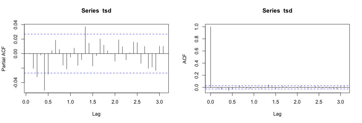
I have converted stock price index time series data into stationary series by differencing once, so $d=1$. I also have removed the seasonal component of the data. I want to develop a model for forecasting future values of SPX. These are PACF and ACF plots obtained. I am not able to determine the values of $p,q$ for ARIMA modeling.

I have read a little about minimum AIC values as well; however, we need a rough estimate of $p,d,q$ to make guesses towards the correct model in that as well.

$\endgroup$
1
  • $\begingroup$ See quant.stackexchange.com/q/1888. It's not surprising that you can't find evidence for autocorrelation in movements of a stock-price index $\endgroup$
    – Scortchi
    Commented Jun 6, 2019 at 23:58

2 Answers 2

6
$\begingroup$

As you know, you look for patterns of (partial) autocorrelation coefficients that are large.

A rough guide to how large is "large" is to pay attention to any coefficient plotted with a spike extending beyond the two bands shown in the charts. (As produced by the stats:::acf.plot function in R, these bands enclose the middle 95% of a standard Normal distribution, implying that if the coefficients were independent -- which they are not -- then a white noise process would have, on average, 95% of its spikes inside the bands.)

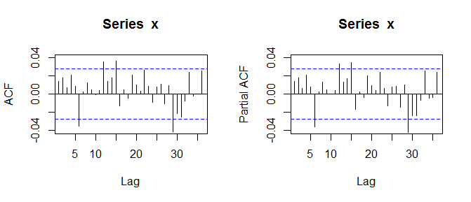
In the original post, both the ACF and PACF exhibited four such large spikes apiece out of 36 (nonzero) lags, but none of the spikes went far beyond the bands; the longest was not even twice as far out. Since the expected number of large spikes is (100%-95%) times 36 = 1.8 per plot, maybe some of these large spikes mean something.

The question is, which of those spikes should you pay any attention to? Although a great deal can be said about this, let's first check to what extent those charts appear to offer any significant evidence of correlation at all. To do so, I generated 500 independent series of Gaussian white noise of length 5000, computed their ACF and PACF functions from lags 1 through 36, and counted how many spikes in each chart fell outside the bands. Here is one such pair of charts. Coincidentally, it exhibits four such spikes in each chart.
Figure

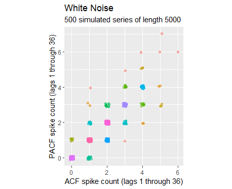
I will summarize all 500 of the simulated series with a scatterplot of those spike counts.
Figure

The points are jittered a little to resolve overlaps. The cluster of light blue dots around $(4,4)$ documents 21 series within the 500 that had four large spikes in each plot. The dots to its right and above document another 13 such series, for a total of 34, or 6.8% of them all. That's a little unusual but not rare. Consequently, we may conclude that four relatively small spikes in each plot does not especially distinguish the series from white noise.

Accordingly, because we have little evidence that any of these spikes means anything, you may elect to proceed as if you have captured all the significant correlation structure in the series through your differencing and removal of seasonality: there is no need to include an autoregressive or a moving average component.

As a double check, if there truly were such components they ought to exhibit themselves as consistently decaying spikes at the shortest lags--but that's not the case in your plots. And, if there were residual seasonality, it would be manifest in a regular series of noticeable spikes at constant intervals, such as every 3, 6, or 12 lags. That's not the case in your plots, either.

$\endgroup$
1
  • $\begingroup$ Thanks, I understand your point. $\endgroup$
    – DeeDee
    Commented Jun 6, 2019 at 23:42
1
$\begingroup$

It appears that you have a sample size in excess of 200 or so . The confidence limits are quite small due to the large sample size thus are of little meaning .

I would say p=0,q=0 ...

since the pacf doesn't suggest decay .. I might guess that the reason for your non-stationarity might be the presence of level shifts or time trends in your data.

OR the need for a seasonal structure .

Only your data knows for sure ..

see Why doesn't ARIMA work on my time series data? for a discussion of how the acf/pacf might be misleading in suggesting the ar/ma structure. misleading is an understatement !

$\endgroup$
6
  • $\begingroup$ The confidence limits suggest a series length around 5000, far exceeding 200! $\endgroup$
    – whuber
    Commented Jun 6, 2019 at 21:10
  • $\begingroup$ I'm sorry had accidentally attached the wrong image. Can you have a look at it again ? $\endgroup$
    – DeeDee
    Commented Jun 6, 2019 at 21:26
  • $\begingroup$ The original image is still available (at least until imgurl removes it through non-use) by inspecting the edit history: link through the red text at "edited ... ago" beneath the question. $\endgroup$
    – whuber
    Commented Jun 6, 2019 at 21:49
  • $\begingroup$ @IrishStat after I made the data stationary and removed the seasonality component from the time series data. This is the plot for the components of the new time series data. photos.app.goo.gl/96HMvSBGtLS6izEt6 Clearly, something is off with the seasonality I don't know the possible explanation. And I don't think there is a trend from the plot. $\endgroup$
    – DeeDee
    Commented Jun 6, 2019 at 22:12
  • $\begingroup$ suggestive of either non-constant parameters over time or non-constant error variance over time . $\endgroup$
    – IrishStat
    Commented Jun 6, 2019 at 22:15

Your Answer

By clicking “Post Your Answer”, you agree to our terms of service and acknowledge you have read our privacy policy.

Not the answer you're looking for? Browse other questions tagged or ask your own question.