7
$\begingroup$

What is the best way to visualize the relationship between an ordinal predictor and a continuous outcome?

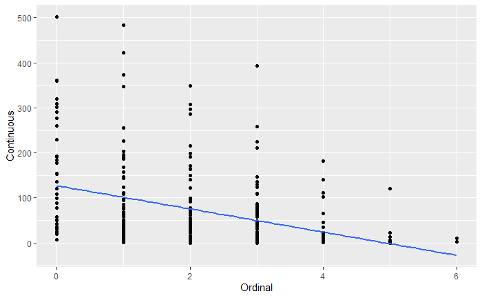
So far I have the below, but I feel like this is lacking...

Enter image description here

The way I modeled it is I treated the ordinal predictor as an interval instead of categorical. If this is not the best way to treat this type of data, I'd appreciate the feedback.

$\endgroup$
1
  • 6
    $\begingroup$ 1. Is there any particular reason to imagine the relationship would be linear? 2. Is there indeed any need to draw any kind of curve or line? Why not simply mark in the means (or any other suitable measure of location) in each category? 3. Can you say more about the continuous outcome? What kind of thing is it? $\endgroup$
    – Glen_b
    Commented Sep 24, 2019 at 8:16

6 Answers 6

5
$\begingroup$

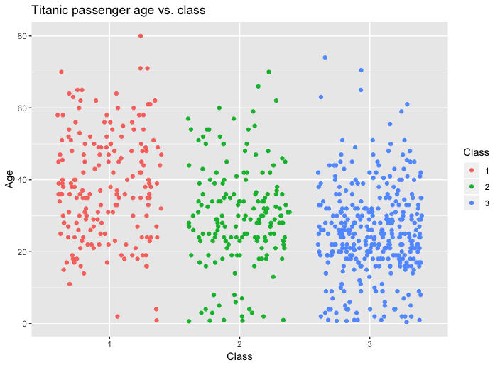
The plot you shown is pretty good. But I think you can improve the data-ink ratio (invented by Edward Tufte) even more by showing all the datapoints. You can do this by adding jitter to the x-axis.

Another improvement is to emphasise that the ordinal variable is categorical and not continuous. You can do this by using a different colour for the different levels.

As an example I have plotted the titanic dataset in R, using the passenger class as an ordinal variable and the passenger age as the continuous variable.

library(tidyverse)
library(ggplot2)
library(titanic)

df <- titanic_train %>% mutate(Class=factor(Pclass))

ggplot(df, aes(Class, Age, color=Class)) +
  geom_jitter(height = 0) + 
  ggtitle("Titanic passenger age vs. class")

enter image description here

$\endgroup$
2
  • 4
    $\begingroup$ Looks like red and green, and I can tell them apart, but many people can't. More crucially: when there is so much jitter it's just distracting. Side-by-side quantile plots would be more informative. $\endgroup$
    – Nick Cox
    Commented Sep 25, 2019 at 11:10
  • 2
    $\begingroup$ Speaking of data/ink ratio.... there's really no need for the color assigned to class and the associated legend $\endgroup$
    – Ashish
    Commented May 21, 2020 at 1:45
5
$\begingroup$

The problem with this is that there's no way of knowing how many dots are bunched up together. Two solutions I've seen:

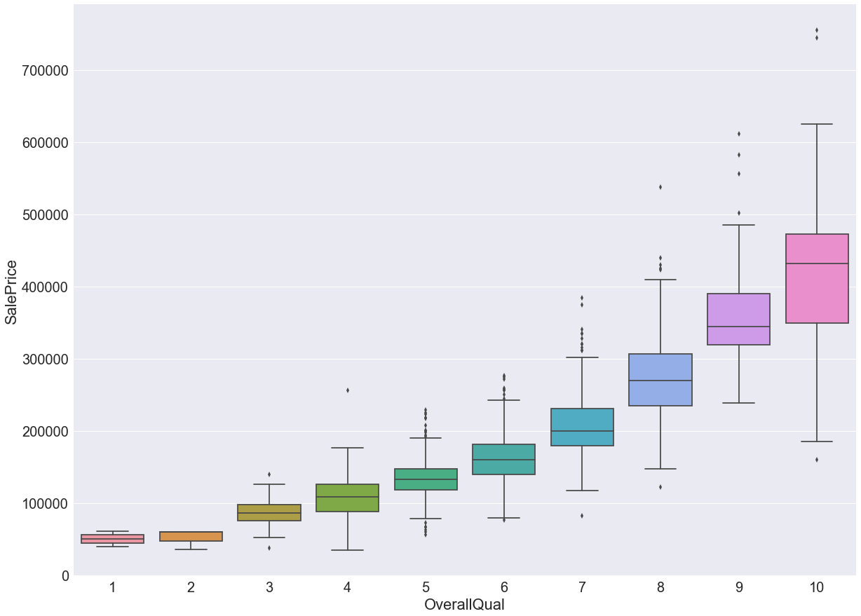
Box plot

This would give you tighter box if data points are bunched up together.

https://nycdatascience.com/blog/student-works/machine-learning/kaggle-competition-house-pricing-in-ames-iowa/

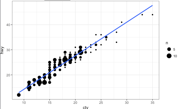
Bubble chart

Not sure if this is the official name, but basically you put the vertical axis into bins. The size of the bubble is determined by how many observations fall into that bin.

enter image description here

$\endgroup$
3
  • $\begingroup$ How does the bubble chart help to display the ordinal variable? Maybe you can change your example image to one with ordinal data. $\endgroup$
    – Pieter
    Commented Sep 24, 2019 at 11:01
  • 1
    $\begingroup$ @Pieter Thanks for the suggestion but I couldn't find one... but you can see the variable on the x-axis are all integers (11, 12, 13, 14, ...) so that's one example of discrete data, and you can treat ordinal values as discrete data. $\endgroup$
    – Art
    Commented Sep 24, 2019 at 11:10
  • $\begingroup$ Bubble only works if y-axis is also not strictly continuous, otherwise, each bubble will have one observation. This is still nice for "semi-continuous" data like integer-integer, which is very common. $\endgroup$
    – dcoy
    Commented Oct 31 at 17:05
5
$\begingroup$

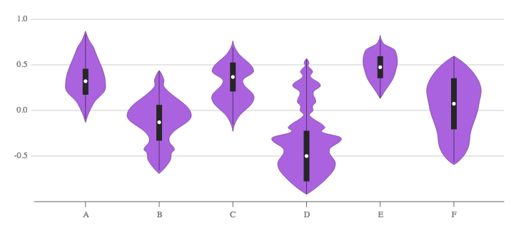
In addition to the box plot suggested by Art, I suggest a violin plot:

enter image description here

Explicitly showing the median and interquartile range, as done in the above image, is optional.

Quoting from Wikipedia:

Violin plots are similar to box plots, except that they also show the probability density of the data at different values, usually smoothed by a kernel density estimator.

A violin plot is more informative than a plain box plot. While a box plot only shows summary statistics such as mean/median and interquartile ranges, the violin plot shows the full distribution of the data. The difference is particularly useful when the data distribution is multimodal (more than one peak).

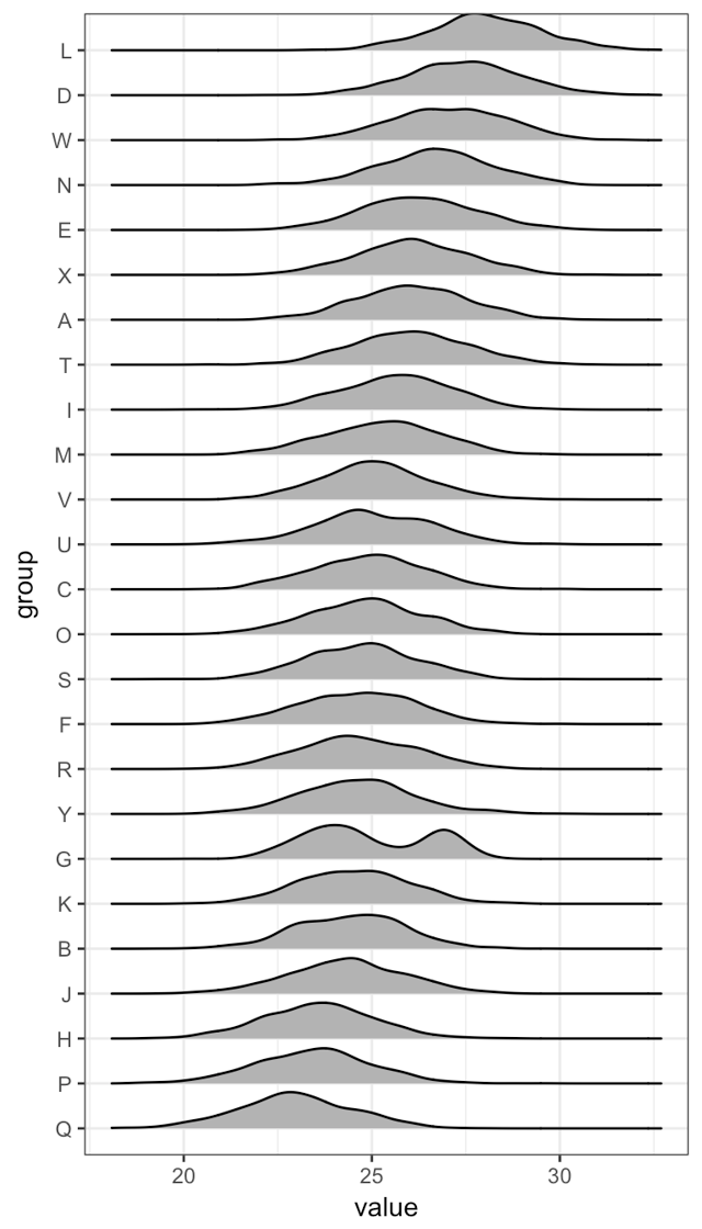
A similar alternative is stacked histograms or density estimators:

enter image description here

$\endgroup$
3
$\begingroup$

To your scatterplot, I would add a large point indicating the mean Y-value at every unique X-value, and also do one or more of the following:

  1. Square-root (or cube-root) transform your Y-axis. Both these transformations can deal with zeroes, unlike log transformations. Cube roots can also deal with negative numbers.
  2. Make the points a bit transparent.
  3. Add a little jitter to the X-axis values if the previous steps are insufficient.

As Glen_b notes, there is insufficient information right now to decide whether adding a linear regression line is meaningful.

$\endgroup$
5
  • $\begingroup$ Are there any zeros in the response? $\endgroup$
    – Nick Cox
    Commented Sep 24, 2019 at 8:34
  • $\begingroup$ @NickCox Hard to say for sure. I squinted at it and it seemed like there might be. See X = 3, for example. $\endgroup$
    – mkt
    Commented Sep 24, 2019 at 8:35
  • $\begingroup$ Question remains for OP, who should know. Incidentally I am a small fan of cube roots, used in Miles, Stokes, Vieli, Cox in Nature. We had to work hard to persuade reviewers that they were a good idea for a response that was variously positive and negative. But for the question here I would favour a Poisson model, which can work fine for non-negative continuous responses. $\endgroup$
    – Nick Cox
    Commented Sep 24, 2019 at 9:58
  • $\begingroup$ @NickCox Agreed, but the question was about how to visualise, not how to model. $\endgroup$
    – mkt
    Commented Sep 24, 2019 at 9:59
  • 1
    $\begingroup$ Indeed. That was a comment not an answer. But a Poisson model would imply plotting on log scale with a secondary question on how to plot observed zeros. $\endgroup$
    – Nick Cox
    Commented Sep 24, 2019 at 10:31
1
$\begingroup$

You state that one variable is ordinal, then you decide to treat it as interval. Is that reasonable? There is no way for us to know, as you have not said what the ordinal variable actually is. If you do decide to keep it as ordinal, then what to do depends on your sample size. If N is very large then I like the box plot solution. If N is not so large, then I like jitter. There are other additions you can make to the scatterplot as well - I wrote a presentation about this using SAS, but I am sure it could be duplicated in R. (If that link does not work, Googling flom, scatterplots, enhancements should find it).

But what if treating the variable as interval is not reasonable? You could come to this conclusion either substantively or by trying different codings and seeing how results change. In that case, I suggest trying optimal scaling. There is an R package optiscale that may help (I have not used this package).

$\endgroup$
1
$\begingroup$

The basic idea of regression is that the probability distribution of $y$ depends on $x$: there is some family of distributions $P_x(y)$. It's generally assumed that these distributions are all normal with a constant standard deviation (homoscedasticity), leaving only the mean as depending on $x$: $p(Y=y) = N(\mu_x,\sigma)$. With continuous data, you typically get only one $y$ for finitely many $x$, and no $y$ for the rest, making estimating $\mu_x$ by just looking at your sample $y$ for that $x$ unworkable. So a further assumption is often made that $u_x$ is a simple linear function of $x$, so that $p(Y=y) = N(mx+b,\sigma)$ for some numbers $m, b, \sigma$. The linear regression formula then gives you an estimate of $m$ (slope) and $b$ (intercept) for your data.

Here, you seem to have highly skewed data, and there seems to be a general trend of decreasing spread, so if you were to use linear regression, the normality and homoscedasticity assumptions would be problematic. But you appear to have a large dataset for each value of $x$. So to estimate $\mu$ for a particular $x$, there is no need to use the linear regression formula; you can simply take $\bar y$ for each $x$. Which is more informative for predicting a $y$ for $x=4$: looking at the $y$ values for $x=4$, or looking at the $y$ values for $x=3$ and $x=5$, and trying interpolate between them?

You may want to show summary statistics other than just $\bar y_x$. A box plot can show meadian and quartiles, for instance. You might also want to represent the standard deviation somehow.

You could also show the entire distributions. You could do that with x-dither, as Pieter suggested, or with another type of chart, such as density plots. You could put them side-by-side as in Pieter's answer, but with only six categories, it might be possible to combine them into one chart with the categories separated by colors. Here's a discussion of histograms and density plots: https://towardsdatascience.com/histograms-and-density-plots-in-python-f6bda88f5ac0

$\endgroup$

Your Answer

By clicking “Post Your Answer”, you agree to our terms of service and acknowledge you have read our privacy policy.

Not the answer you're looking for? Browse other questions tagged or ask your own question.