1
$\begingroup$

I'm writing an essay that's looking at the presence of the Pareto Principle in data. Unfortunately, as a consequence of interest, I've picked a topic that involves statistical analysis well above what I've been taught so far.

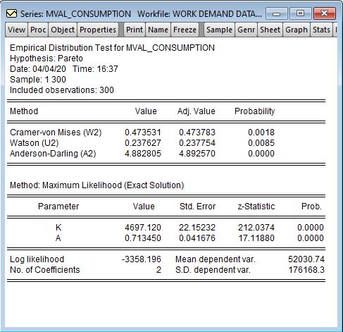
I'm looking at two data sets, one from my workplace around sales and another looking at macroeconomic wealth data. I've run my first data set, the sales data, through Eviews in an EDF test for the presence of a Pareto distribution but I cannot find any literature in layman's terms that helps me understand whether or not I can/can't reject the null hypotheses, or even what the null hypotheses are. The attached image shows the results. I was able to replicate the MLE estimate for alphahat in excel and achieved the same 0.713 value, I understand this is a shape parameter for the distribution but I don't know what information this tells me, please help me interpret these results. Additionally any information of a good reference for understanding the Pareto distribution in wealth would be very helpful.

enter image description here

$\endgroup$

1 Answer 1

1
$\begingroup$

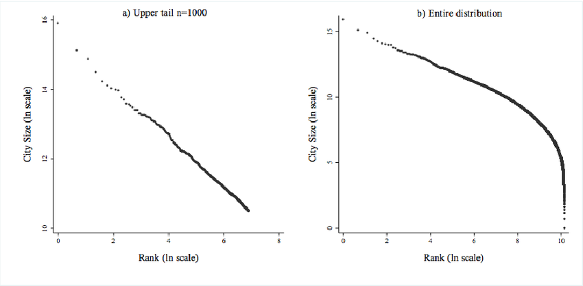
Given that you find yourself out of your depth statistically, may I recommend that rather than presenting formal hypothesis tests for testing the Pareto tails, you instead concentrate primarily on graphical depiction of the tails of a dataset using a "tail plot". A standard tail plot for a variable will show the rank of the value on the horizontal axis and the actual value of that variable on the vertical axis, with both axes on a logarithmic scale. Often this will be shown only for data that are "in the tails", which in practice means some relatively small proportion of the data within the relevant tail. If the tail of the distribution obeys the power law then the data should roughly follow a straight line on the plot.

For example, here is a tail plot of city sizes taken from Fazio and Modica (2012) (direct link to the image is here). As you can see, the data in the upper tail roughly follow a straight line on the log-log-scale of the plot, which means that they appear (at least to the naked eye) to satisfy a distribution with power law tails. This means that the city-size data in the paper appears to accord roughly with a power law distribution. You can estimate the value of the power by looking at the slope of the line. While there are formal estimation methods for this, even just running a ruler through the data should give you a rough guess that you could describe to a lay audience.

enter image description here

It ought to be possible for you to write a powerful essay on this topic, using graphical depictions of tail plots to show the idea of power law tails, and the Pareto principle. Most likely you are writing this paper for an audience of non-statisticians, so it will be your job to explain things clearly without excessive technical detail. If you want to mention the formal statistical tests at all, it would probably suffice to note that they are tests that look at whether the tails on these plots really do follow a straight line (on the log-log scale), or whether the data deviates from this line sufficiently to make that hypothesis implausible.

$\endgroup$
1
  • $\begingroup$ I've taken your advice and plotted the two 5% tails, my results are akin to the paper you've referenced in the top tail, but emulate the plot of the full distribution on the bottom tail. It seems as though I can deduce my data set follows a power distribution (or Pareto, whats the link/difference?), but why the non-conformance in the bottom tail? $\endgroup$
    – M.White
    Commented Apr 5, 2020 at 13:03

Your Answer

By clicking “Post Your Answer”, you agree to our terms of service and acknowledge you have read our privacy policy.

Not the answer you're looking for? Browse other questions tagged or ask your own question.