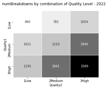
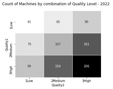
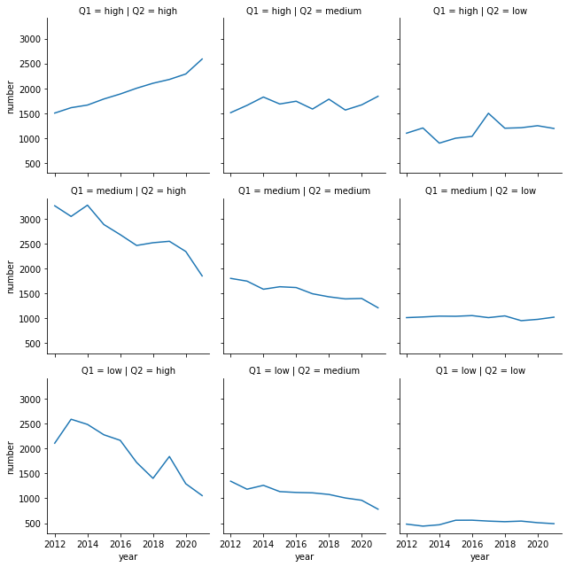
I'm not sure what you mean by "facetplots of the heatmap, faceted by year", but an option may be to draw upon the heatmap/contingency table design, and plot the evolution of each interaction in its own cell (year on the x-axis, the number of interest on the y-axis). It comes down to using line charts in a facet grid.
Here's an example with some made up data:

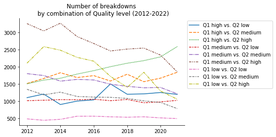
Now, it might not be perfect if you want to compare lines together. So you could compress all the facets into a single one. Which gives a single line chart:

A single line chart is borderline non-readable with 9 variables, and it would probably not work if you had a larger contingency table. But I think the graph is still understandable even if it requires some attention.
You'll probably get a very different result with your actual dataset. The graph can be probably largely improved with a different choice of colors, increasing the graph size, etc.
You get the general idea: each line representing a different interaction, with time on the x-axis, and the y-axis representing your variable of interest (here I used the number of breakdowns, but you could use the number of machines, or the average number of breakdowns by machine).
An issue you may run into is if several lines are very close to each other, or if some lines are particularly far away from others (making the others looking very close), which can make the graph difficult to read.
In this case, one solution is to transform the data (e.g. taking the power of 2 of the values, exponentiate them, take their logarithm, etc.) to modify the gap between the lines. This may or may not be a good solution depending on what your actual data look like, and what you want to show or to learn from your graph.
Otherwise, you probably have to go back to square one, with the facet grid. It's basically a trade-off between readibility and saving space.

