0
$\begingroup$

I have a longitudinal dataset with continuous variables for 6 different time points nested within each ID. I prepared a longitudinal Poisson model with ID as a random effect for the intercepts, which in itself is working fine. In preparing the figures for the report, I prepared a figure with the predicted values for each of the 6 timepoints and the confidence intervals derived from the model. Then I grew uncertain and started looking in the literature. I could not really decipher what other people had done for their confidence intervals since it was not shared in the methods section or figure legend. Looking at some of these figures I am left wondering whether some have just reported either means or medians with 95%CI or IQR. I guess median/IQR could be defended, but if means and CI´s are reported, wouldn't the confidence interval be biased due to within-subject correlation?

So I guess my question is if I should use my calculated confidence intervals from the model (with ID as a random intercept) or if there is another universally accepted way of doing this that I have missed?

Thanks for the input regarding confidence and prediction intervals. What I am looking for is the most appropriate way of demonstrating the uncertainty of our measurements over time in three groups - see figure - whether I should include the fact that the measurements are correlated over time or not.
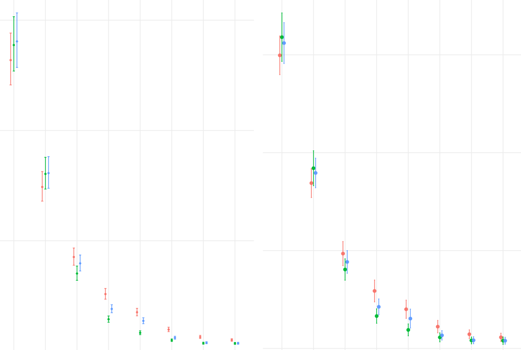
Left is Poisson based fitted population level values and to the right is means and confidence intervals for each time point disregarding the within-subject correlation

$\endgroup$
8
  • $\begingroup$ There are a few things in your question I'm not quite sure about. (1) You write that you show "predicted values" and CIs. But predictions are about not-yet-seen realizations, so a prediction interval would be more appropriate than a CI (there is a difference). Or are you really talking about fitted values, not predicted ones? ... $\endgroup$ Commented Dec 4, 2022 at 5:59
  • $\begingroup$ ... (2) I am a bit confused about just what you want to show. You can show fitted/predicted values with CIs or PIs, per above. Or you could also show means or medians within groups or timepoints, together with CIs, or with quantiles (probably not IQRs, because these are just numbers - you are probably thinking of visualizing the 25th and the 75th percentile within groups). Either one can be informative. Which one you want to show depends on, well, what you want to show. But whether CIs are biased is only a question subsequent to that decision. $\endgroup$ Commented Dec 4, 2022 at 6:02
  • $\begingroup$ @StephanKolassa -- please see edits $\endgroup$
    – Misha
    Commented Dec 4, 2022 at 14:46
  • $\begingroup$ Could you please share some reproducible data? $\endgroup$
    – Quinten
    Commented Dec 11, 2022 at 9:55
  • $\begingroup$ @Quinten - dont know how reproducible data would help in this question as the uncertainty revolves around the issue of whether to report model based confidence intervals that include the uncertainty related to the longitudinal data or disregard the latter and just report the quartiles etc-- however, the width of the confidence intervals are quite different $\endgroup$
    – Misha
    Commented Dec 11, 2022 at 19:40

1 Answer 1

1
$\begingroup$

The question is whether you want to display "the uncertainty of our measurements over time" (essentially the raw data) or the uncertainty of the model estimates over time.

If all you have is a simple Poisson model of counts versus time and random intercepts for individuals, and you have complete data, then it might make sense to take the original data and show means with standard errors. Boxplots can be even more useful for illustrating the variability among measurements. Then your model evaluates whether any differences apparent in the raw data are statistically reliable.

Particularly if there are other covariates in your model, however, plots of raw data alone can be misleading. Then you should report means estimated from the model for each condition; showing 95% confidence intervals (CI) for those estimates is frequent practice. Those would be determined from the model coefficients and the variance-covariance matrix of the estimates. For your data, a logarithmic y-axis might make sense. Make it clear to your audience precisely what you are displaying.

A few warnings.

First, as comments indicate, a CI for a model estimate is not the same as a prediction interval. Use of the phrase "prediction interval" isn't always consistent, but it typically includes both the error in the model estimate and the additional error in sampling: for example the Poisson variance for observations here, or the residual variance in an ordinary least squares model.

Second, it's tempting to equate overlap of CI with lack of significance. That's incorrect. This page explains the relationship for simple t-tests, but the principles hold in general: non-overlap of CI is too stringent a test for "significance." The emmeans package can provide a visual display for which non-overlap of arrows is approximately related to significance of differences among model estimates.

Third, @usεr11852 raises an interesting point about displaying pointwise CI (like you seem to have) versus "simultaneous" CI. The latter involve a correction for multiple comparisons so that the CI represent the entire family of comparisons. Provided that you are clear in describing what you show, one could argue either way about what to plot.

$\endgroup$

Your Answer

By clicking “Post Your Answer”, you agree to our terms of service and acknowledge you have read our privacy policy.

Not the answer you're looking for? Browse other questions tagged or ask your own question.