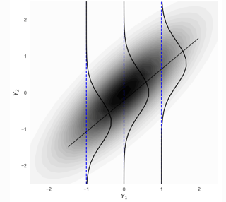
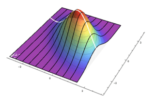
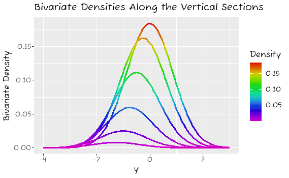
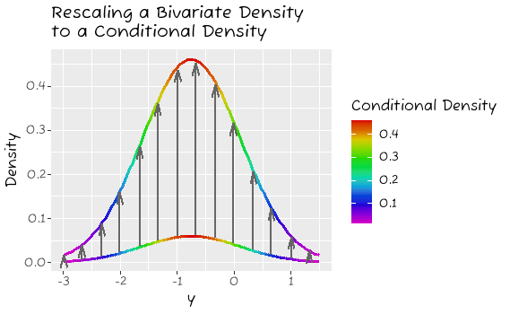
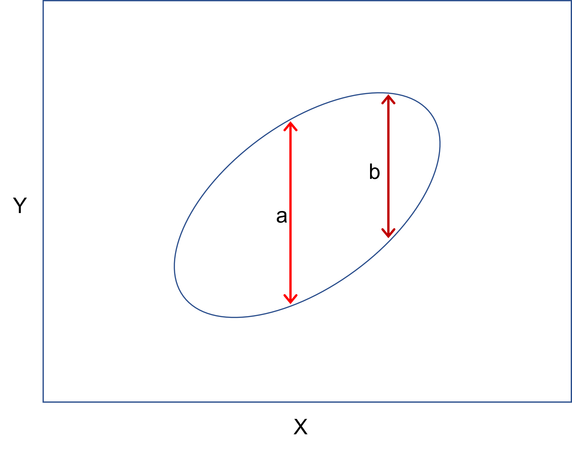
If I plot a 95% ellipse for a bivariate normal distribution, it might look like the plot below.

When I take a vertical slice through that distribution, I might get a slice like the lighter red line, a, in the center, or I might get a slice like the darker red line, b, on the right. It looks like a is longer than b (and it is). That is, the vertical spread from the bottom to the top of the ellipse at a given point on $X$ changes as you move from side to side. This is simply not the same as the conditional variance. As a first attempt to understand the bivariate normal and the idea of homoscedasticity, just looking at the vertical spread is reasonable, but it isn't quite right. It's simply not the case that the length of those lines are the variances of the conditional distributions of $Y$ given $X=x_i$.
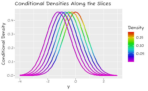
With a bivariate normal, you will have more data, and more density in the center (either from side to side, or equally, from top to bottom) than at the extremes. Where there is more data, you will have more extreme values. For instance, only 5% will be $>|2|$ SD's from the mean; where you have 100 data, that would be 5, but where you have 1000 data, that will be 50. The result is that the density is higher with more data and it looks like it is spreading out further, but in both cases, the variance is the same. To illustrate, consider the very simple simulation below. Even though the standard deviation is the same, with more data, the value at the 2.5th percentile is further out:
set.seed(1)  # makes this reproducible
quantile(sort(rnorm( 200, mean=0, sd=1)), probs=.025)
#      2.5%
# -1.641215
set.seed(1)
quantile(sort(rnorm(2000, mean=0, sd=1)), probs=.025)
#      2.5%
# -2.092716

