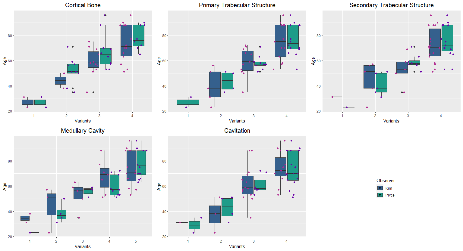
A scatterplot would be most useful for assessing for well the two observers agree (and draw the attention to this comparison).
It's hard to say which one would be more useful in your case. Try looking at scatterplots and seeing whether they convey what you need. You would need to replace each one of your five panels by four scatterplots (please keep the scaling constant within each variant). If you have a gold standard (true age), indicate that within each scatterplot.
If you decide to stick with this visualization, I would consider removing the boxplots, since you do not really have a lot of data (again, try it and see what works). However, reduce the horizontal spread between points within a variant and observer, and increase the spread between adjacent variants. And again, if you have a "true" value, indicate it in the plots.

