6
votes
$\begingroup$

Using R, I'd like to plot two boxplots without the boxes—just the points.

Creating clean boxplots in R is trivial:

    business <- runif(50, min = 65, max = 100)
    law <- runif(50, min = 60, max = 95)

    boxplot(business, law, horizontal=TRUE, names=
      c("Business", "Law"), col=c('green', 'red'), 
      main="Salary example (boxplot)")
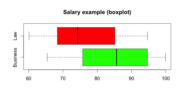
Regular boxplots

However, the only way I've found to plot just the points in the two random distributions seems needlessly complicated: I overlay two scatterplots with each variable plotted against either 1 or 2, to make a flat line:

    plot(business, rep(1, length(business)), 
          xlim=range(business, law), ylim=c(0, 3), pch=20, 
          col='green', main="Salary example (dots)")
    points(law, rep(2, length(law)), col='red', pch=20)
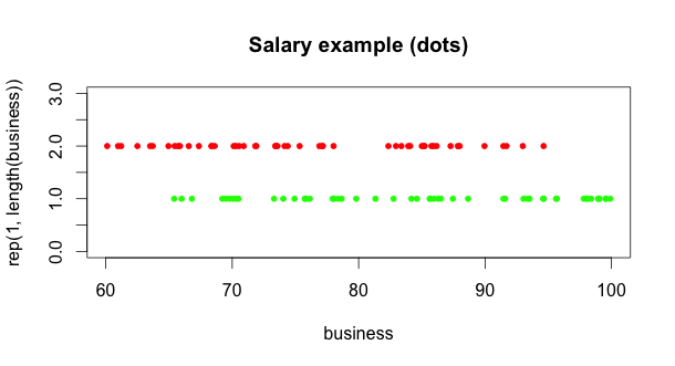
Sample dotted boxplot

While this works, it will require a ton more tweaking to get the axes, tickmarks, and labels to match what R does with boxplot(). It seems that there has to be a simpler, more R-like way to do this. What's the best way to draw a boxplot without the box and whiskers—just the individual points?

$\endgroup$
2
  • $\begingroup$ Just to clarify, you're looking for a way to plot quantile markers, correct? A box plot is simply a "fancy" (term used loosely here) plot of quantiles and outliers. $\endgroup$
    – eykanal
    Commented Jan 20, 2012 at 3:44
  • $\begingroup$ No, I'm looking for a way to use boxplot() to not draw the quantile markers, and only draw the dots. It already draws outliers as points—I'm hoping there's a way it can draw all the vector values as points. $\endgroup$
    – Andrew
    Commented Jan 20, 2012 at 4:12

3 Answers 3

8
votes
$\begingroup$

The stripchart function in the graphics library seems to be what you want if you want to plot the data 1 dimensionally for each group. It produces a somewhat basic plot but you can customize it

    business <- runif(50, min = 65, max = 100)
    law <- runif(50, min = 60, max = 95)
    df <- data.frame(group = rep(c("Business", "Law"), 
            each = 50), value = c(business, law), 
            stringsAsFactors = FALSE)
    
    stripchart(value ~ group, data = df, 
       main = "Salary Example (dots)",
       pch = 16,
       col = c("red", "green"))
$\endgroup$
2
  • $\begingroup$ Awesome! I had no idea stripchart existed. That's exactly what I was looking for. $\endgroup$
    – Andrew
    Commented Jan 20, 2012 at 4:23
  • $\begingroup$ (+1) I've developed similar ideas using lattice but your response is fine. $\endgroup$
    – chl
    Commented Jan 20, 2012 at 9:33
6
votes
$\begingroup$

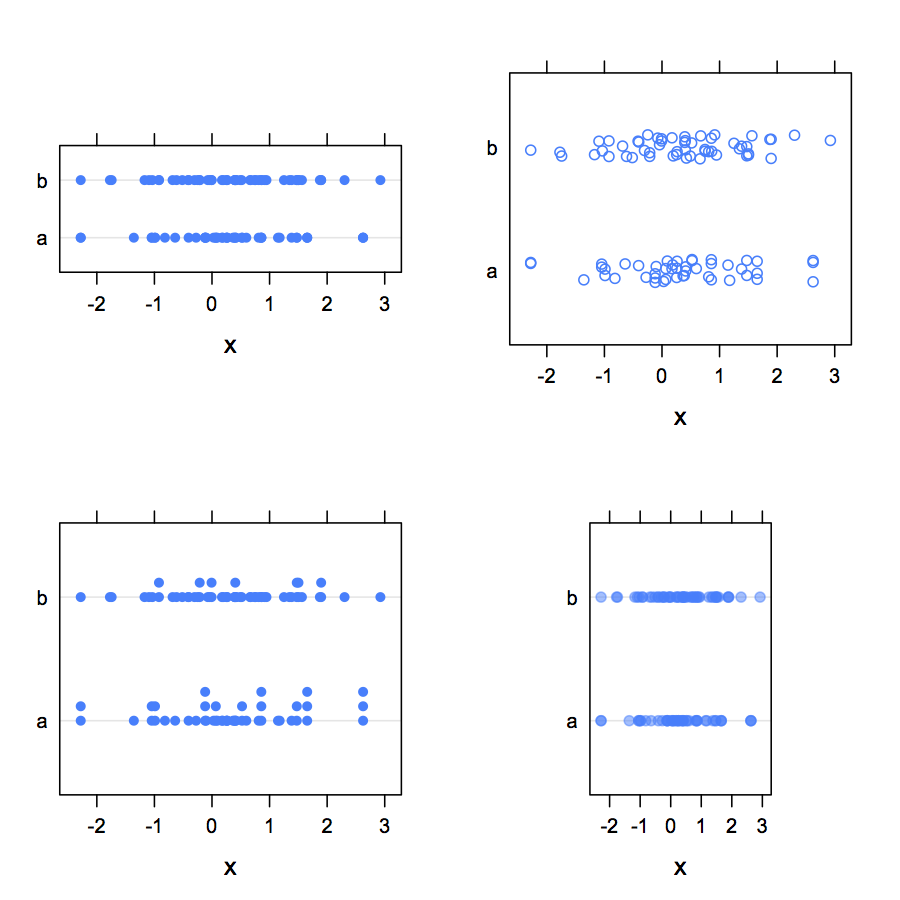
One interesting application of R's stripchart() is that you can use jittering or stacking when there is some overlap in data points (see method=). With lattice, the corresponding function is stripplot(), but it lacks the above method argument to separate coincident points (but see below fo one way to achieve stacking).

An alternative way of doing what you want is to use Cleveland's dotchart. Here are some variations around this idea using lattice:

    my.df <- data.frame(x=sample(rnorm(100), 100, replace=TRUE), 
                        g=factor(sample(letters[1:2], 100, 
                        replace=TRUE)))
    library(lattice)
    dotplot(x ~ g, data=my.df)               # g on the x-axis
    dotplot(g ~ x, data=my.df, aspect="xy")  # g on the y-axis
    ## add some vertical jittering (use `factor=` to change 
    ## its amount in both case)
    dotplot(g ~ x, data=my.df, jitter.y=TRUE)  
    stripplot(g ~ x, data=my.df, jitter.data=TRUE)  
    ## use stacking (require the `HH` package)
    stripplot(g ~ x, data=my.df, panel=HH::panel.dotplot.tb, 
                   factor=.2)
    ## using a custom sunflowers panel, available through
    ## http://r.789695.n4.nabble.com/ Grid- graphics- 
    ## issues- tp797307p797307.html
    stripplot(as.numeric(g) ~ x, data=my.df, 
              panel=panel.sunflowerplot, 
              col="black", seg.col="black", seg.lwd=1, size=.08)
    ## with overlapping data, it is also possible 
    ## to use transparency
    dotplot(g ~ x, data=my.df, aspect=1.5, alpha=.5, pch=19)

Some previews of the above commands:

enter image description here

$\endgroup$
1
vote
$\begingroup$

I got a little curious of how the violinplot works when I saw this question. This also led me to the beanplot that might be on the same theme.

The base data creation for all three plots:

business <- runif(50, min = 65, max = 100)
law <- runif(50, min = 60, max = 95)

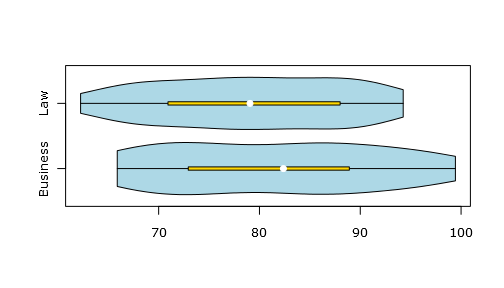
The violin plot

library(vioplot)
vioplot(business, law, names=c("Business", "Law"), 
        horizontal=T, col=c("lightblue"), rectCol=c('gold'))

Gives below, different colors aren't possible without a tweak:

Basic violin plot

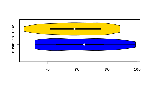
For getting different colors I found this slightly more advanced solution from Ben Bolker

plot(1,1,ylim=c(0,2.5),xlim=range(c(business, law)),type="n",
     xlab="",ylab="",axes=FALSE)
## bottom axis, with user-specified labels
axis(side=2,at=1:2,labels=c("Business", "Law"))
axis(side=1)
vioplot(business,at=1,col="blue",add=TRUE, horizontal=T)
vioplot(law,at=2,col="gold",add=TRUE, horizontal=T)

And it looks like this:

Violin plot with different colors

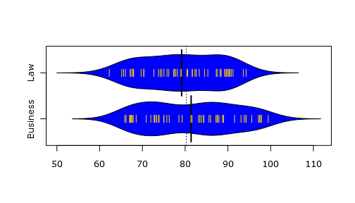
The beanplot

In my search I also stumbled across the beanplot from Peter Kampstra that seems interesting:

library(beanplot)
beanplot(business, law, horizontal=T, 
         names=c("Business", "Law"), 
         col=c("blue", "gold"))

Gives this:

Beanplot

$\endgroup$

Not the answer you're looking for? Browse other questions tagged or ask your own question.