1
$\begingroup$

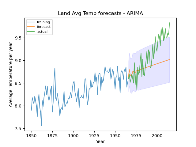
I know this has been asked a lot but I have checked everything and still don't understand. To start, I have a dataset of global temperatures averaged over years. There is a trend in the series and I use pmdarima ndiffs to give me the number of differencing. I use pmdarima auto_arima to get the model with the lowest aic value. But when I plot the predictions, I get a straight line with a trend. The model I use is:

size = len(avg_temp)
cutoff = int(size*0.7)
train = avg_temp[:cutoff]
test = avg_temp[cutoff:]    
model = pm.auto_arima(train, start_p=1, start_q=1,
                     max_p=10, max_q=10,
                     seasonal=False,
                     d=1, trace=True,  
                     suppress_warnings=True)

Image of the original series and the prediction

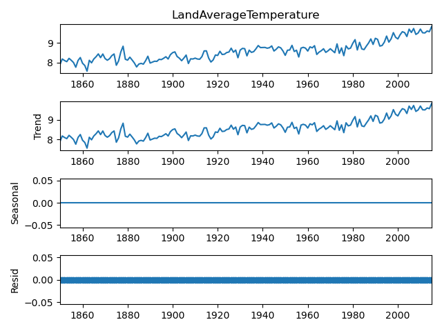
The order of the model obtained by auto_arima is (1, 1, 3). I read in some answers that the forecast of ARIMA is only to the value of q. But I have seen people forecasting bigger ranges of values. I checked for seasonality by using statsmodels seasonal_decompose and there was no seasonality.

Additive seasonal decompose

My questions are: Am I doing something wrong? What can I do to improve it? and if it can't be improved how do I explain it?

$\endgroup$
5
  • 2
    $\begingroup$ Once you zoom in, it is clearly not a straight line. It asymptotes around a positive linear trend as the forecast horizon increases. This is what you should expect from ARIMA(1,1,3) with drift. $\endgroup$ Commented May 15, 2023 at 13:06
  • $\begingroup$ Why does it behave like that? This is my first time using time series forecasting. Does it mean that arima is not good to forecast the time series? $\endgroup$ Commented May 15, 2023 at 14:09
  • $\begingroup$ It does not mean that. It could even be close to the best forecast there is given the data you are including in the model. $\endgroup$ Commented May 15, 2023 at 15:26
  • $\begingroup$ Thanks @RichardHardy and sorry for being annoying but why does it asymptotes like that? $\endgroup$ Commented May 15, 2023 at 16:07
  • $\begingroup$ The effect of the MA part disappears after 3 steps. The effect of the AR part shrinks exponentially with each step. The drift term produces a linear trend. Add the three together, and you get what you see in the picture. $\endgroup$ Commented May 15, 2023 at 16:24

1 Answer 1

0
$\begingroup$

Maybe you need a slight change in your code as follows:

from matplotlib import pyplot
from sklearn.metrics import mean_squared_error
from statsmodels.tsa.arima.model import ARIMA
from pmdarima.arima import auto_arima


def ARIMA_Model(history,test,coeff):
    predictions = list()
    # walk-forward validation
    for t in range(len(test)):
        model = ARIMA(history, order=(coeff[0], coeff[1], coeff[2]))
        model_fit = model.fit()
        output = model_fit.forecast()
        yhat = output[0]
        predictions.append(yhat)
        obs = test[t]
        history.append(obs)
    rmse = sqrt(mean_squared_error(test, predictions))
    return (rmse, predictions)


size = len(avg_temp)
cutoff = int(size*0.7)
train = avg_temp[:cutoff]
test = avg_temp[cutoff:]    
coeff = auto_arima(y=train, seasonal=False, m=0,error_action="ignore", suppress_warnings=True, trace=True)

ARIMA_rmse,ARIMA_predictions=ARIMA_Model(train,test,coeff)
pyplot.plot(test, color='black',label='Original Data')    
pyplot.plot(ARIMA_predictions, color='blue',linestyle='dashed',label='ARIMA')
$\endgroup$

Your Answer

By clicking “Post Your Answer”, you agree to our terms of service and acknowledge you have read our privacy policy.

Not the answer you're looking for? Browse other questions tagged or ask your own question.